Bill Buchanan, HonPSA, FGDC
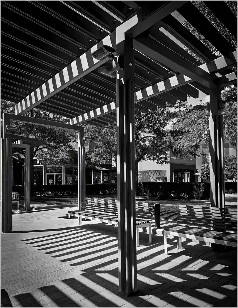
July 2026 - Untitled
About the Image(s)
Happy Independence Day!!
I'm in the process of writing a book on Composition based upon fifty plus years in Photography. This image was shot on July 3, 2026 at a local mall. It was converted to Monochrome in Lightroom Mobile. The chapter title is, "Let There Be Light: Mastering the Soul of Every Photograph"
This photograph was taken under a pergola at midday. The sun turned the slatted roof into a pattern of strong, repeating lines. What drew me in was not only the wooden beams themselves, but the second set of lines they cast onto the pavement below ??” lines made entirely of shadow.
One important note: the color version of this scene is noticeably weaker than the black-and-white rendering. In color, the graphic power of the lines and shadows is diluted. The image only comes alive when reduced to tone, shape, and contrast. This is a useful reminder that some scenes are best seen ??” and composed ??” in monochrome from the start. Visualization is not only about where you place the camera, but also about how you choose to render light and shadow.
6 comments posted
(Group 32)
In this image, you have broken the composition effectively. The column in the middle of the scene seems to violate the traditional rules of composition but it produces good result with all the criss-cross shadows from the ceiling beams on the top down to the floor. Although the background seems busy, the green hedge does acts as a barrier to prevent the viewer's eyes from wandering past that area.
Your conversion to B&W is a great choice since shadows become key visual elements without the distraction of color. It's an excellent image! It can also be used as a practical tip on how to break the rules of composition effectively in your upcoming book. Thanks for sharing your great image! Posted: 07/13/2026 20:50:14