Robert Schleif

May 2023 - Not so Dandy
Original
About the Image(s)
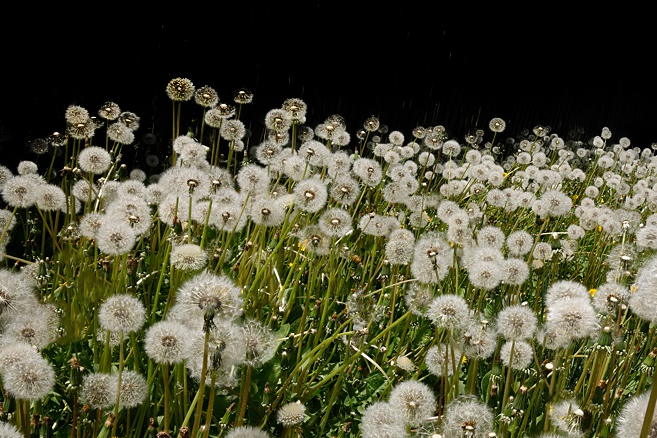
This is an image that didn't meet my expectations so I'm hoping that others may make improvements or suggestions that could improve this image or others I try in the future. My objective here was to present the horrifying image of a dense patch of dandelions. To make it artistically interesting, I wanted one or two seed heads to be prominent in the foreground and for the background to show that there were a LOT of dandelions. To accomplish this, I used focus stacking so that all the dandelions would be in focus. My favorite lens for focus stacking with close objects is the Canon RF 100mm F2.8, but this didn't show enough of the dandelions. Therefore, I used my RF 24-105 mm F/4 at 24 mm even though it limited how close I could get to a seed head. After conversion from raw to TIF with Canon's DPP4, the 20 images with at least some of the dandelions in focus were processed with Helicon, and then cropped and lightly processed with PWP8.
This round’s discussion is now closed!
11 comments posted
Is it a bit too sharp? It looks like everything was sharpened instead of just the heads? And I do think Ed has a good point about the color being off a bit. The green is a little flat and the yellow seems a little weak. You can use the saturation slider in Camera Raw to adjust a bit.
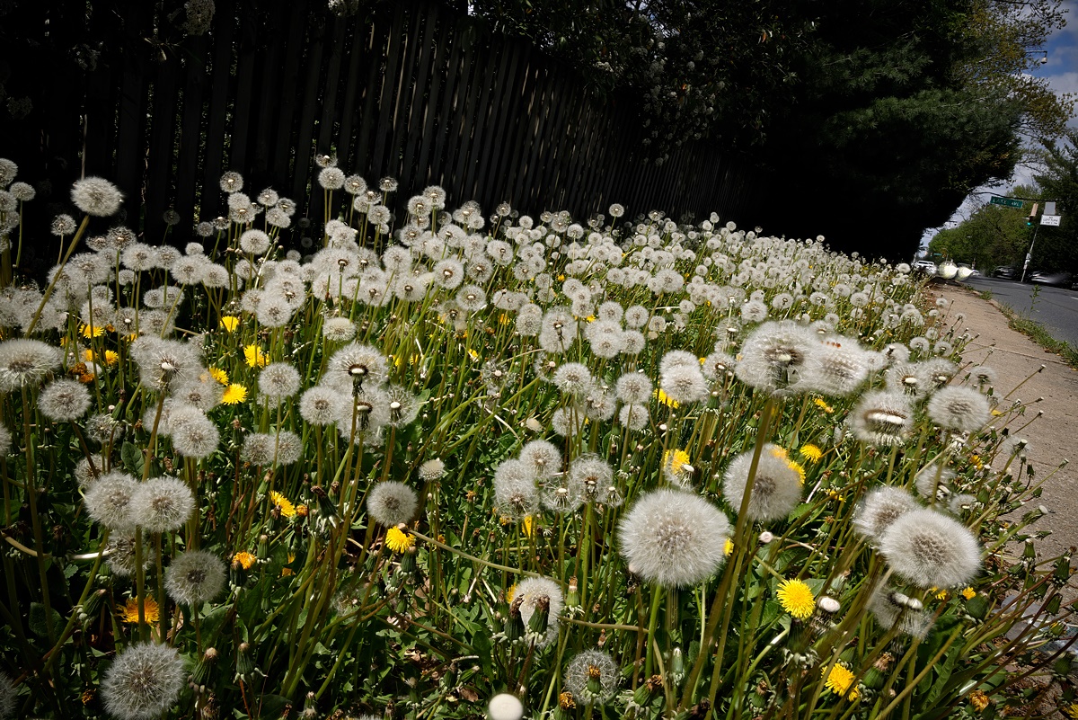
Would you consider removing some of the busy pieces? I think there is another crop that might be more interesting, I can play with it, if you want. Posted: 05/04/2023 20:43:09

Given what you indicated you were trying to accomplish, I believe your choice of focus stacking here might have worked against you.When there is no depth-of-field, due to the focus stack, it feels a bit challenging to visually see the "vastness" of the patch of dandelions.
Additionally, it might have been easier to show the desired effect if you had gotten a little lower on your vantage point/perspective in relation to the dandelions.
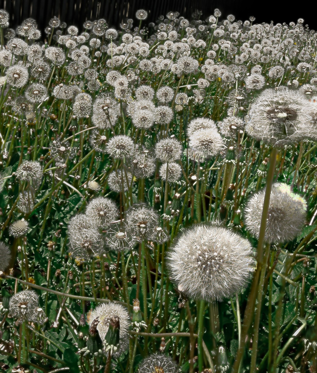
I played very slightly with the rotation of the image and crop, but kept it constrained to normal 3:2 to try and help keep some of the desired depth. I then played around with the geometry settings in Lightroom to modify the perspective in a manner that helped make the dandelions feel a little taller and create more depth. Finally, I applied a linear gradient at the bottom to selectively sharpen just the bottom third of the image, artificially creating depth-of-field. Minor modifications to contrast and shadows but not much else.
Posted: 05/07/2023 10:25:36
For me, Jim has made most of the relevant points, and has excluded the moving heads which don't look particularly great.
James has also mentioned getting down low, if not below the heads to make them more interesting.
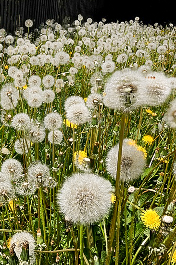
I would also play with Dehaze and Vibrance to lift the overall feel of this image.
Posted: 05/08/2023 10:52:05
Very busy image, try different crop, may look better. Posted: 05/16/2023 20:10:36