David Halgrimson, APSA
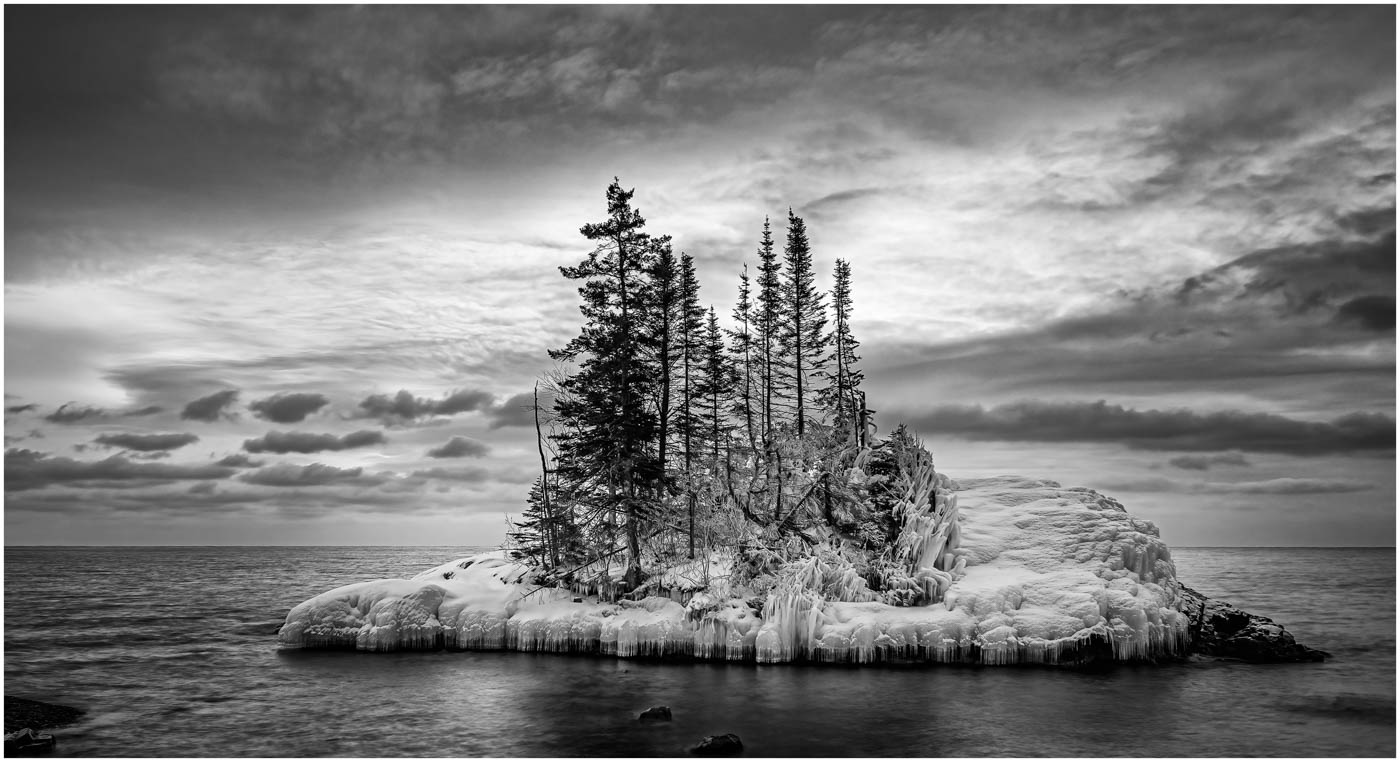
May 2023 - The Tombolo

Original
About the Image(s)
This is another image from the workshop I took in norther Minnesota. This Island is called the Tombolo. We were here early morning for sunrise. The sunrise is behind the island and there were great clouds which provided a dramatic background for the island.
Taken with my Olympus EM1 MKII, an Olympus 7-14mm at 14mm. Settings were 1.3 sec, f/2.8 and ISO 200.
It was a bit of a challenge with the sun in the background but the clouds were a great filter and added to the overall image.
I did some basic adjustments, raised shadows, and added texture and clarity in Lightroom and converted to B&W in Silver Efex Pro 2. I used preset #6 adding a control point over the center area of the island and added a thin boarder.
This round’s discussion is now closed!
7 comments posted
I like you image Dave. Like the white border which I forget to use with my image that I sent in to you today. By the size of lens you used, you must have been very close to the island.
I think that a little dodging and burning of the snow and ice on the island would really make this a very stunning image. Over all this is a super image Dave, but need a little help with the island which if the center of attraction. Even though it is blue in the original, the island needs help in the B/W. My opinion. Jerry Posted: 05/02/2023 09:09:37
I think that a little dodging and burning of the snow and ice on the island would really make this a very stunning image. Over all this is a super image Dave, but need a little help with the island which if the center of attraction. Even though it is blue in the original, the island needs help in the B/W. My opinion. Jerry Posted: 05/02/2023 09:09:37
See what you think? Posted: 05/02/2023 09:20:24
Thanks Jerry, I will look into doing that.
Posted: 05/02/2023 11:50:56
Posted: 05/02/2023 11:50:56
The B&W is moe dramatic, well done.
The structure of the sky (clouds ans light) is present and is beautiful. Same opinion fir the island.
There is a stone on the left. Is it disturbing ?
I like the central positon of the island. More central?
Posted: 05/10/2023 02:31:24
The structure of the sky (clouds ans light) is present and is beautiful. Same opinion fir the island.
There is a stone on the left. Is it disturbing ?
I like the central positon of the island. More central?
Posted: 05/10/2023 02:31:24
Dave lovely shot and you caught the light and atmosphere beautifully. The conversion is well done though the tonal values could be tweaked with some more dodge and burn to pop the snow on the island would help pull the eye in to the focal point of the story. Black and white definitely gives more drama and impact to the scene. The dark black rock(?) at the bottom left could be removed or cropped out. Nice work. Posted: 05/17/2023 14:11:41
Brrr...You're a long way from Sun City, Dorothy:) I like both versions, but particularly like the way the sky is glowing in the color version. Is there a way to brighten the sky like that with a layer that brings out the whites? I use the NIK Collection Viveza and think a control point with brightness raised might help. Nice catch. Posted: 05/17/2023 15:43:41
I think the subject {the island} shows more separation in the color version. The range of tones and the composition is nice in the B&W version. I agree that a little dodging and burning on the island would draw the eye more. Posted: 05/19/2023 10:59:23