Stephen Levitas

May 2023 - In the temple

Original
About the Image(s)
In the Temple
Here is another shot from our trip to China. It is the interior of a temple. I am very fond of great extents of black. How do you like that? And how do you like the crop I chose? All I did was convert to monochrome and sharpen a bit. Perhaps there is no story here?
This round’s discussion is now closed!
14 comments posted
I like.
From a "presentation standpoint" your black merges in to the basic background which is also black. You could consider a fine white border on your image in order to separate it and make the overall view less black and "less big." Posted: 05/01/2023 13:04:44
From a "presentation standpoint" your black merges in to the basic background which is also black. You could consider a fine white border on your image in order to separate it and make the overall view less black and "less big." Posted: 05/01/2023 13:04:44
Thank you, Wes. Of course I should have thought I needed a border to define the edges of a nearly black image. How is this? Posted: 05/01/2023 22:45:44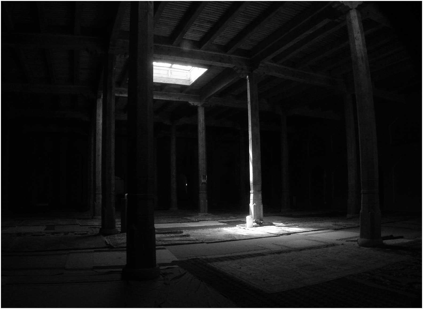
I think that makes it easier to appreciate your LowKey image.
Posted: 05/02/2023 06:07:30
Posted: 05/02/2023 06:07:30
In some ways this is like my portrait-we've both gone for a gloomy black image which just a small area of brightness. I think my model would have been just right for posing in your temple.
I do like the single area of light illuminating the post. However does it have enough to keep the attention? I think i wanted a temple cat sitting in the patch of sunlight. If I was good at composites, I could add one! Posted: 05/02/2023 04:09:25
I do like the single area of light illuminating the post. However does it have enough to keep the attention? I think i wanted a temple cat sitting in the patch of sunlight. If I was good at composites, I could add one! Posted: 05/02/2023 04:09:25
Oh, I would have very much liked your model in this shot, although I don't want an added animal as a focal point. Posted: 05/02/2023 19:59:45
Oh no, I think a model would have been completely wrong! I thought a temple cat lazing in the patch of sunlight or one just skulking in the shadows would have highlighted the emptiness of the area. I obviously got a different impression of the temple than you. Posted: 05/03/2023 03:47:40
Although it is a temple, the effect is almost that of a prison. (I'm sure it was not possible), But a haggard person, or even a cat or dog sitting in the spot of light would transform the image Maybe there is a way to composite it in? My PS skills are not good enough for that. As it stands, like you say, there is no story here. Nicely processed. Posted: 05/12/2023 22:27:56
Thank you Som. Seems like everyone agrees this might improve with some center of attention in the pool of light. I have shot other such subjects, and if you wait long enough, someone is likely to walk through the scene. But not in this case. Perhaps I could have asked my wife or someone in our tour group to walk into the scene. I agree that would have been more interesting. But, but, but this shot expresses a personal preference I have for dark, still scenes empty of people or animals. They appeal to me. Posted: 05/12/2023 22:39:48
In which case, you've got what you wanted! Ignore us! However that means that in a competition, others might feel the same way -so it depends on what you are going to do with the image. Is it as a record and going to become part of an album or a photobook or will you ever want to use it for comps? Posted: 05/13/2023 08:55:00
Diana, thank you. No, not for competition. I did competition for a while a few years ago, and I did not enjoy it. I just shoot for myself. I do like sharing in this environment a lot. Posted: 05/16/2023 00:36:36
I like the image. I would have cropped more off the right, to get rid of the curved post. Wes's suggestion of a small white border was a good one. I would not add anything to the image. The emptiness is what makes the image, and from what you said, it is what you, the artist prefers. Posted: 05/13/2023 08:56:10
Thanks, Tom. At first I thought cropping out that curved post was taking out too much, but looking at it for a while let me get used to your idea, and I now agree that would work. Posted: 05/16/2023 00:38:31
Now I like the curved post as it mirrors the post to the left of the central lit one -they both have more light at the top, so they match well. taking out the right hand curved post leaves an empty space on the right whereas the post provides a stopper to the photo. Posted: 05/16/2023 04:29:21
The light coming in from above is interesting, and you've done a good job of controlling it and keeping it from overpowering the coverings (? Is that what they are?) on the floor in this image. Without your description, though, my mind did not think "temple" when I saw the image. Thus, I do have to agree with others' suggestions that I believe I personally would find the image more compelling with a subject apart from the light beam. However, as I often tell people when judging, you should take pictures YOU like, and if anyone else connects with them, too, then that's a bonus, but you didn't make the image for them. (Of course, that didn't tend to work as effectively when I did photojournalism work and did have to make images for my editors and audience, but that's not the situation here.) It seems you've created an image you like that speaks to you, so in that case, yes keep it as you like it. Posted: 05/22/2023 23:49:16