Carol Sheppard
July 2026 - Simplicity Itself
Original
About the Image(s)
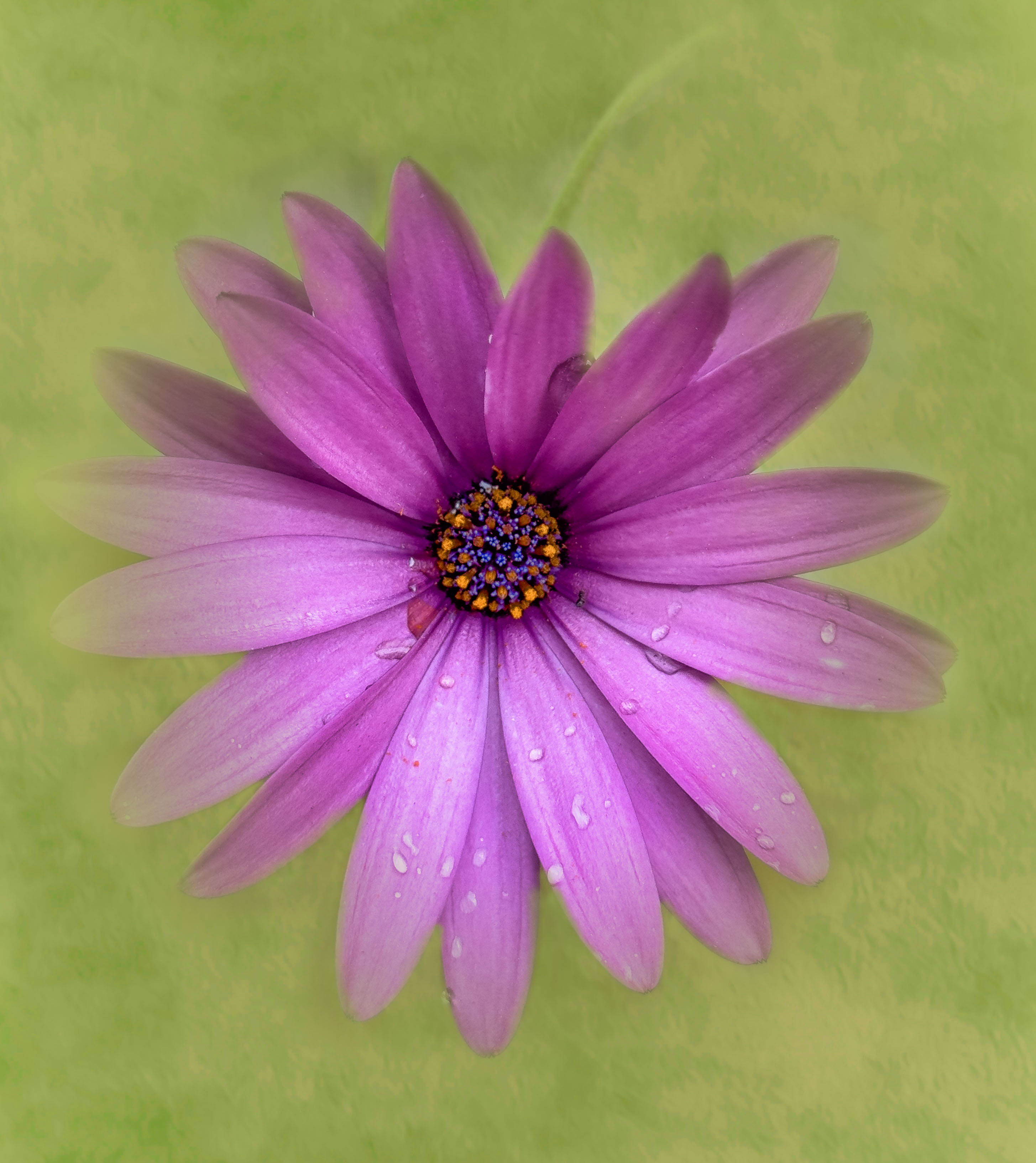
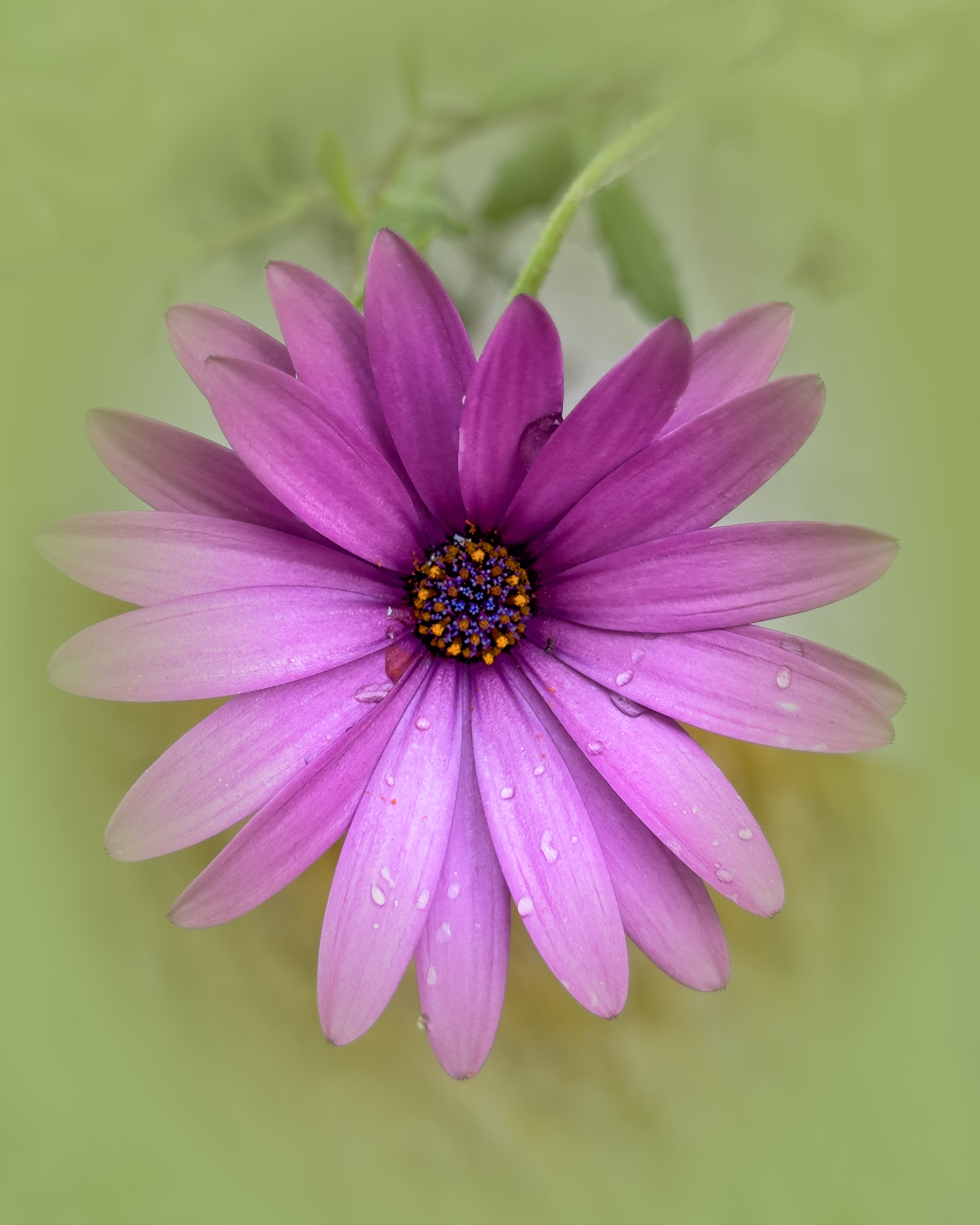
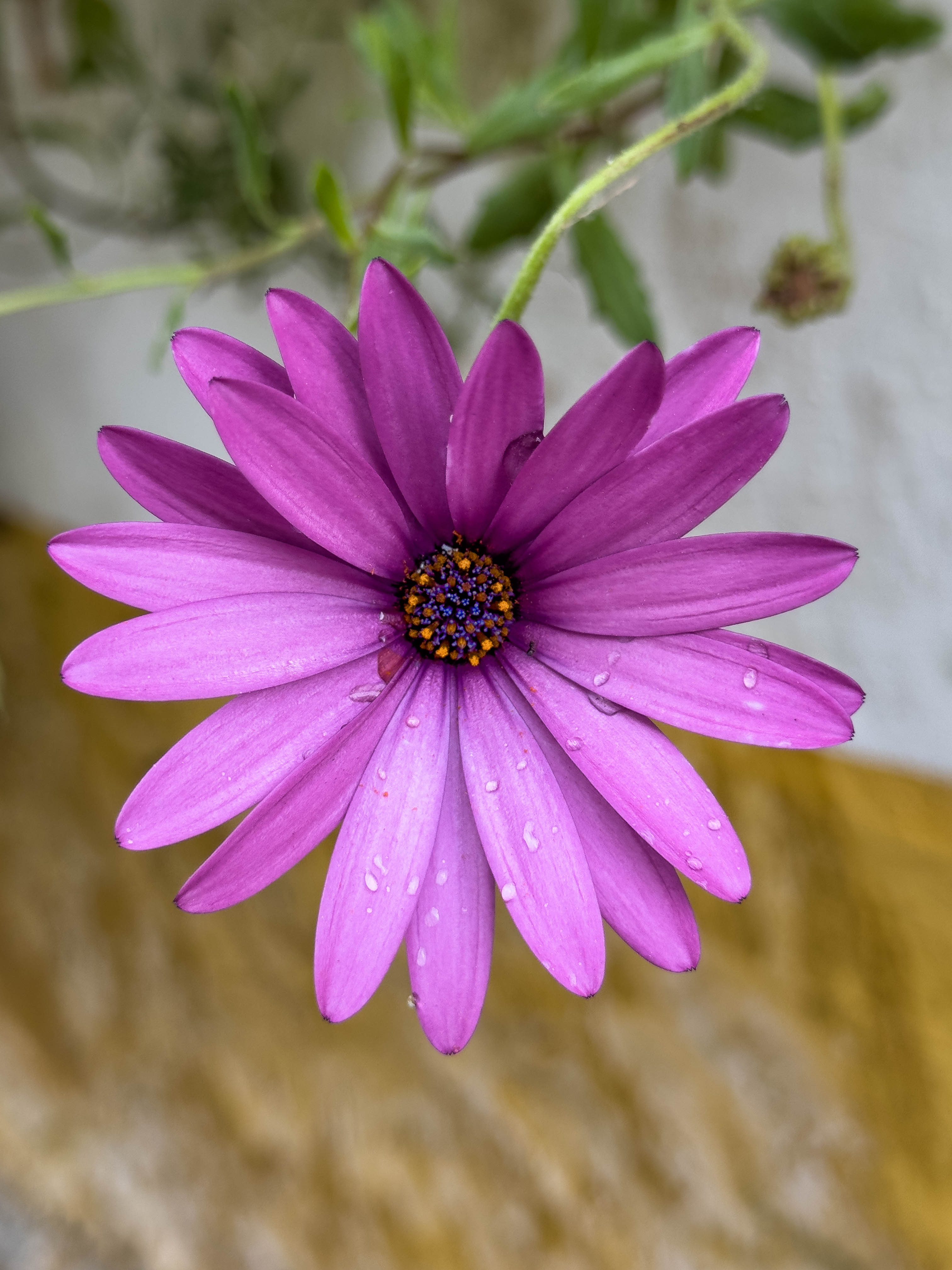
I took this on vacation with my iPhone 15 Pro Max. I didn't do much to this, but I did use Color Efex to apply Details Extractor to the very center. I then used the ?Vignette Filter to add the soft background color because my background was pretty bad, with a very obvious horizontal line right behind the flower. I used the Eyedropper to pick up the lightest green color from the stem, then played with opacity until I could still see the stem but only slightly (and the horizontal line was covered up). There are multiple ways I could have handled that background, but this is just what I felt like at the time. Settings on phone: 1/120, f1.8, ISO50, handheld in a slightly shaded backyard area.
10 comments posted
I like the detail and the soft background. Very nice edit! Posted: 07/05/2026 15:37:11
Thanks, Margaret! Posted: 07/05/2026 15:38:12
Very nice image of the flower and you did a wonderful job softening the background and reducing the clutter. I may have gone one step further and darken the background a little bit more. That would increase the separation between the flower and background. Right now I feel the flower and background are competing for attention because the background is bright. Posted: 07/07/2026 02:29:08
I know what you are saying. My dilemma is that I want the ethereal, dreamy look, which needs lower contrast. I might try a few other things to achieve this, though. Posted: 07/07/2026 22:19:14
How about a slight vignette to darken the edges to draw your eye towards the lighter flower area? I use a radial mask (inverted) to do my vignettes instead of the build in vignette tool in LR. I think it gives a softer transition. Posted: 07/08/2026 01:44:10
Carol, I think you are a master at this sort of picture. Personally, I wouldn't alter it, except I would consider flipping it upside down. Posted: 07/08/2026 20:33:28
Thank you, Stuart! I will try that. Posted: 07/08/2026 20:47:19
Here is a remake taking into account your different inputs. In PS, I added a darker texture to what I already had, darkened the color somewhat, remarked it, added a vignette with a radial gradient in LRC. It was hard to get the stems back in, but I did my best. Stuart, I flipped it upside down but it didn't look right, so I flipped it back. Posted: 07/08/2026 23:03:33
Interesting perception! My logic was that usually we see a flower above the stem and leaves, so it would be better placed at the top of this picture, even though it's view is vertically down. You have all but removed the stems etc now, and to me, that was a feature that distinguished this image from "the rest". So, I stick to my comment :-) Posted: 07/09/2026 09:25:51
Posted: 07/08/2026 23:05:01