Jim Hagan, MPSA
July 2024 - Nap Time
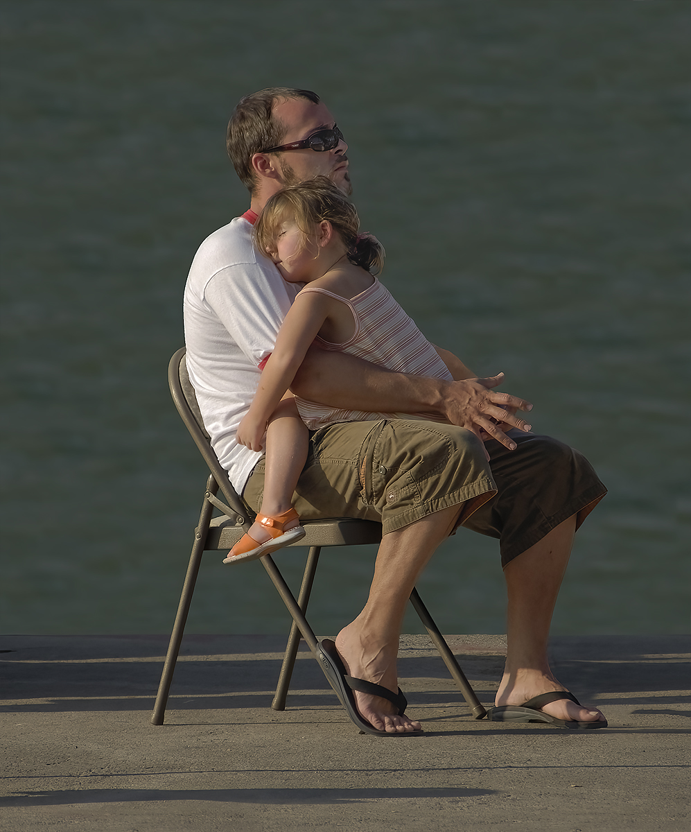
Original
About the Image(s)
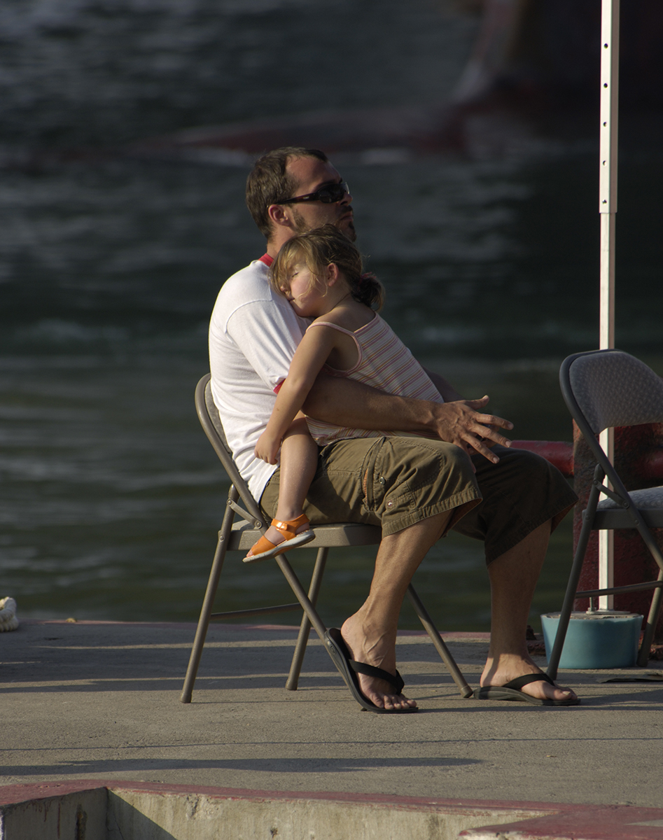
I photographed a little girl fast asleep in her father’s arm. But this serene image was marred by many distracting elements in the foreground. And the background had a lot of noise and very uneven shades of contrast.
In Photoshop I removed all the distracting foreground elements. And I reduced the contrast of the background, slightly blurred it and also reduced the contrast.
This round’s discussion is now closed!
8 comments posted
Great work getting rid of the distractions, Jim!
Since its such a sweet thing, I made a couple of changes. I cropped to bring us closer to the scene. And then I added a radial gradient in Camera Raw (or Lightroom Classic). I added a little bit of exposure and a little yellow light to make it feel like sunlight. The completed image is below. Posted: 07/04/2024 02:15:32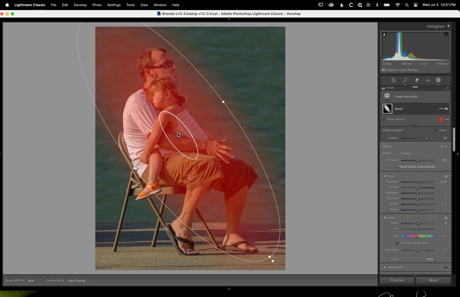
Since its such a sweet thing, I made a couple of changes. I cropped to bring us closer to the scene. And then I added a radial gradient in Camera Raw (or Lightroom Classic). I added a little bit of exposure and a little yellow light to make it feel like sunlight. The completed image is below. Posted: 07/04/2024 02:15:32
My rework of your image with the radial gradient increasing exposure and warmth over the subject. Also cropped. Thoughts? Posted: 07/04/2024 02:18:01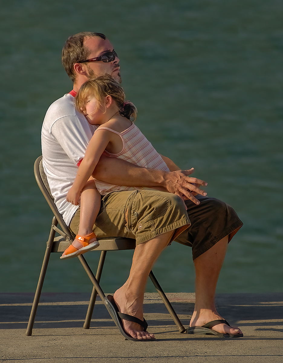
Brenda, at first I did not like your crop but the more I look at it the more I like it. I think it does improve the composition. And, I also like a like your warmer color a lot. Thanks.
Posted: 07/12/2024 02:29:36
Posted: 07/12/2024 02:29:36
I like Brenda's work, the original image represent the beautiful sunlight and father-child intimacy, very beautiful. Posted: 07/06/2024 23:31:42
Good job removing distracting elements. Also, I like Brenda's edit. Posted: 07/10/2024 20:38:24
Ed's comments mirror my thoughts. Very nice image. Posted: 07/12/2024 23:09:48
Fantastic image! It's beautifully captured and processed.
Liked it. Posted: 07/17/2024 01:40:26
Liked it. Posted: 07/17/2024 01:40:26
I agree the original image background was distracting and I like the approach to blur. I am somehow drawn to the shadows at the bottom - they seem more pronouced in both revisions. Not sure -- what if anything could have been done to minimize or eliminate them from the composition. Brenda's cropped revision addresses some of it... but I wonder how it would it would look to photoshop the rest of the shadow out to focus solely on the subject? Posted: 07/29/2024 13:29:39