Brenda Fishbaugh, QPSA
About the Image(s)
Canon R5 Canon 100mm Macro lens, tripod, macro flash
ISO 200 100mm. 1/200 sec. f/22
I took a weekend Macro workshop in Louisville, Kentucky. Had a great time, as I haven't done macro before.
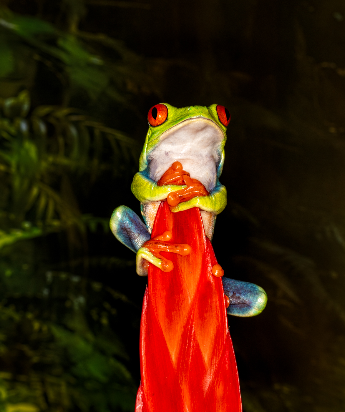
This is a poisonous Red-Eyed Tree Frog and is a tiny thing!
I used a macro flash to stop action as the frog climbs and doesn't hold still.
I cropped, used DeHaze, darkened the background, and brightened the eyes.
I can only enter this in PSA Color, as it is a "setup" and the background is actually a photo (and this is why I darkened it).
Any suggestions? I'd love a cute title. Thanks!
This round’s discussion is now closed!
22 comments posted
It is so cure. I like the title " hanging on". The color and saturation are wonderful. The macro flash is well-done. Thanks for your sharing. Posted: 07/06/2024 23:24:26
Thanks so much, Pei-Fan! I appreciate it! Posted: 07/10/2024 19:53:37
Would you take a look at my July 20 post where I reworked the image? Improved? Any additional suggestions? Thanks! Posted: 07/21/2024 01:18:18
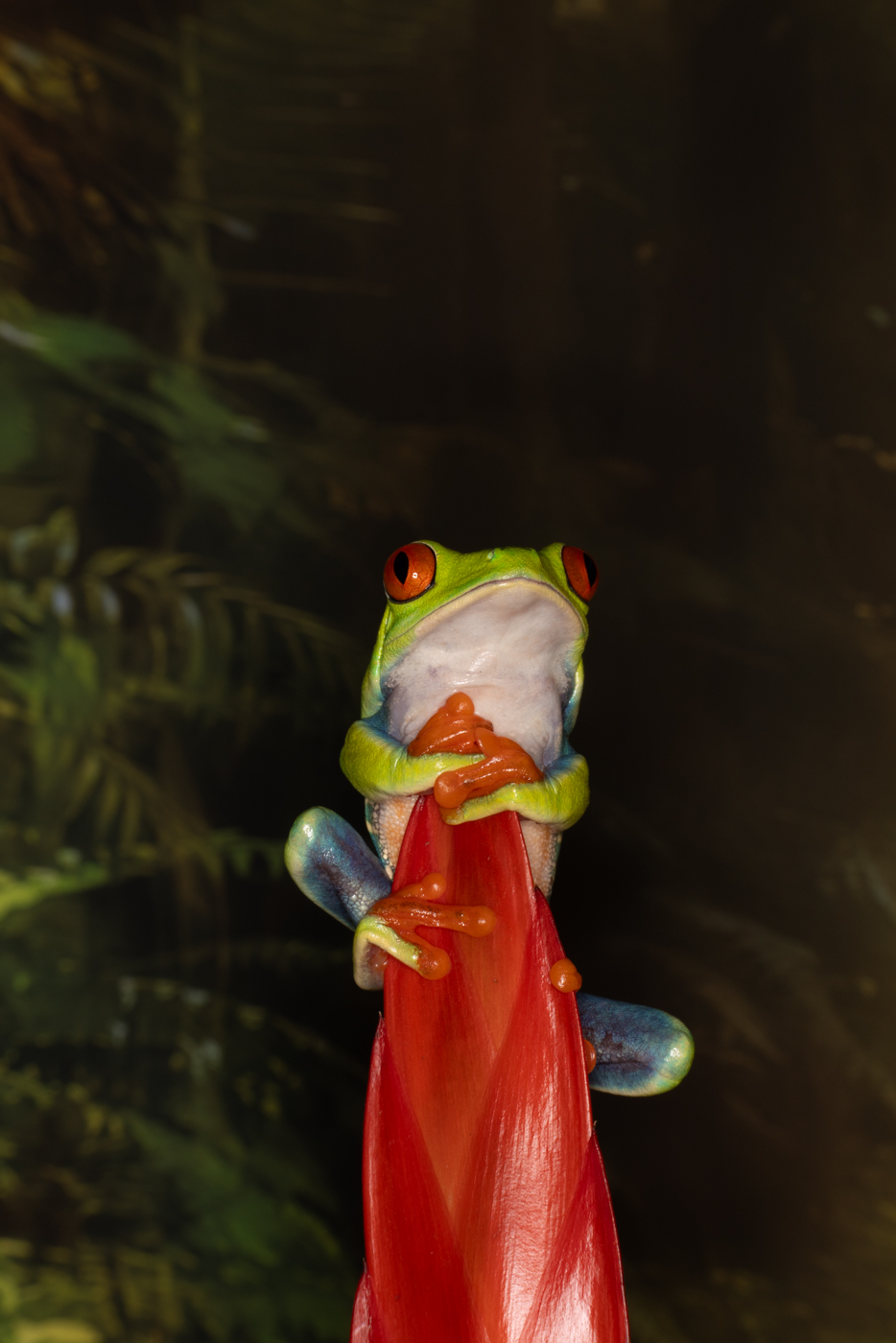
Very nice. I think you could have cropped it slightly differently and made it more dramatic. Maybe more negative space on the viewer's right but it looks like maybe this was the original full frame. Is this from Florida? Posted: 07/09/2024 15:02:11
This is the full frame, do you have a crop suggestion? As I mentioned above, it was during a macro workshop in Louisville, Kentucky. It's a poisonous frog from Central and South America. Posted: 07/10/2024 20:02:39
Would you take a look at my July 20 post where I reworked the image? Improved? Any additional suggestions? Thanks! Posted: 07/21/2024 01:18:46
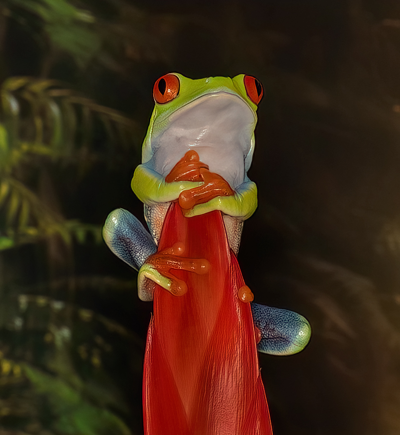
I like the image but to me it needs to be cropped tighter since the frog is the main subject it should be a larger part of the composition. Also, the top part of the frog should be brighter and the hot spots on the stem reduced. In my revision did those suggestions. I like the background as I think it compliments the frog image. Posted: 07/12/2024 02:57:57
Thanks for your suggestions, Jim. I think it is a good idea to take down the brightness.
Posted: 07/13/2024 00:24:38
Posted: 07/13/2024 00:24:38
Would you take a look at my July 20 post where I reworked the image using your suggestions? Improved? Any additional suggestions? Thanks! Posted: 07/21/2024 01:19:15
To me, the reds make this picture. I also like the way the lighting illuminated the frog and not the background. I prefer Brenda's version to Jim's reworking because his feels too dim and the white chest and throat of the frog feel more natural to me when they are brighter. Posted: 07/12/2024 23:07:26
Thanks, Robert! I think I can take down some of Froggie's shine and still have it feel bright and the red bring your attention. Posted: 07/13/2024 00:25:28
Would you take a look at my July 20 post where I reworked the image? Improved? Any additional suggestions? Thanks! Posted: 07/21/2024 01:19:40
This is great! I usually don't prefer oversaturated photos, but in this image, it works really well. My only suggestion would be to try a slightly tighter crop. However, the current version is also very good. Posted: 07/17/2024 01:25:25
Thanks, Sunil! I'm going to rework my image a couple of ways and get the group's feedback. Posted: 07/20/2024 17:55:56
Would you take a look at my July 20 post where I reworked the image? Improved? Any additional suggestions? Thanks! Posted: 07/21/2024 01:19:54
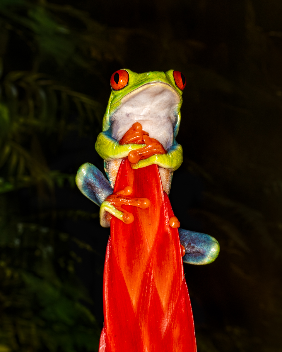
Once again, I found value in everyone's input! Ed and Sunil recommended a tighter crop frame. I was going for the feeling of a tiny frog, but now have cropped in to take you closer to it. Â
Jim felt it was too bright and saturated, so I did brush down the brightest parts, and opened up the blocked up blacks in the background. I also brushed some exposure around the frog, so he didn't look pasted on the background. I took down the exposure on the red vrisea bromeliad, so it shows its natural red without being too bright.
Any additional feedback before I put this is PSA PID Color competition? Thanks so much! Posted: 07/21/2024 01:17:07
I like your revision - much better than mine. Posted: 07/21/2024 10:20:19
Thanks, Jim! You inspired it! Posted: 07/29/2024 23:43:56
I find the image captivating and something I would normally blend with AI to achieve the effects you have here. I like that the subject is front, center, and engaging. The color of the material and the eye coloring serve to nail the focus on the subject. Posted: 07/29/2024 12:04:59
Thanks, Jo-Ann! The "material" is actually a bromeliad flowering plant the frog is climbing, which works well with his eye color and body color.
As you know, AI isn't allowed in PSA, and not allowed in competitions anywhere. But it sure is fun to play with. Maybe someday! Posted: 07/29/2024 23:46:17
As you know, AI isn't allowed in PSA, and not allowed in competitions anywhere. But it sure is fun to play with. Maybe someday! Posted: 07/29/2024 23:46:17
I know AI is not allowed in competition or PSA, but I love developing my skills across platforms. Hopefully, as AI is adapted more in industry and other spaces, it will evolve into the competitive space as well.
Posted: 07/30/2024 17:59:43
Posted: 07/30/2024 17:59:43


