Robert Schleif

September 2023 - Blazing Star
About the Image(s)
Nothing special here. I was struck by the top down blossoming pattern in contrast to a bottom up pattern that I had been seeing lately. This was a focus stack so that all the flowers could be in focus. The flower is Prairie Blazing Star.
This round’s discussion is now closed!
16 comments posted
Here is the output of the focus stack which was then processed normally to produce my posted image. Posted: 09/01/2023 19:07:27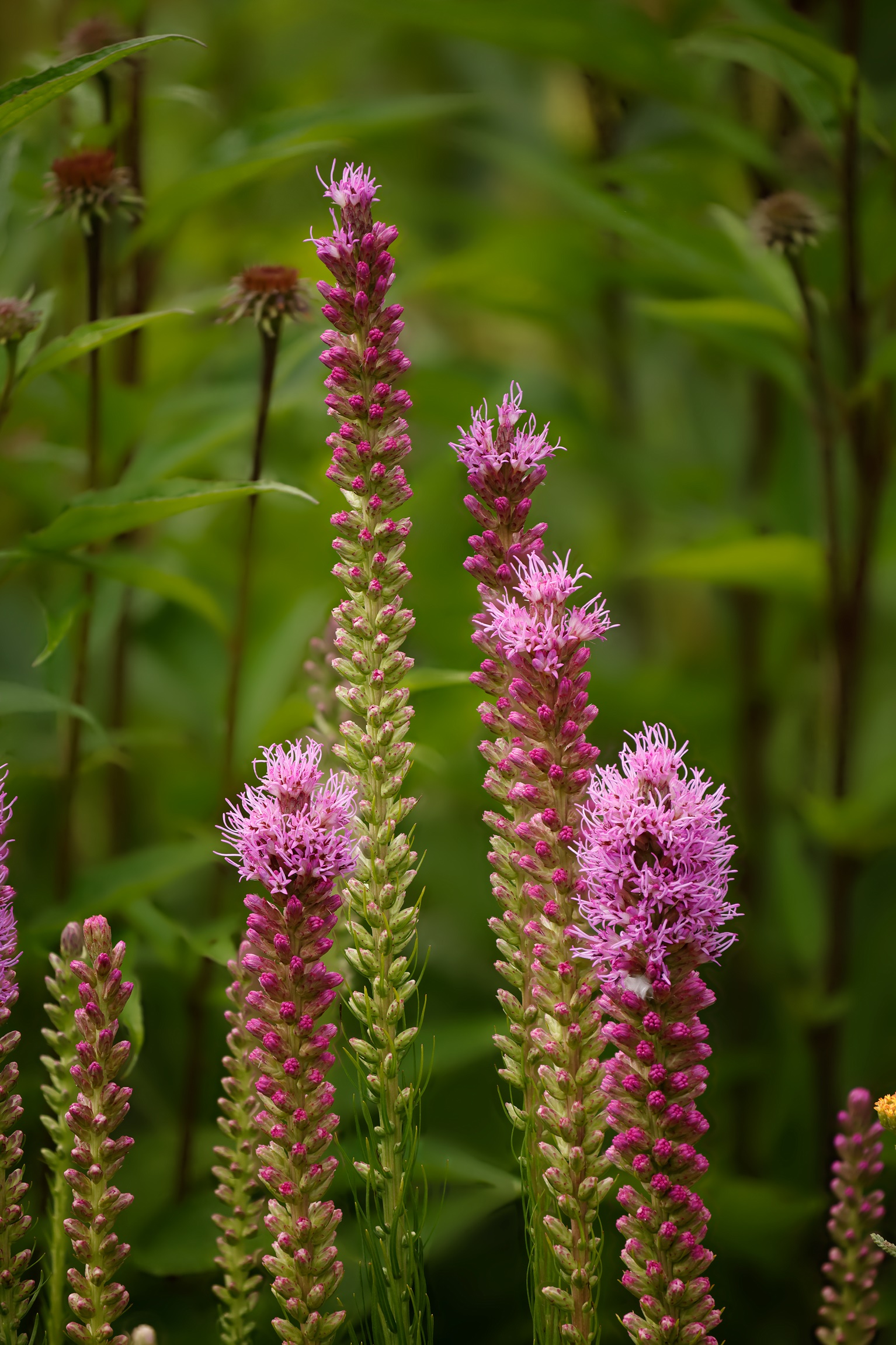
I like your use of the photostack on this one Robert. Especially with limiting the depth of field to include only the pink flowers, still keeping some level of bokeh for the background. Selectively removing the one tallest blossom in the center might offer a different perspective and also removing the dark-stemmed with dark orange either very young or past prime blossoms in the background. Further blurring the background with a Gaussian blur and selectively pulling back the saturation of the brighter green colors just a touch might also help the blossoms stand out even more. Posted: 09/02/2023 18:36:41
I'll try that. Thank you. Posted: 09/03/2023 10:24:45
Robert,
This is good, I have not tried focus stacking, looking at your work it encourages to do so, will try.
Appreciate your work a lot. Posted: 09/03/2023 21:29:22
This is good, I have not tried focus stacking, looking at your work it encourages to do so, will try.
Appreciate your work a lot. Posted: 09/03/2023 21:29:22
Really nice botanic photo. I think it might be a tiny bit over saturated, especially the background. But hey, you know what they say, "saturation sells." At least that what all the photographers in Estes Park, Colorado say about selling images to tourist.
I read James T's comment. I think that if you had just three stalks then the composition might be better but that would probably be a re-shoot.
We have a wild flower here called a blazing star, but it looks nothing like this. I'm guessing this is an ornamental. Posted: 09/04/2023 20:27:38
I read James T's comment. I think that if you had just three stalks then the composition might be better but that would probably be a re-shoot.
We have a wild flower here called a blazing star, but it looks nothing like this. I'm guessing this is an ornamental. Posted: 09/04/2023 20:27:38
In the processing, I did increase color saturation, but it only had a perceptable effect on the pinks. The greens in the image acquired their saturated-like appearance when I selectively reduced their luminosity.
I like the background in this image because it reminds me of the jungle that I remember in one of Runyard Kipling's children's books (80 years ago).
From the illustrations that I find from a Google search on blazing star, it looks like my flowers are Liatris spicata.
With respect to the question of the best number of flower stalks to have in the image, I agree with you, but one could say that the image contains three distinct groups of stalks. Posted: 09/05/2023 05:17:09
I have finally had time to think about your comment that the background looks oversaturated. I find that decreasing luminosity does increase saturation, and thus, my step of specifically decreasing the luminosity of the greens to make the flowers stand out did increase the saturation of the background. Henceforth, I'll keep this effect in mind as I make adjustments to images. Posted: 09/08/2023 05:56:49
In looking still more at the saturation issue, I see that my image on PSA site is more saturated than my copy of it on my computer. My copy was a tiff file in the Adobe RGB color space and the copy on the web is a jpg file in sRGB. Thus, the increase in saturation may have been generated at my end in the color space conversion or by the PSA site itself. In a conversion however, from Adobe RGB to sRGB, wouldn't saturation either remain constant or decrease, but never increase? Posted: 09/12/2023 10:16:10
I tried several cropped but yours appears to be the best with the three groups of stems. I would edit out the dead flower in the background tho. I am okay with the saturation Posted: 09/11/2023 14:18:43
Thank you. Now I'm seeing the negative effect of the dead flower immediately to the left of the tallest stalk. There is a second dead flower further to the left. So far that isn't bothering me as much as the first. Should that also go? Posted: 09/11/2023 14:52:44
I would remove all the dead brown flowers...background will be cleaner. Posted: 09/11/2023 15:16:58
I really like your image. The flowers are very sharp and the background is nicely blurred. I have no suggestions. Posted: 09/14/2023 06:30:20
I really like this image. As soon as I saw it, I thought, "Liatris", so glad to know I was on track. I agree with Ken on the dead flowers always ruins an image.
In my opinion, the saturation is fine, at least on my monitor. I like the background, also. One thought not mentioned by the others--some flowers are cut off on the right and left of the image. I'd consider using content aware fill to remove them, as they seem to draw my eye off the page (or you could crop). Posted: 09/14/2023 13:15:21
In my opinion, the saturation is fine, at least on my monitor. I like the background, also. One thought not mentioned by the others--some flowers are cut off on the right and left of the image. I'd consider using content aware fill to remove them, as they seem to draw my eye off the page (or you could crop). Posted: 09/14/2023 13:15:21
After trying out the many ideas suggested above, I've come to this version of Blazing Star. I removed the dead flower close to the tallest stalk, but not the one further to the left, mostly because of the difficulty of removing. I darkened a couple bright areas and blurred the one leaf that was nearly in focus. I like the degree of saturation of the greens on my monitor, (see my comments above on saturation) so I left it as before. To reduce the illusion that some of the flowers overlapped the boundary, I added the narrow, red border to show the edge of the image. I thank everyone for their helpful comments.
As before, the saturation of the greens in the image on the PSA web page is greater than the exact same image on my computer before uploading. Therefore, it looks to me like the PSA site is changing the saturation. Posted: 09/14/2023 19:28:48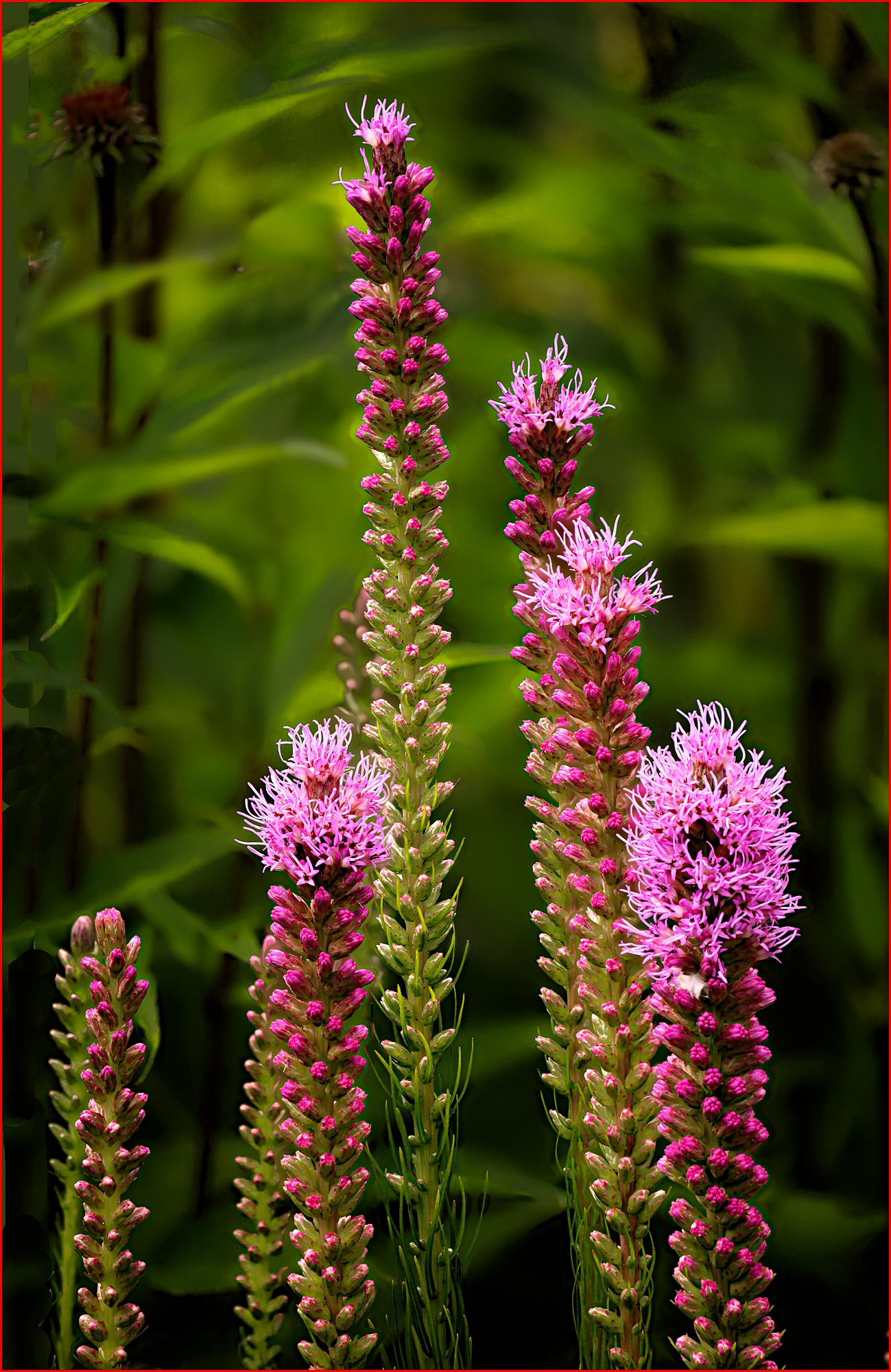
As before, the saturation of the greens in the image on the PSA web page is greater than the exact same image on my computer before uploading. Therefore, it looks to me like the PSA site is changing the saturation. Posted: 09/14/2023 19:28:48
A vast improvement! Deeper colors, more separation in the flowers, and we really see the "pyramid" shape, which adds interest and keeps me moving around the composition!
My only final suggestion is to not use red as a border. What I have been taught is to make the border not attract attention, as that pulls us off the page. So in this case, a super dark green or black would work well. With borders, many club competitions and PSA competitions don't allow them, so just make sure you have looked at the rules before entering it. But I agree it would work nicely here, in a more subtle shade.
Have you thought of making a calendar for 2024, with your flower images? It would be a very nice gift for your friends, supporters and family. And flowers are YOU.
Posted: 09/27/2023 20:07:34
Thank you for pointing out the unsuitability of the red border. I think I'll go with no border. I haven't been entering competitions, but only giving an occasional print to friends. The calendar idea sounds most appealing, as by now I have acquired quite a few images in this genre. Posted: 09/27/2023 20:23:36