Brenda Fishbaugh, QPSA

September 2023 - Magic by Merlin
Original
Original 2
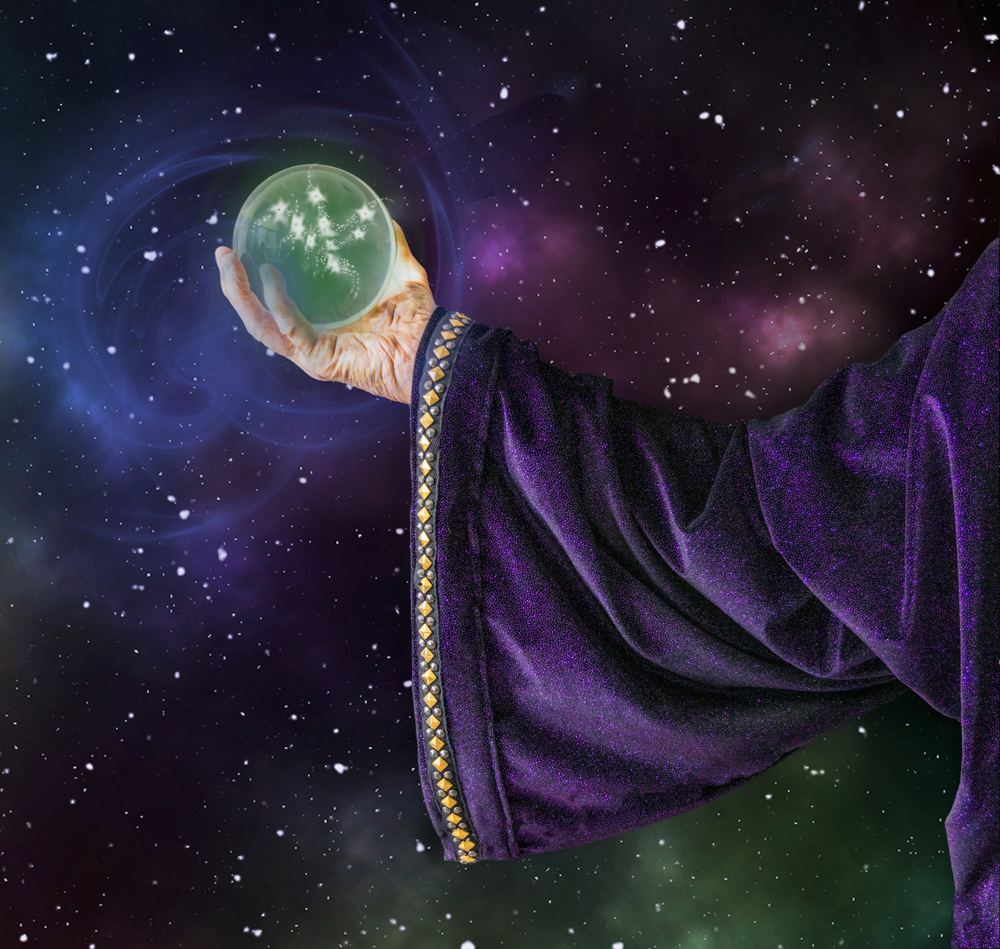
About the Image(s)
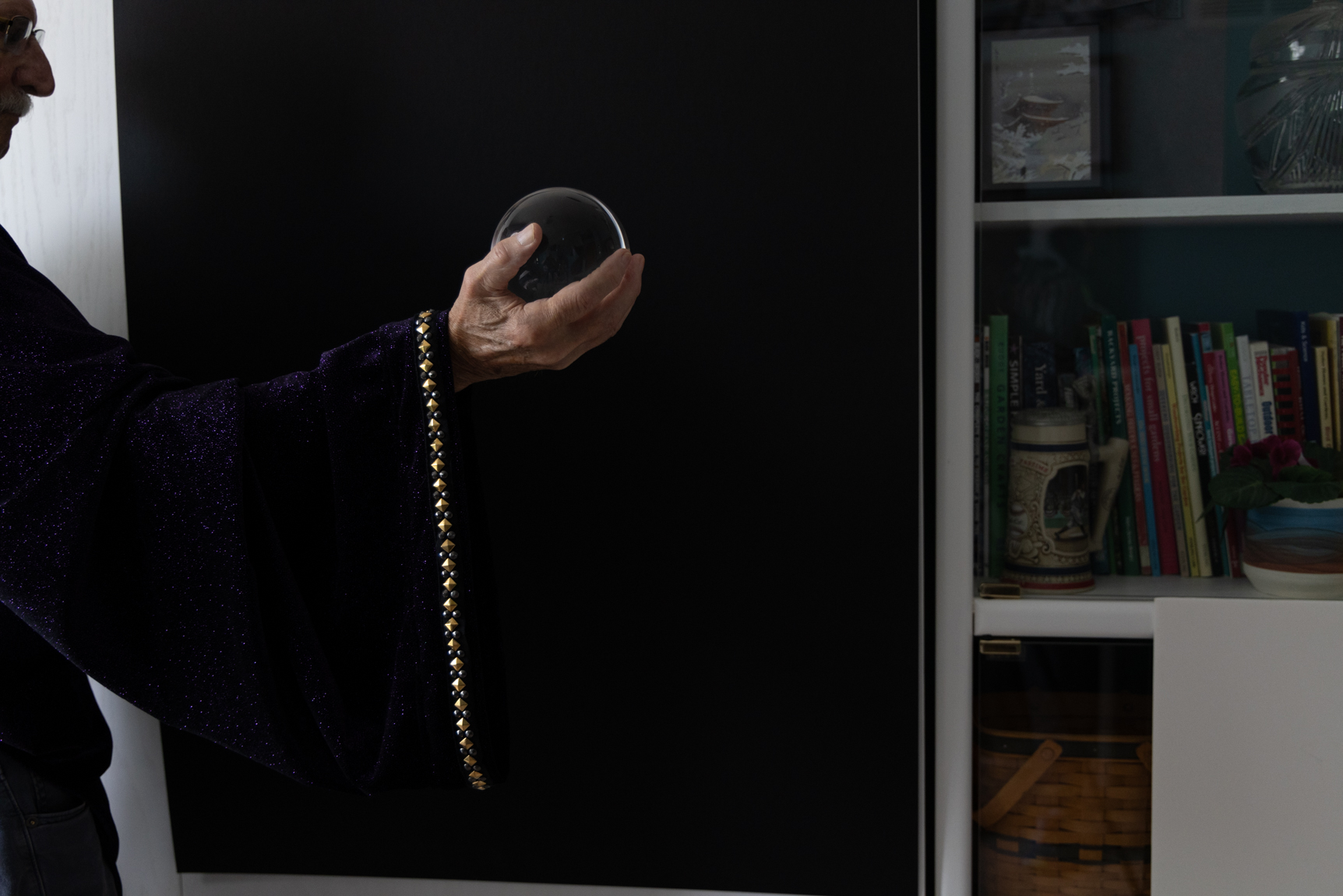
Canon R5, Canon RF 24-105 lens, tripod, cable release
ISO 125 f/5.6 15mm. 1/125 sec
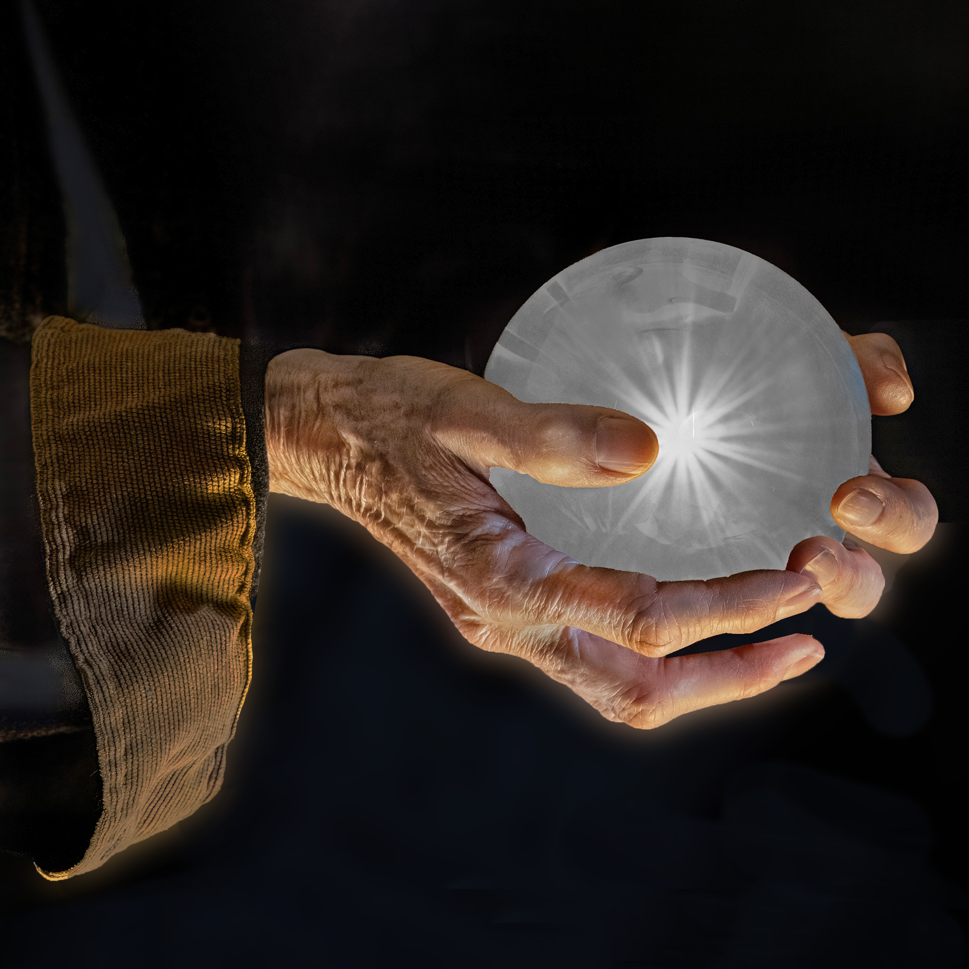
Ed Ogle had entered a wonderful magic image in June(his image is pictured as "Original 2 here"). He shared how he did it and I tried it with friends.
In mine, a friend held my newly purchased crystal ball with his back to the window. It's actually just a sleeve his wife sewed for us, not a whole costume. See original 1.
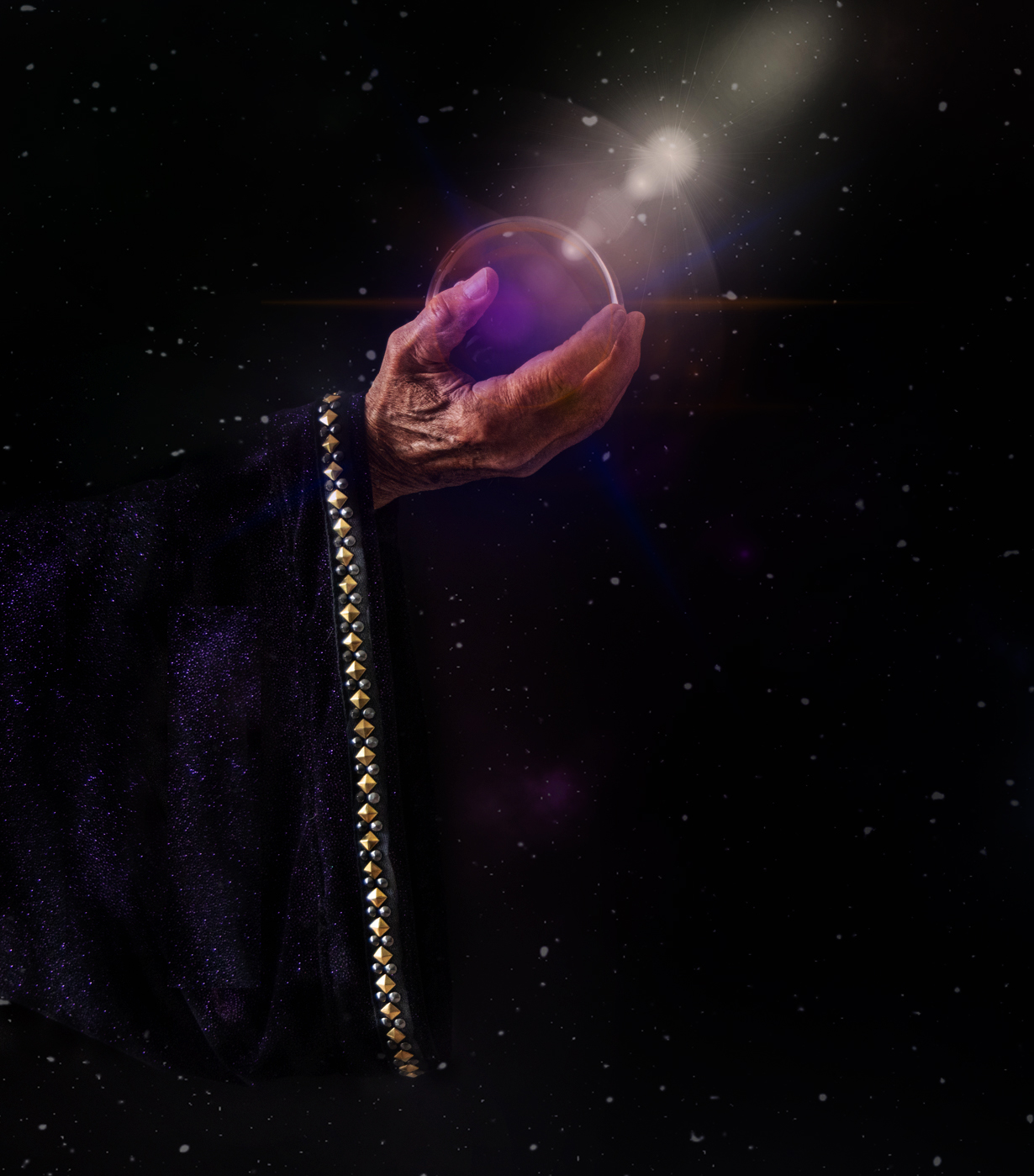
I selected the subject from the background, and then added a night sky I created in Photoshop as the new background (hundreds of videos on You Tube). I then used different brushes in Photoshop to created the different colors and lighting effects. Most I then lowered the opacity, so I could layer them (and delete if you thought it would be better if gold streak was gone, etc).
After I learn from your suggestions this month, I'm going to create another one using wispy smoke instead of light flashes. I shot the sleeve intentionally dark for this look, but I have lighter ones, where it will work better with my idea of golden smoke.
This is my first attempt, so I'm open to any suggestions. Loved doing this! I'd like to enter in PSA Color Open, if you think this type of fantasy does well.
This round’s discussion is now closed!
24 comments posted
Now about posted image, light coming from the right and from the left, I would use from the right only, also add some detail in the sleeve of the robe.
Posted: 09/03/2023 19:31:35
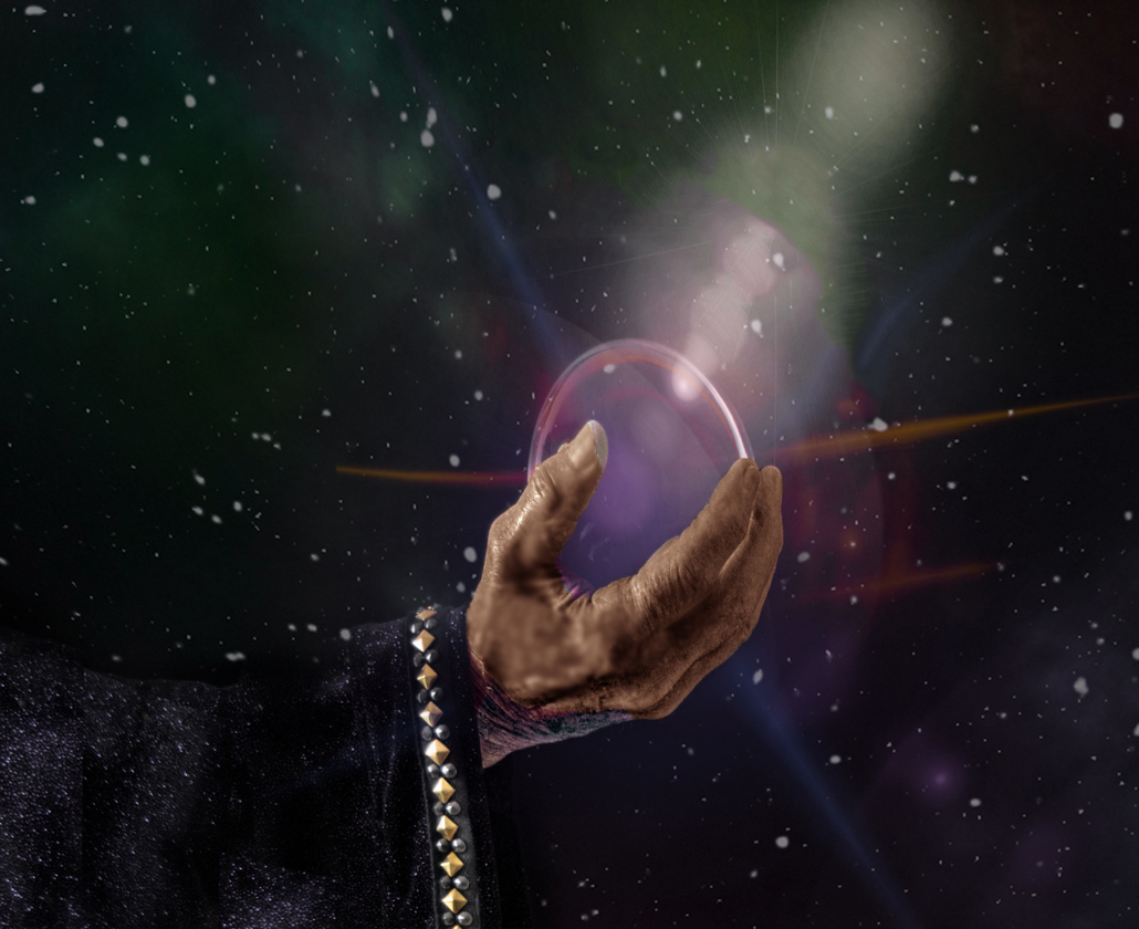
Why change the color to green?
Also, green version ball looks solid colors, little more transparent may look good.
Attached quick edit, more work required. Posted: 09/29/2023 09:24:40

https://www.google.com/search?q=create+lens+flare+photoshop&oq=create+lens+flare+&aqs=chrome.0.0i512l2j69i57j0i512j0i22i30l4j0i15i22i30l2.22237j0j7&sourceid=chrome&ie=UTF-8#vhid=me0avxlgYkj5eM&vssid=l
I added brushes, the blue and gold are brushes, and a few radial gradients. Posted: 09/08/2023 22:24:56
I agree with Ken in that the fogginess is a bit overdone. I do not find the amount or size of the sleeve to be distracting nor the hand to lack sufficient "age" to offer interest.
All that said, I do like the crop that Jim H. offered, even with the bottom of the sleeve cut off. And I really like what Sunil did as far as the light direction and color striations.
Posted: 09/17/2023 18:06:44
I used the background I had created and used in my first rendition. I'm not in love with the stars in the center...thoughts on what you like and don't like?
Thanks!
Posted: 09/26/2023 23:08:47
You are right, calling him "Merlin" invokes in my mind King Arthur's time, and not a galactic presence.
With respect to the stars on the glove, I believe that whether they are to be reflections, or magnified images of stars behind the globe, or eminating from within, those closest to the edge need to be elongated in the direction of the nearby edge of the globe and foreshortened in the radial direction.
Posted: 09/27/2023 20:16:04
If anything for me, the stars could potentially feel a bit better if they had a bit more of a fake/mystical feel to them. They also do not bother me as they are.
I still disagree with Robert regarding the background not fitting together well with the sleeve/cloak. I'm willing to concede that perhaps they do not fit the theme/title of "Merlin," specifically, but I do believe they work together very well and in my mind, they conjure up images of the evil Yen Sid from Disney's Fantasia.
Maybe just change the title to "The Magic of Yen Sid" or something similar?
Posted: 09/27/2023 12:03:38
The stars in the ball bother me, so I'll play with them and see if I can make it more mystical. I was trying something besides the rays I had shooting out from my first rendition, but I will try some more "magic" tricks. Thanks! Posted: 09/27/2023 19:51:32