Kathryn Bundy
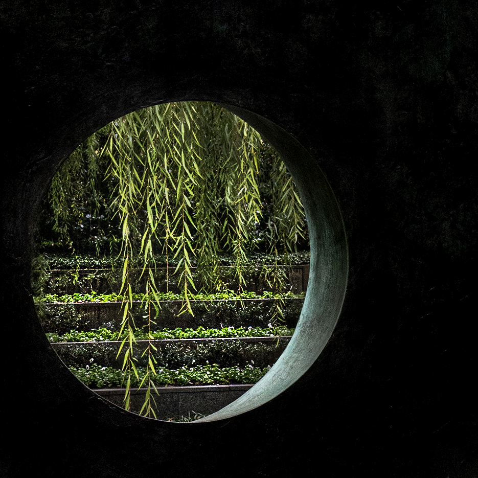
July 2026 - Garden Beyond
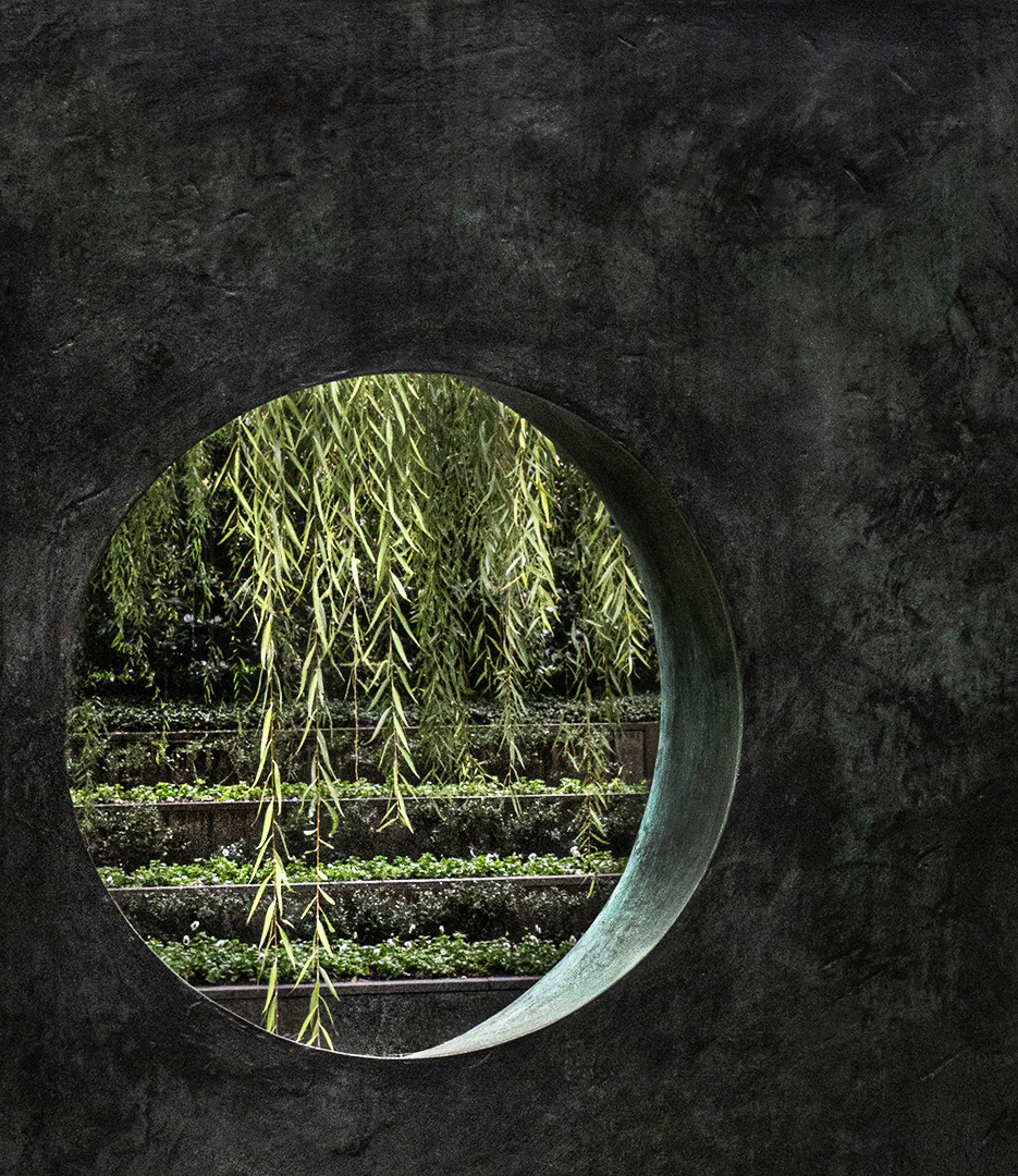
Original
About the Image(s)
While on a trip to the Dallas Sculpture Park I came across this hanging sculpture which when you looked through the center you saw the terraced flower bed at the back of the park. I couldn't resist taking photos of it.
Neither of these are the original as I am traveling and only have what I am working on with me. One shows the oblong piece while the other I have darkened and made square. I would like to have your feedback on both or which one I should continue working on. I am thinking about entering it into our state fair competition in August.
11 comments posted
Nice, Kathryn! I prefer your original. I especially like the great texture on the hanging metal(?) and the off-center view into the garden. On my monitor, the view seems a bit too saturated on the "big pic", but it could just be my view.
Looking forward to all the rest of our group's votes on their favorite. Posted: 07/04/2026 00:11:47
Looking forward to all the rest of our group's votes on their favorite. Posted: 07/04/2026 00:11:47
My preference is for the "original" one as well but my camera club liked the other one. I like the texture and pattern of the sculpture but they thought it detracted from the garden view. Posted: 07/04/2026 16:11:56
Nice image with an interesting perspective! I like the original, but I think cropping it to a 1x1 ratio and keeping the same perspective would make it even better. Posted: 07/05/2026 16:25:16
Is this like what you meant? Posted: 07/05/2026 22:22:10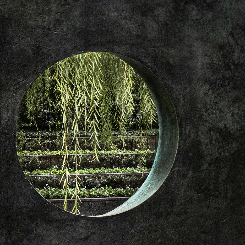
Yes. Posted: 07/07/2026 17:50:31
This is an interesting subject. Both the original and the processed versions look good. I would try bringing back a little more detail in the wall, as it appears almost black in the processed image. Keeping it slightly darker than the original-but not too much-might preserve the mood while revealing more texture and making the image even stronger. Posted: 07/06/2026 01:26:31
I prefer the original with its texture of the sculpture. I'd prefer the viewing hole not to feel as cramped near the left and bottom edges. Cropping some more off the top and right makes the image feel more natural to me. Posted: 07/06/2026 21:23:39
very nice work. I love the different layers of light on the green leaves, as well as the structural layout of the foreground, midground, and background Posted: 07/10/2026 22:05:12
(Group 32)
I happen to be quite passionate about using 100% pure black in some areas of photos. So, naturally I disagree with all your colleagues and much prefer your original with no detail whatsoever in the black areas. This means that the result is a completely different composition from your original. Posted: 07/12/2026 02:06:14
I like this image and I think it is very creative exactly the way you have done it. Only thing I would suggest is to add a border around the outside. Something like this: Posted: 07/12/2026 15:03:01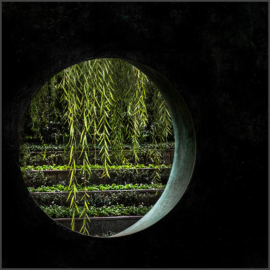
Ed - thanks for the suggestion. Posted: 07/12/2026 15:13:45