Kathryn Bundy
April 2026 - Which Way
Original
About the Image(s)
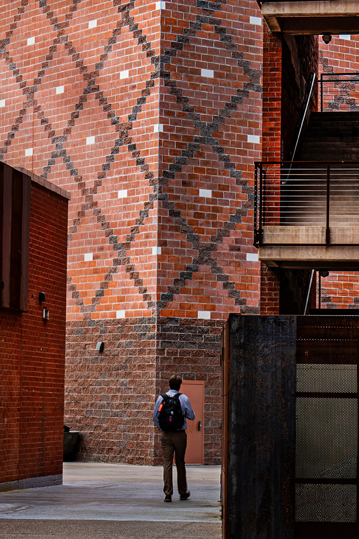
While walking around the University of Arizona campus I was drawn to this alley. The light was coming in from the left and it highlighted both the building wall and the opposite stairway. After observing several students walk down it, I got my camera ready to take a photo. After several shots of an empty landscape a student walked down.
Luckily, I was still interested in shooting the scene. After 5 or 6 shots he finally made it all the way through the alley so "my model" was no longer. It was also time for me to leave to catch up to my husband.
72mm, 1/20 sec, f/14, ISO100
9 comments posted
Beautifully captured street photograph-thoughtfully processed, with a precise crop and excellent vertical correction. The wall patterns are especially striking and add strong visual interest. Thank you for sharing. Posted: 04/03/2026 02:24:42
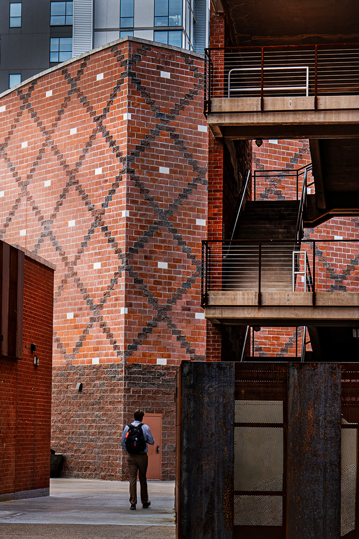
Thank you Sunil. I was drawn to the diamond shapes in contrast with the linear-ness of the stairs and stairway fence. Posted: 04/04/2026 18:55:47
(Group 32)
Very good composition. You might consider converting it to monochrome with high contrast. Posted: 04/04/2026 07:31:00
I had the same idea! I'm seeing this as an architecture photo, and it's a great capture because it really highlights all the lines, patterns, planes, and shades. In black and white, the viewer's eye is naturally drawn to how these elements come together so beautifully, which is more impactful than the color version, which might take away from the overall design. I'm also considering removing the person in your photo, as I don't think he adds any value to the overall image. Posted: 04/06/2026 17:20:07
Thanks for your suggestion. I tried several times but it just looses interest for me. Posted: 04/06/2026 19:55:21
An interesting shot. I really can't see any difference between the original and the final version. Posted: 04/07/2026 04:03:31
I also love the diamond pattern. The horizontal balcony lines on the right also bring us into the composition. Really nice and crisp, good color, I think the "model" really makes it and gives us perspective on the size of the building.
If you weren't entering it in a street composition, I'd be tempted to clean up some of the odd little junk on the walls and the trash can (?) on the lower left. But that's me, I really try to direct everything to the subject and remove all the distractions. Posted: 04/08/2026 22:55:57
If you weren't entering it in a street composition, I'd be tempted to clean up some of the odd little junk on the walls and the trash can (?) on the lower left. But that's me, I really try to direct everything to the subject and remove all the distractions. Posted: 04/08/2026 22:55:57
Thank you for your comments (and support). I did enter it into a competition last week and now that it's over I can do some item removal to get rid of the distractions you mentioned (plus a couple of others that bother me). Posted: 04/09/2026 14:44:26
Interesting geometry and smart crop. Posted: 04/14/2026 16:06:44