Sunil Mehta
December 2025 - In Bo-Kaap
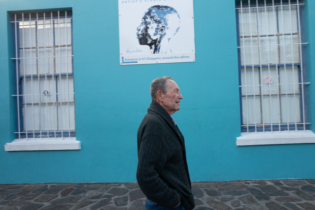
Original
About the Image(s)
EXIF:
Camera: Leica Q
Lens: 28mm F/1.7
ISO 125, 1/60 Sec at f/8
Post-Processing:
The image was edited in Lightroom and Photoshop. Adjustments were made to color density, contrast, and saturation.
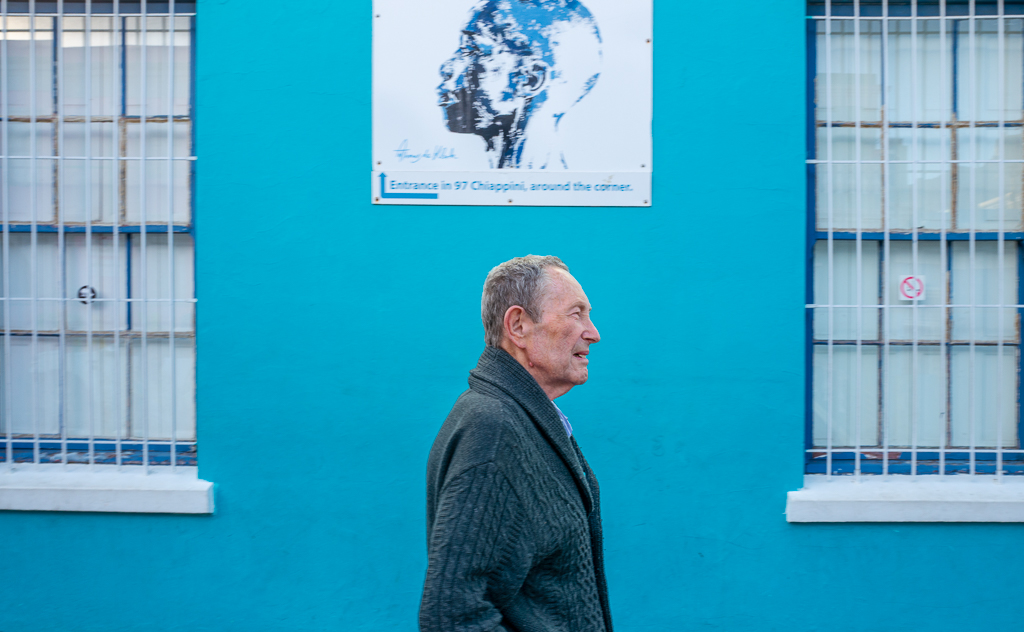
About the Photo:
This photo was taken in Cape Town’s Bo-Kaap, a neighborhood known for its vibrant streets and striking wall art. I was framing a shot of the blue wall and graffiti when, unexpectedly, my friend walked through the scene??”completely unaware of the camera. That spontaneous moment added an unexpected layer to the composition, tying together the two windows, the artwork, and his presence into a much more interesting frame than I had originally planned.
6 comments posted
It's a good capture. The only comment I have is that the subject is right in the center of the image frame and right in the center of two windows. It is too symmetrical to me. Posted: 12/04/2025 02:06:20
Thanks for sharing your thoughts - much appreciated.
Reframing to the rule of thirds would reduce the tension created by the current geometry. Centering the man between the two windows adds compression and structure, while the artwork above introduces a contrasting posture and direction. Both the man and the portrait act as co-subjects, and the symmetry is what anchors the image and gives it visual weight. Posted: 12/06/2025 02:28:13
Reframing to the rule of thirds would reduce the tension created by the current geometry. Centering the man between the two windows adds compression and structure, while the artwork above introduces a contrasting posture and direction. Both the man and the portrait act as co-subjects, and the symmetry is what anchors the image and gives it visual weight. Posted: 12/06/2025 02:28:13
I agree with Jean that in this case it's too symmetrical plus I don't like to cut people's legs and feet off unless it's a close up face shot. I also think the whole image is too blue which gives it a cold tone. Posted: 12/06/2025 21:01:59
I think it is fun that your friend walked right into the frame. I actually like the image and the symmetry and and don't see another crop option. I think the partial head off the poster and legs off your friend work.
I'd like to see it in black and white, which might make it more art-like. And you are the master of monochrome, no doubt of that! Posted: 12/07/2025 03:10:38
I'd like to see it in black and white, which might make it more art-like. And you are the master of monochrome, no doubt of that! Posted: 12/07/2025 03:10:38
What interests me in this photo is the opposite orientations of the two heads. I like the semi-symmetry as a result. Posted: 12/09/2025 01:57:21
I like the symmetry you achieved and your vision. The only thing that bothered me a bit was the head on the poster was cut off - would have like to see the whole head. But that may not be what you wanted. Posted: 12/14/2025 00:23:48