Kathryn Bundy
April 2025 - Atrium Angles
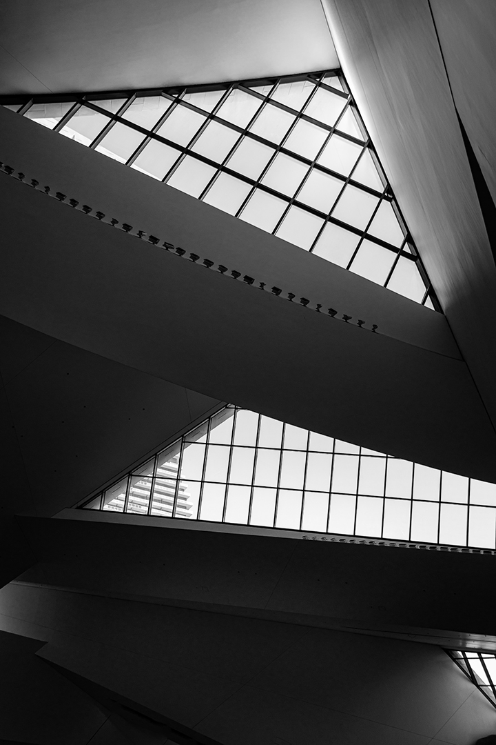
Original
About the Image(s)
EXIF - Sony a6700, 1/40s, f5.6,ISO100, location - Las Vegas The Shops at Crystals interior, March 2025
Question I have is on cropping. I have three different versions - this one plus two square ones - top 2/3rds and bottom 2/3rds. So I guess the question is what do people think would be the best crop?
10 comments posted
Welcome to the group.
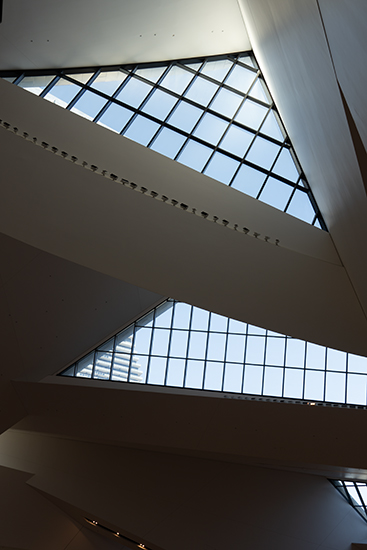
I love 'Architecture' photography very much. I modified your original to 1:1 ratio and used high key with frame (Nik Silver Efex preset) for 2 dimensional presentation of abstract shapes, forms, and lines. Posted: 04/04/2025 17:59:14
I love 'Architecture' photography very much. I modified your original to 1:1 ratio and used high key with frame (Nik Silver Efex preset) for 2 dimensional presentation of abstract shapes, forms, and lines. Posted: 04/04/2025 17:59:14
Thanks Jean. I like the 1:1 ratio - had tried that with a couple of different iterations of the shot. Will go back to that for the final. Not sure if I like the high key aspect but will use it on some others as it is not something I normally do but it adds another dimension. Posted: 04/11/2025 20:02:21
Kathryn, we are thrilled you are here! I thought Jean's idea was very good. I went a different direction and straightened the bottom which gave it a different look. It will be fun to see what else the group can come up with for you.
I like your contrast, lots of angles and depth. It's a great sighting!
Posted: 04/08/2025 01:27:58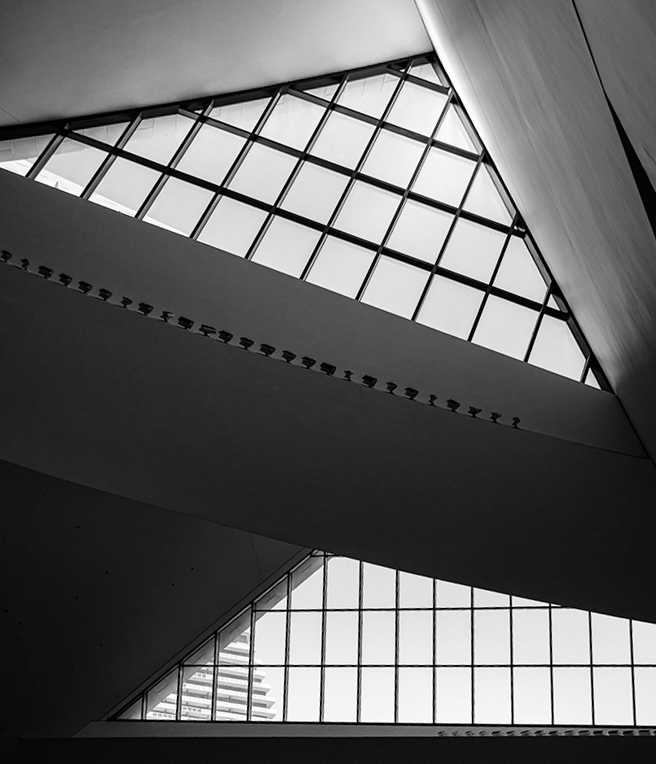
I like your contrast, lots of angles and depth. It's a great sighting!
Posted: 04/08/2025 01:27:58
Brenda - interesting how it feels different when the bottom line is straightened. Thanks! Posted: 04/11/2025 20:03:48
I love the pure whites, pure blacks, and the nice gradations between, just what I want in a B&W image. The shapes and angles capture my attention as well. I'm not so keen on Brenda's rectification of the bottom windows. I'd like it a bit more if that building on the left in the middle section of windows could be removed.
Posted: 04/08/2025 17:22:22
Posted: 04/08/2025 17:22:22
Thanks for the input. The building in the window can be removed but I originally thought it added another dimension. I'll give it a try. Posted: 04/11/2025 19:58:45
Kathryn, welcome to the group!
I really enjoyed your first post-especially in black and white. We don't see many B&W photos in our group, so it's refreshing to see yours. The image is well-processed, with beautiful handling of shadows, highlights, and midtones. It all comes together to make a very intreasting photograph.
With a bit of fine-tuning on cropping, this image would look fantastic on a wall-especially if you print your work!
Looking forward to seeing more from you.
Posted: 04/17/2025 01:02:43
Sorry for the late response. I've been traveling and I came home sick. I may have had covid again as it was that bad. However I'm now on the mend.
I really like Jean Wu's version and that's how I would edit it. I love BW photography and am in another discussion group just for BW photography. Posted: 04/17/2025 20:34:19
I really like Jean Wu's version and that's how I would edit it. I love BW photography and am in another discussion group just for BW photography. Posted: 04/17/2025 20:34:19
OK, I've read everyone's comments (plus some others & mine) and made adjustments to the photo. I highlighted parts of the photo, cropped it, removed the buildings in the windows and straightened it somewhat. Here's the result. It does appear a bit sharper and crisper on my monitor than it does here - not sure if that is the result of loading it or not.
Posted: 04/17/2025 22:29:15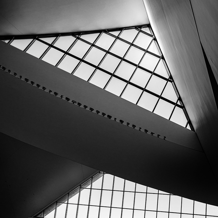
Posted: 04/17/2025 22:29:15
Sorry for my late response. I enjoy reading all the recommendations and your finial version. From your photo, it is evident that you have a good grasp fo lines, light adn shadow and composition in black and white skills. I like it very much. Posted: 04/18/2025 03:04:46