Ed Ogle
About the Image(s)
f/5
0.8 second
ISO 12,800
EV +1.33
160mm
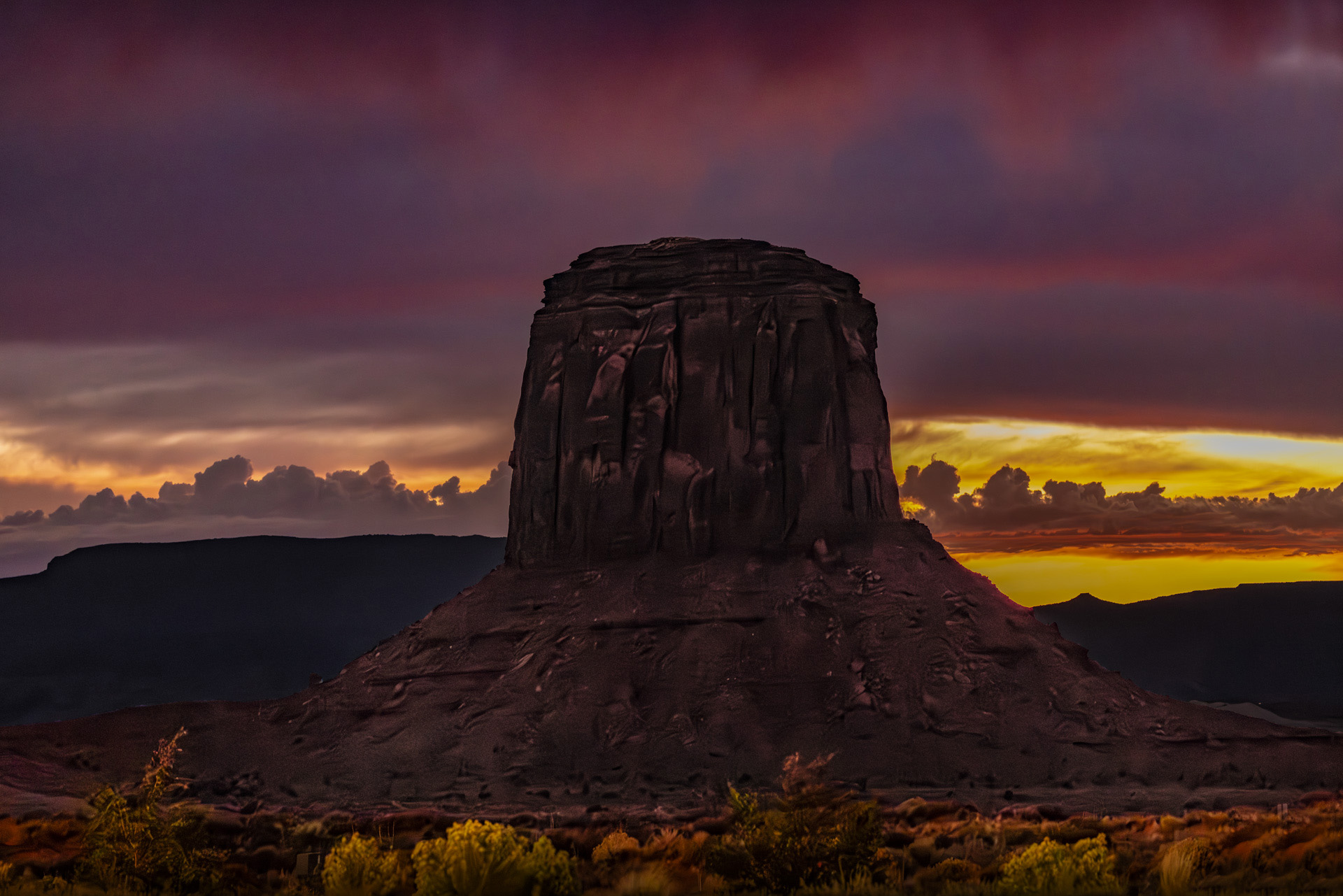
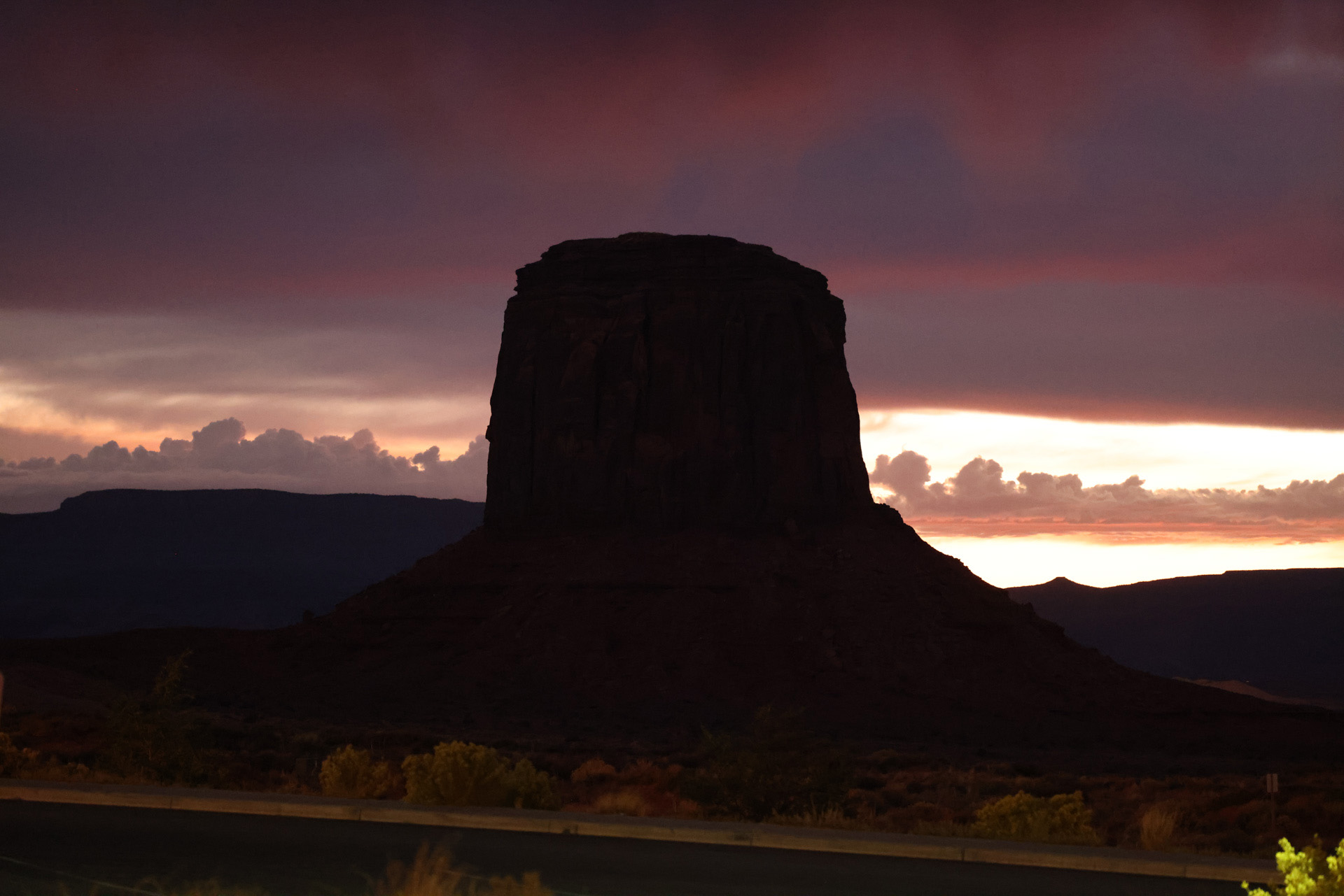
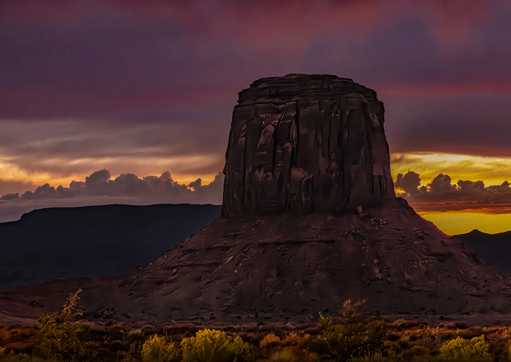
A sunset photo from Monument Valley made right at the very end of the day when the last vestige of the sunset was visible.
This is kind of an experimental photograph made under extreme conditions of light and dark. I did a whole bunch of post processing to the point that you might say it’s ‘over-cooked’.
• Adobie camera RAW noise reduction.
• Breaking the foreground, background and sky into individual layers and editing each individually.
I kind of like the result but also kind of don’t. What do you think and how would you edit it???
7 comments posted
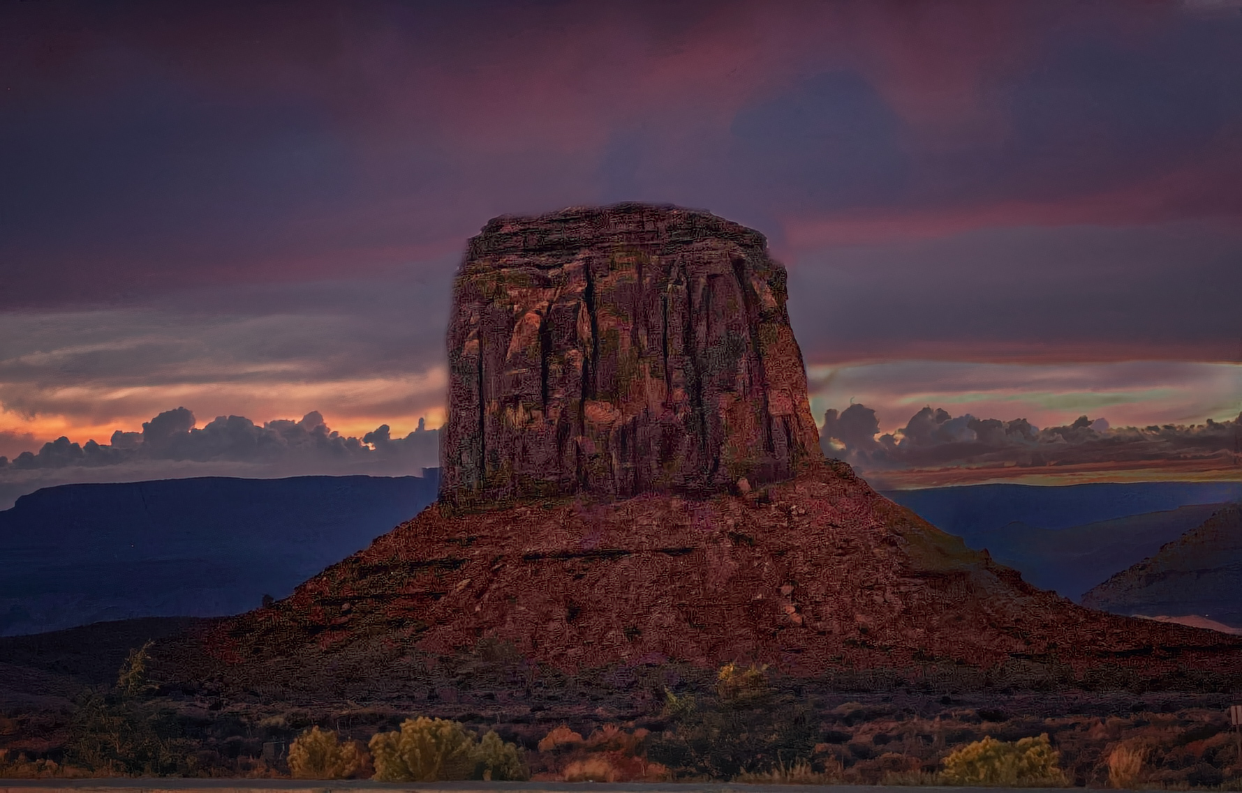
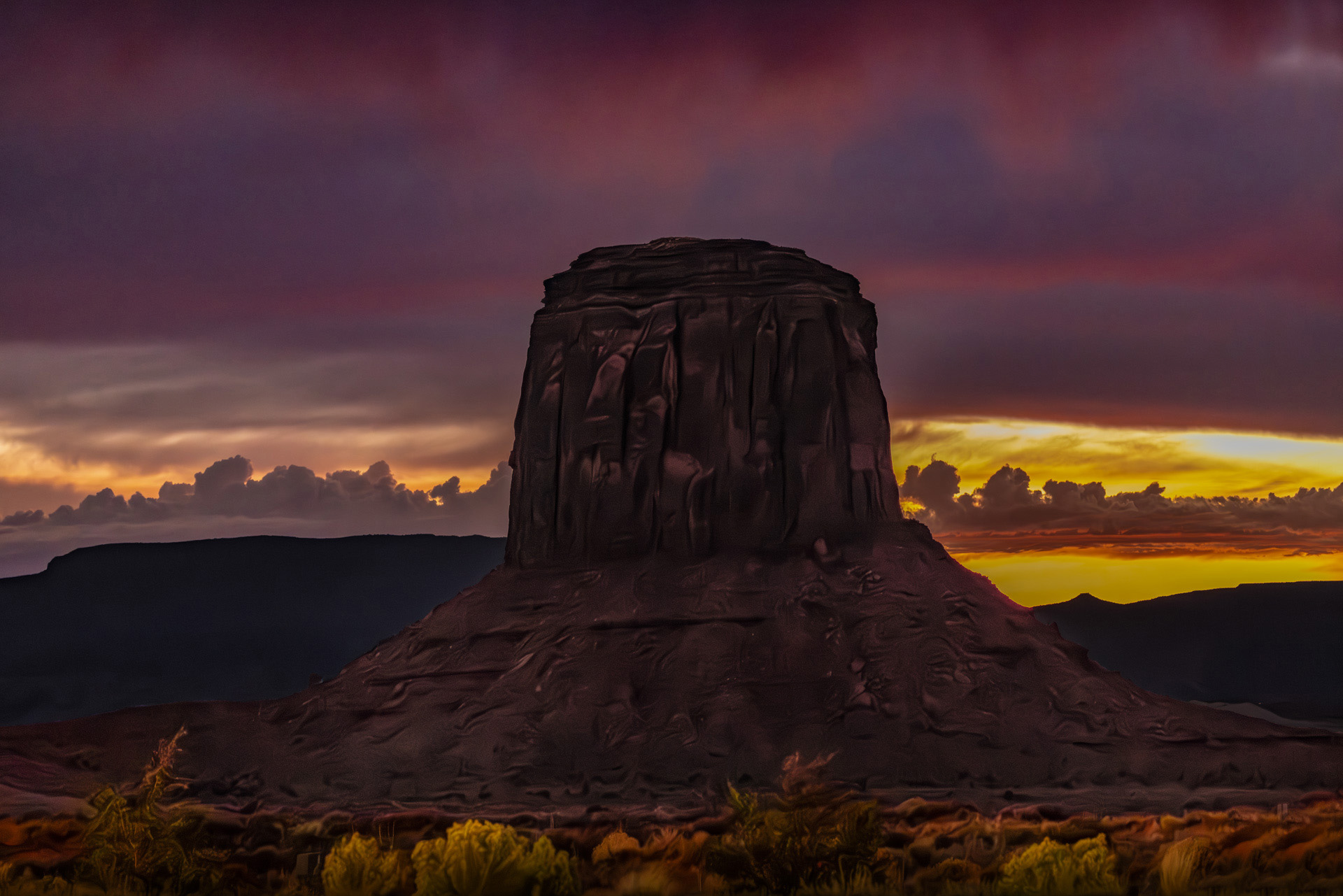
Thanks, it's just an experiment. Your version look too bright and it seems to bring out the noise but the color looks good. Anyway I have been playing with the oil-paint feature under stylize in Photoshop lately. I've gotten some results that I really like. I've found that it doesn't work well on the sky so I mask the sky in this version and used the oil-paint filter on everything else. Posted: 11/07/2024 15:04:25
I like this a lot, and while I prefer to "take" good images and not "make" them, despite all that you described, I don't think that your editing has changed what you were seeing in your mind's eye as you took it. I prefer your treatment of the rock column whereas in Brenda's version, to me it feels unnaturally bright in view of the illumination everywhere. I am a little perplexed however by the fact that in your original and in your processed image, the sun seems to be to the right of the rock column, but the trees below the rock seem to be illuminated from the left. Posted: 11/04/2024 00:51:40
I think that the trees in the foreground are being illuminated by the street lights in the parking lot where this photo was taken. If you look at the original the bush on the viewer's right is really bright. This was the parking lot of the resort owned and run by the Navajo Nation. Again, this is just an experimental photo that I thought would be interesting to share and discuss. I really wouldn't want this hanging on my wall. Posted: 11/07/2024 15:00:42
Ed, this is a fascinating experiment with light and shadow in challenging conditions! The layered editing really brings depth to the scene, and your creative use of the oil-paint filter adds a unique texture. Thanks for sharing such a dramatic yet experimental image with the group! Posted: 11/11/2024 17:42:11
This is great, liked it.
Nothing to suggest. Posted: 11/15/2024 03:55:46
Nothing to suggest. Posted: 11/15/2024 03:55:46
