Grace Yang
March 2025 - Surrey Central
About the Image(s)
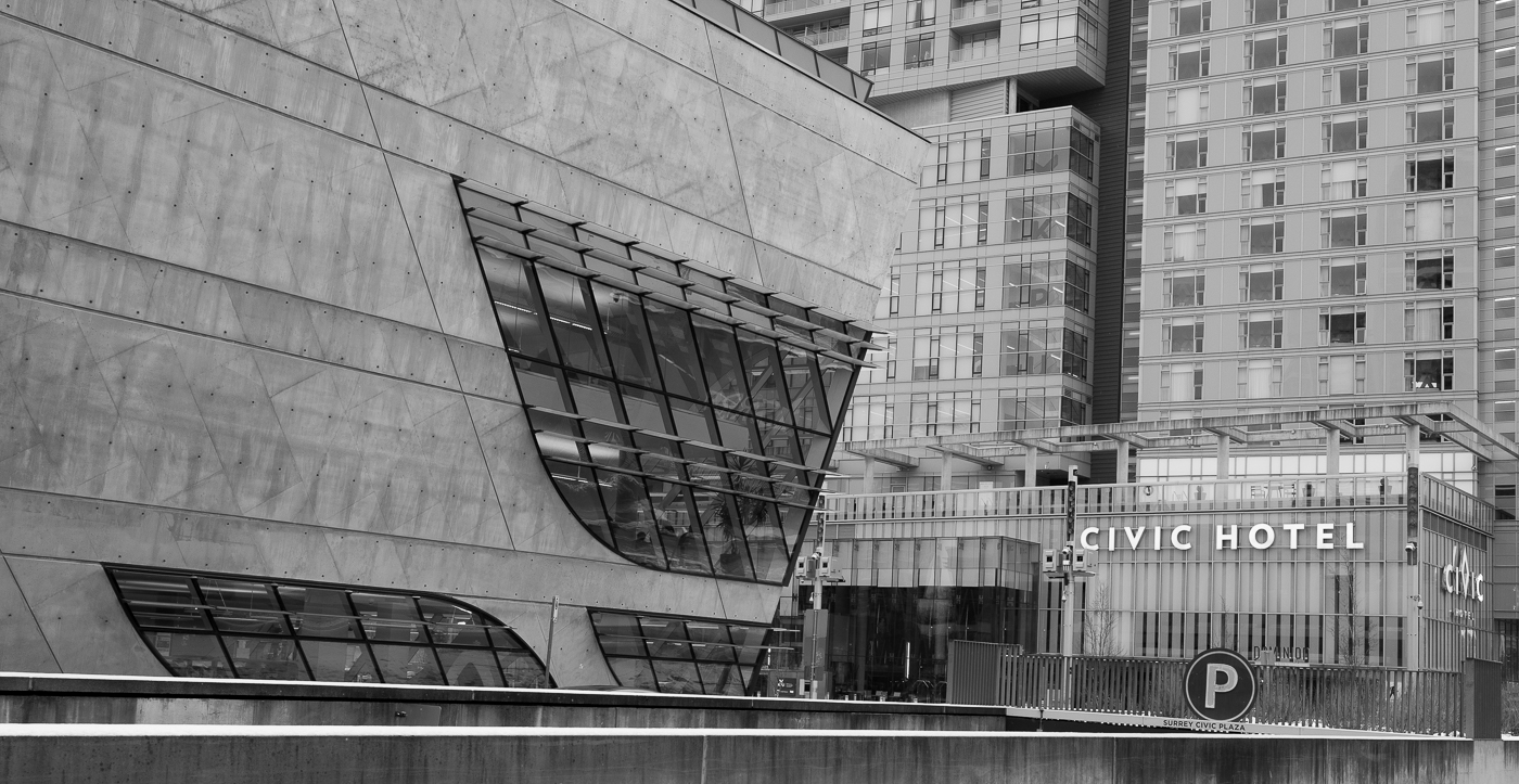
This image was taken last month in my city, It is a library and a hotel on the same site. An interesting place to photograph. Canon R5 1/160 sec at F7.1, ISO 400 35mm
This round’s discussion is now closed!
8 comments posted
I like the mix of four architectural styles. The tones are dull with little variation. You might try increasing luminance of the shadows and adding contrast to outline the lines of the windows and buildings. What processing did you use?
Posted: 03/14/2025 13:17:02
Posted: 03/14/2025 13:17:02
Grace Yang
Thank you, I will try increasing luminance. I use Lightroom convert to Black and white, but I have old version of nik silver Efex, just not very familiar. Posted: 03/14/2025 18:45:23
To me most of the interest is in the windows so I would play that aspect up by cropping about 30% off the left eliminating a large expanse of the blank wall. You would end up with a more squarish format which I believe would be more dynamic. Also as Jerry suggests a boost in contrast would not go astray. I have taken the liberty of doing this by adding (in photoshop) a curves adjustment layer then a levels adjustment layer and just tweaking things ever so slightly as per the screenshots. I am not saying this is the best end result but just an example to pique your interest.....and I really hope I hav'nt offended you by doing this.
Posted: 03/15/2025 20:46:53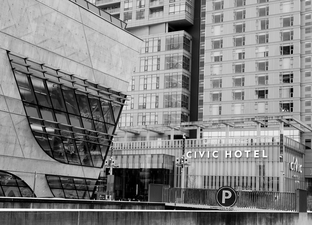
Posted: 03/15/2025 20:46:53
Posted: 03/15/2025 20:47:07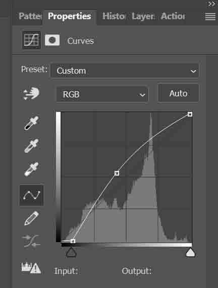
Posted: 03/15/2025 20:47:21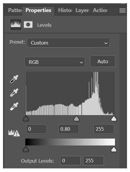
Patrick O’Brien
I agree with Chris. Crop the left and adjust contrast / levels. Tones are kinda flat. Posted: 03/15/2025 21:01:42
I agree with Chris, crop and increase contrast. Posted: 03/19/2025 16:16:34
I like the building on the left pointing to and leading into the buildings on the right and the name "Civic Hotel" being where they point and a clear subject area. I think I like the longer lines without the crop, but that just demonstrates that opinions vary, and geneally there is no right and wrong. It appers thre is a reflection on the building on the left. I personally would prefer to not have that. Posted: 03/31/2025 00:29:58