Jerry Snyder
February 2025 - Abandoned
Original
About the Image(s)
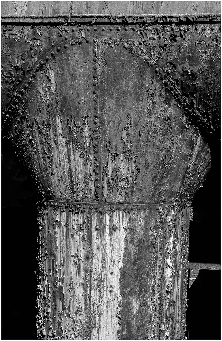
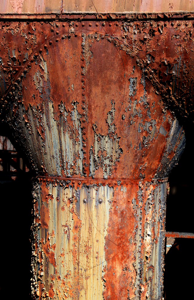
The image was made at the site of a the former Bethlehem Steel Mill in Pennsylvania. The corrosion on the metal exhaust pipe from one of the furnaces makes some interesting patterns. The exposure settings were 1/200 sec, f/8, and ISO 100 on a tripod-mounted Canon 6D at 46 mm. In Lightroom tonal and color adjustments were made followed by cropping, straightening, and removal of some distracting elements before converting to black and white. Resizing was done in Faststone. A comparison of the monochrome version with the original color version shows how much the colors distracted from the textures of the corrosion.
5 comments posted
Patrick O’Brien
Great image capture! I would have captured the same subject, but would have kept it color because I'm weird and interpret the rust as blood. Consider using a red filter in your conversion app to make the red slightly darker, adding a contrast with the lighter gray metal to make the rust more obvious. It's a little "flat" to me.
The small metal piece middle right is unidentifiable and distracts me.
Showing the color original is a nice touch. Thanks for that! And again, for me, the color version has more impact.
Posted: 02/10/2025 06:51:50
The small metal piece middle right is unidentifiable and distracts me.
Showing the color original is a nice touch. Thanks for that! And again, for me, the color version has more impact.
Posted: 02/10/2025 06:51:50
Patrick, welcome to the group. I also feel that the color version has more impact. I included it to highlight not just the impact that the colors have on the subject, but to show what the colors are hiding; shapes, textures, patterns. The impact of these elements are also strong in my opinion but not immediately perceived. Posted: 02/12/2025 18:15:45
I agree with Patrick. The color version is more interesting to view. However, the monochrome seems to bring out more detail in the rivets? Posted: 02/10/2025 16:11:12
I always go with the old adage "If colour is an important factor in a photograph, use colour. If not, use mono". I think both versions are interesting, but I too would enter the colour in a competition rather than the mono.
After removing the nib on the right which destroys the symmetry, which I like. Posted: 02/12/2025 22:20:59
After removing the nib on the right which destroys the symmetry, which I like. Posted: 02/12/2025 22:20:59
I agree with all the above comments. For me the colour version brings out a stronger sense of the extent of the rusting so tells the story better. It just looks more dilapidated and gnarlier. Posted: 02/17/2025 00:16:50