Stan Bormann, FPSA, MPSA
About the Image(s)
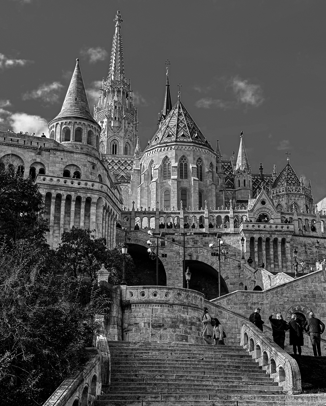
Shot with an iPhone 14 Pro Max at ISO 64. 6.86mm, f/1.8, 1/1500 sec. Processed in Lightroomfirst in color with typical Basic Panel adjustments. Thn processed in Lightroom B&W using the color sliders to adjust the tones. Blue down to darken the sky and Orange up to make the tower roofs stand out more and just general sliding to adjust all tones. Then back to Basic Panel to darken the bush in lower left and bring up the texture and clarity sliders to bring out the individual stones more.
4 comments posted
What a splendid building, and a great portrait of it. The composition is faultless I think, the people adding to the way it leads to those far parts of the building. Your processing generally makes it look good, although I wonder if the 3 central buildings being made a bit lighter might help the impact?
Posted: 11/14/2024 08:16:10
Posted: 11/14/2024 08:16:10
Sharp and nicely detailed with plenty of tones and contrast. I like the composition with the steps leading up and into the image and the people providing depth and scale. The only suggestion I have is to correct the perspective of the building on the left if that is possible. Whatever tweaking you did in selectively adjusting tones and textures has worked wonderfully well. Posted: 11/17/2024 09:49:50
The detail, tone and composition is wonderful. I think there is a perspective tilt in the image which makes everything lean to the right even though the steps are fairly straight. Posted: 11/17/2024 17:09:28
Your composition captures the active scene very well. Specifically, the different architectural elements such as the towers and stairs and the visitors, combine to tell a story. The detail in the shadowed stonework is clear, which must have been a challenge considering the strong angled sunlight. The darkened sky makes an excellent background that is not distracting. Nice job. Posted: 11/19/2024 14:00:30
