Keisha Becerra
About the Image(s)
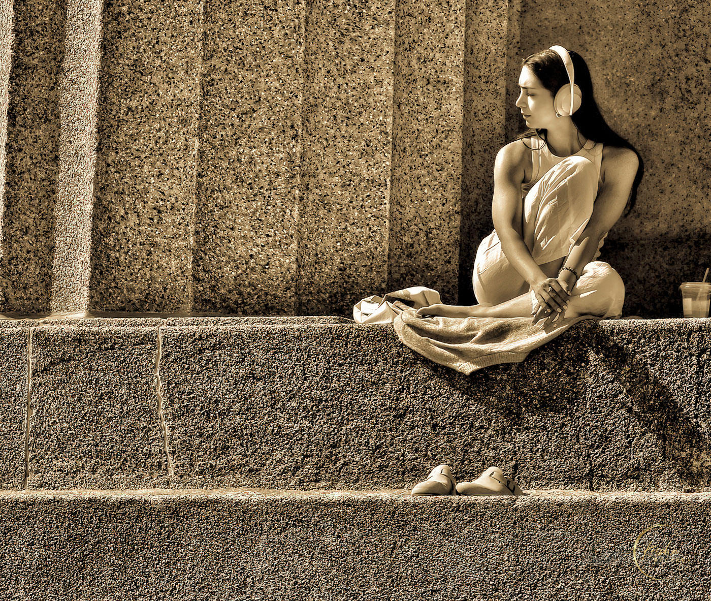
Here is a photo I took at the Parthenon in Nashville, a busy spot where both tourists and locals like to hang out making it a good spot for street photography. As I was walking around I spotted this person dressed all in white, sitting on the steps and just enjoying the day. She seemed so relaxed it made for a really peaceful photo. When composing the photo I left a lot of space in the direction she was looking to give a feeling of openness and tranquility.
Settings
* Focal length - 105mm
* 1/1,000s
* f/6.7
4 comments posted
Keisha, this is lovely. I'd comment about her drink being on the edge of the frame, I think a little room between the two would look better. But your composition and processing are superb, well done. Street phtography seems to be being called "snapshots" in some circles now, which I really dislike. This isn't a snap, it's beautifully worked photographic street art.
I'm really going to miss you when you depart for group 20. You can do two groups (and certain favoured people are allowed a third!) (Alas not me. I do 95 as well as 64.) Do stay!
Posted: 11/14/2024 08:24:17
I'm really going to miss you when you depart for group 20. You can do two groups (and certain favoured people are allowed a third!) (Alas not me. I do 95 as well as 64.) Do stay!
Posted: 11/14/2024 08:24:17
Keisha, your monochrome image is wonderful! I like everything about its range of tonality, sepia tone selection, and overall composition and exposure. I like the image balance with the young lady, the drink and the shoes. I particularly like the contrast of the textures and lines in the stone steps and building and the soft tones and curves of the woman. You have an exquisite eye. Posted: 11/14/2024 17:45:04
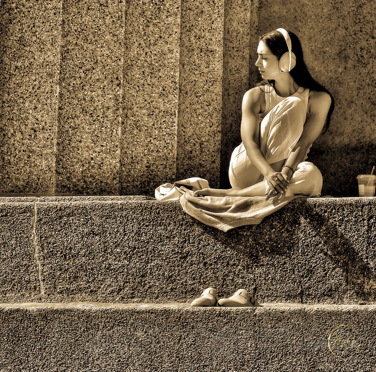
I concur with everything Stuart & John have said especially the drink being fully included. Lighting is exquisite and the shoes on a lower ledge adds to a strong story. I love the way you have composed this with a contrast of vertical & horizontal masonry and subject placement off to the side framed by the small alcove behind her. It is a fantastic image but I think you could make it better by cropping out the two light verticals at the top far left as this would delete a distraction, simplify and place even greater impact on the young lady. I have taken the liberty. What do you think? Posted: 11/18/2024 08:46:16
I love the range of textures and the serene mood that the image created in my mind. I agree that the cup can go. Posted: 11/19/2024 14:02:10

