Michael Laezza

August 2026 - Deep in Thought
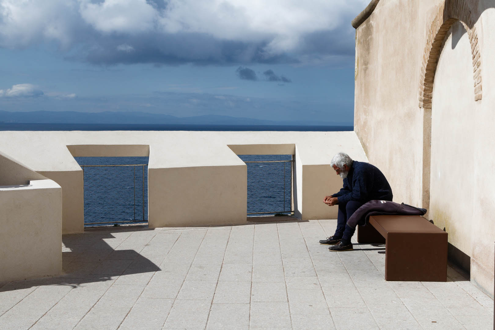
Original
About the Image(s)
I was drawn by this person sitting quietly on a bench overlooking a beautiful view of the Mediterranean . He looked like he was waiting for someone and was in deep thought. The light was very harsh and contrasty, which is what I tried to reproduce.
Canon T6s, Iso 400, f11, 1/1500, 24-105 lens. Processed in DXO photo lab and NIK
12 comments posted
Michael,
I really like this composition. As I dwell on it I feel relaxed, calmed...
Emil Posted: 08/01/2026 14:36:08
I really like this composition. As I dwell on it I feel relaxed, calmed...
Emil Posted: 08/01/2026 14:36:08
Emil - thank you. Regarding your comment on composition I was initially concerned that that composition I used ( horizontal, vertical and diagonal leading lines all converge at a point that also follows the rule of thirds ) as too conventional. The composition is not dynamic but as you pointed out hopefully evokes calmness.
Cheers Posted: 08/09/2026 19:55:10
Cheers Posted: 08/09/2026 19:55:10
Hi, Michael,
I'm new so I hope you're open to ideas.
I really like the mood of this image -- a man alone, thinking in a lovely place.
What I did was play around with your image -- you may or may not like it. I lowered the highlights on the walls and also brought out some detail in his clothing so you could see the texture. I deleted the white thing on his -- blanket? Jacket? not sure. I just thought the highlights were so bright, and I couldn't see enough of him. The changes I made are subtle. Other than these little things, I do like this image ! Posted: 08/09/2026 22:45:38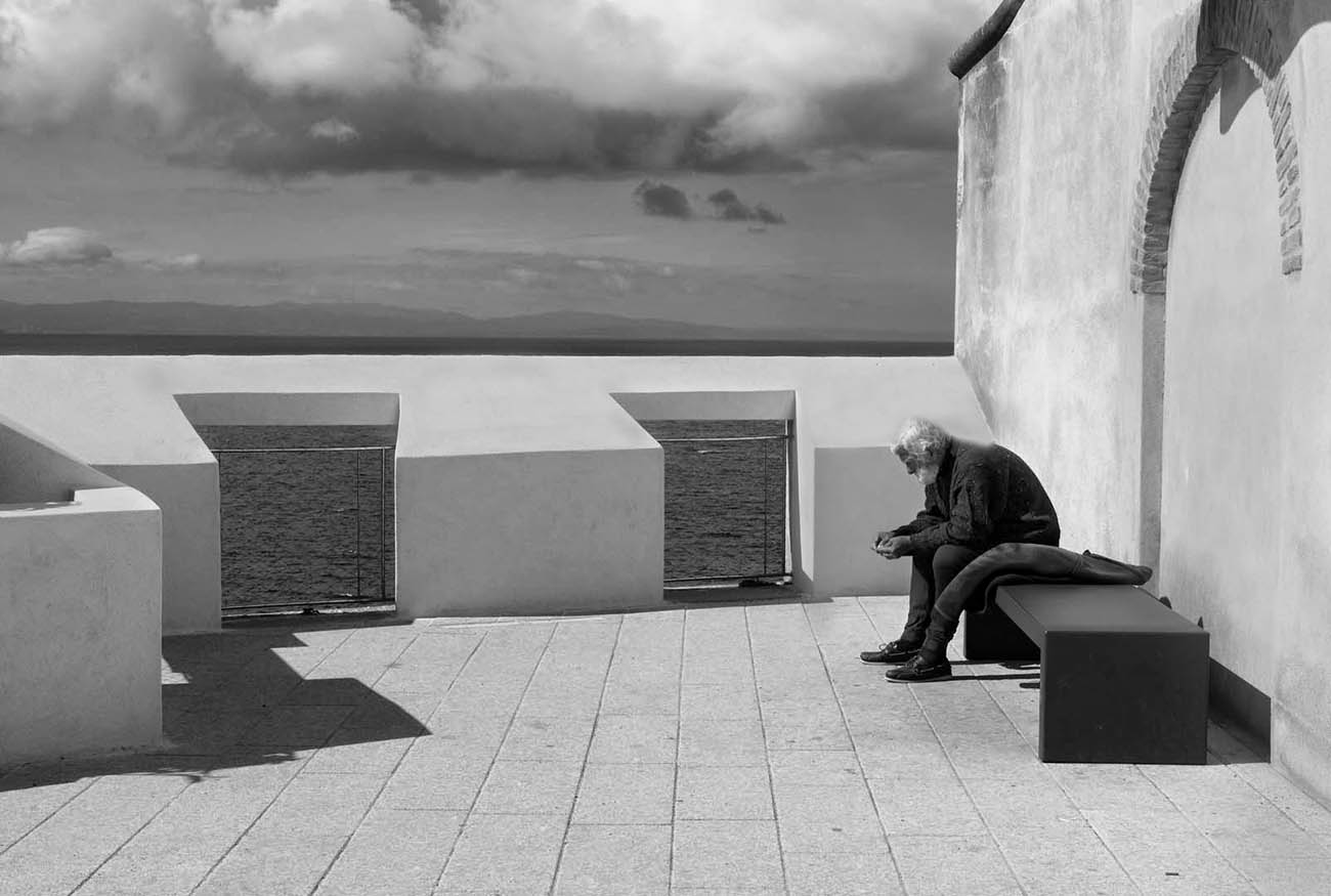
I'm new so I hope you're open to ideas.
I really like the mood of this image -- a man alone, thinking in a lovely place.
What I did was play around with your image -- you may or may not like it. I lowered the highlights on the walls and also brought out some detail in his clothing so you could see the texture. I deleted the white thing on his -- blanket? Jacket? not sure. I just thought the highlights were so bright, and I couldn't see enough of him. The changes I made are subtle. Other than these little things, I do like this image ! Posted: 08/09/2026 22:45:38
Donna - welcome to the group and feel free to provide lots of comments and suggestions. This is what makes these study groups so interesting and useful.
Based on your suggestions and Adrian's I have edited a slightly different image taken from a slightly different angle. In the original version I had submitted I was aiming to show the man as part of the whole scene -
In the revised version the closer crop and the added texture draws the attention mainly to the man. Certainly this illustrates that the choice of the crop factor does influence the interpretation. And it also illustrates that in B&W texture is one of the important elements ( along with contrast, light ) to draw attention to the subject.
Cheers
Mike Posted: 08/13/2026 01:50:27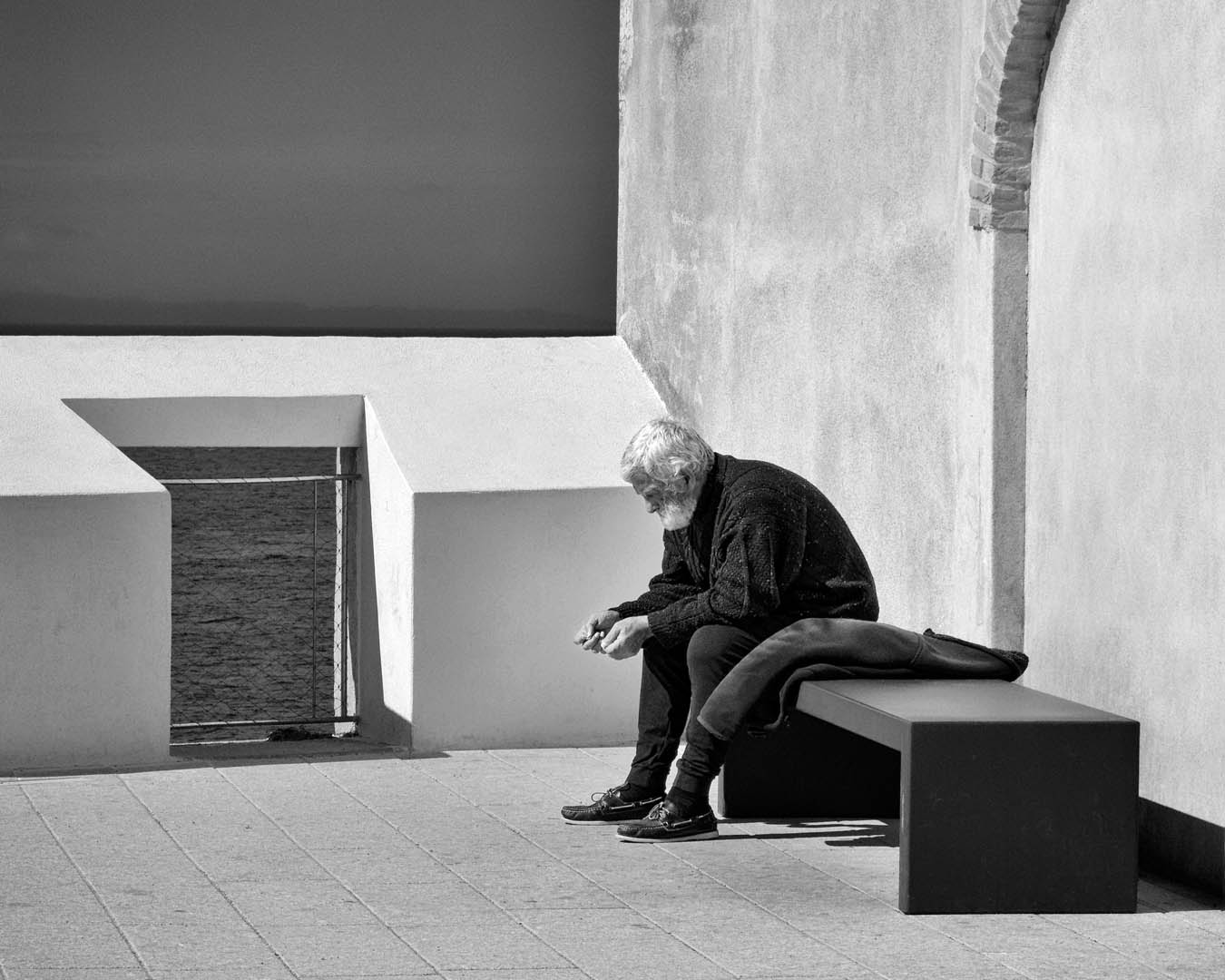
Based on your suggestions and Adrian's I have edited a slightly different image taken from a slightly different angle. In the original version I had submitted I was aiming to show the man as part of the whole scene -
In the revised version the closer crop and the added texture draws the attention mainly to the man. Certainly this illustrates that the choice of the crop factor does influence the interpretation. And it also illustrates that in B&W texture is one of the important elements ( along with contrast, light ) to draw attention to the subject.
Cheers
Mike Posted: 08/13/2026 01:50:27
Hi Mike excellent picture: Hemingway's the old man and the sea alive :-) I created an alternative version, in whhich I removed the shadows and walls on the left and the shadows on the top. I feel this version is even more calm. However it loses a bit of the wideness. Br, A Posted: 08/12/2026 13:48:57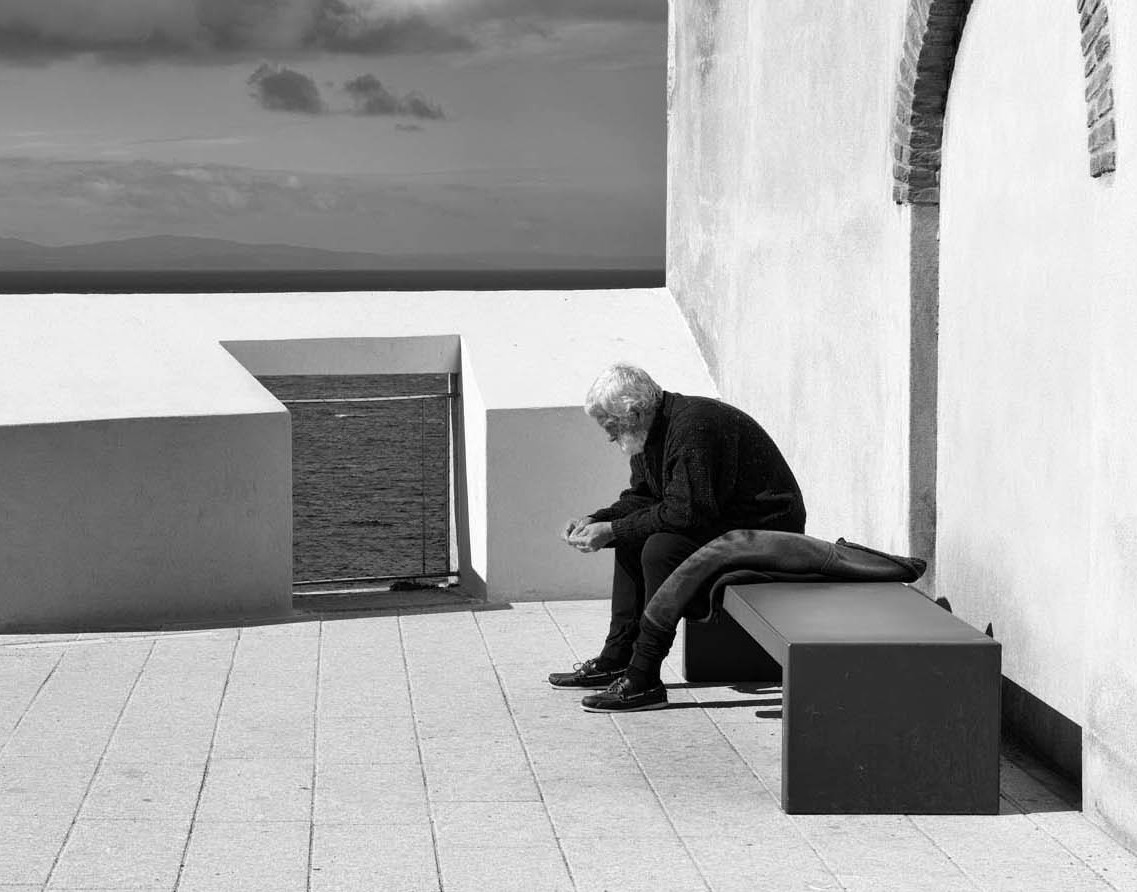
Adrian - Based on your suggestion and Donna's I have edited a slightly different image taken from a slightly different angle. In the original version I had submitted I was aiming to show the man as part of the whole scene -
In the revised version the closer crop and the added texture draws the attention mainly to the man. Certainly this illustrates that the choice of the crop factor does influence the interpretation. And it also illustrates that in B&W, texture is one of the important elements ( along with contrast, light ) to draw attention to the subject.
Cheers
Mike Posted: 08/13/2026 01:52:56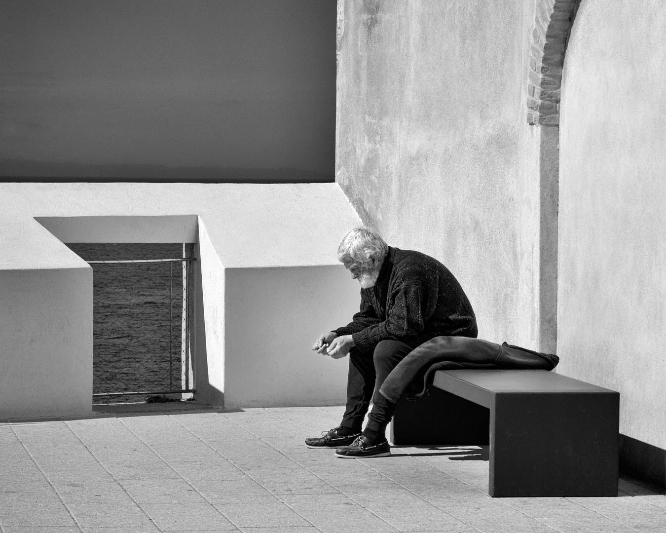
In the revised version the closer crop and the added texture draws the attention mainly to the man. Certainly this illustrates that the choice of the crop factor does influence the interpretation. And it also illustrates that in B&W, texture is one of the important elements ( along with contrast, light ) to draw attention to the subject.
Cheers
Mike Posted: 08/13/2026 01:52:56
I love the variety of ideas of this group. Awesome!
Mike, to me, this is an intimate image that captures a man in deep thought. (And, for a change, he's not looking at his cell phone.) I see the appeal of the various versions; however, your original crop makes the man seem more isolated and alone... which adds to the intimacy (to me). I agree with Donna's thoughts about lowering the wall brightness, and I took it a step further to make the man stand out even more. What do you think? Posted: 08/15/2026 14:55:56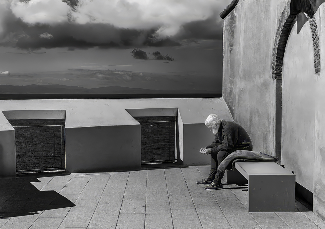
Mike, to me, this is an intimate image that captures a man in deep thought. (And, for a change, he's not looking at his cell phone.) I see the appeal of the various versions; however, your original crop makes the man seem more isolated and alone... which adds to the intimacy (to me). I agree with Donna's thoughts about lowering the wall brightness, and I took it a step further to make the man stand out even more. What do you think? Posted: 08/15/2026 14:55:56
After posting my modified version of your wonderful photograph, I noticed that the man's lighting didn't feel natural. Here's a different version that I like better.
Posted: 08/15/2026 15:03:29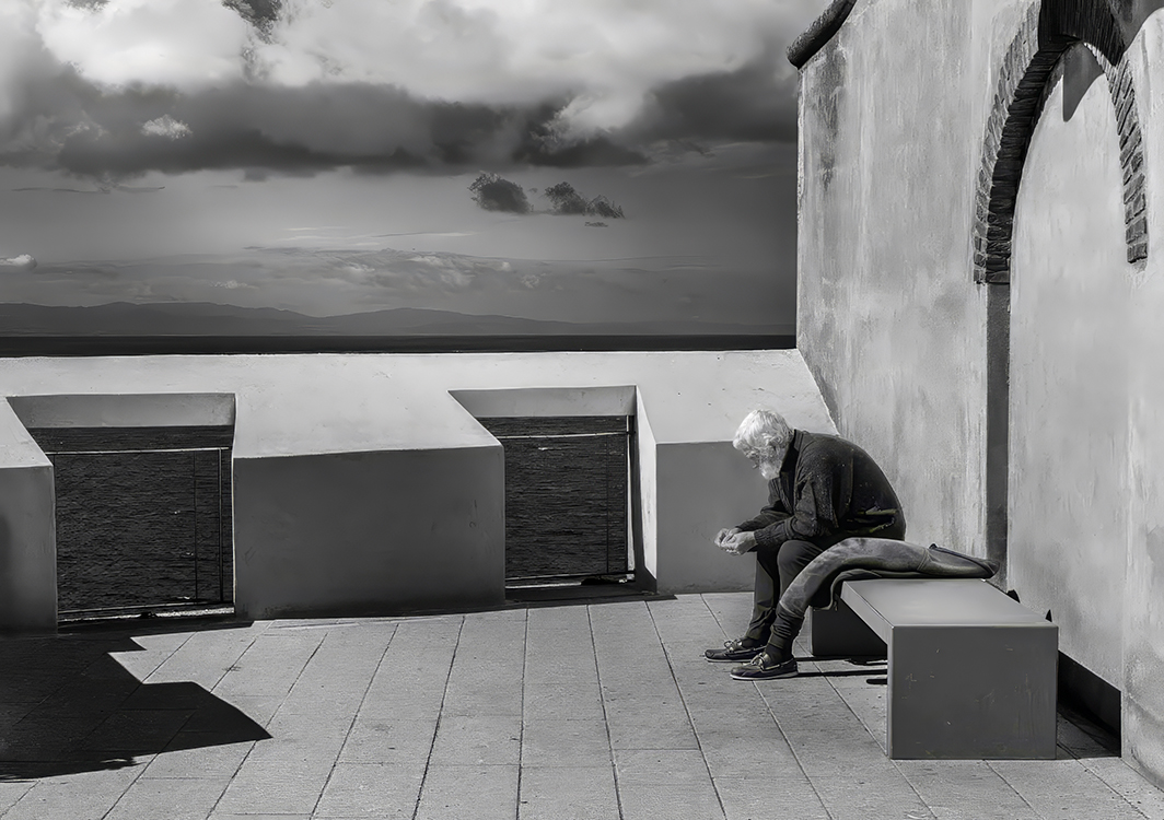
Posted: 08/15/2026 15:03:29
I like your edit also ! More texture added to the wall really helps.
Posted: 08/19/2026 20:03:42
Posted: 08/19/2026 20:03:42
Pete - thank you for taking the time to experiment with different edits - each one does contribute to the overall interpretation of the scene.
Mike Posted: 08/21/2026 17:30:41
Mike Posted: 08/21/2026 17:30:41
Michael - I really like your image this month. The composition is strong, and the placement of the gentleman works very well. It makes the viewer pause and wonder what he may be thinking about.
The only adjustment I would suggest is lowering the highlights slightly on the wall behind him and on the wall to the right. Those brighter areas draw my attention away from the gentleman. I would also avoid adding texture there, as it could become distracting. Posted: 08/22/2026 12:50:14
The only adjustment I would suggest is lowering the highlights slightly on the wall behind him and on the wall to the right. Those brighter areas draw my attention away from the gentleman. I would also avoid adding texture there, as it could become distracting. Posted: 08/22/2026 12:50:14
Hi Michael,
Greetings my friend.
I love the way, you have captured and converted the image from the original. The color version is also wonderful. This light and colors are comlementing each other; I belive. I also appreciate your framing, composition and the tighter crop. Great image and all the other versions are also well appreciated.
THANKS AND CHEERS.
KAMAL. Posted: 08/23/2026 14:00:10
Greetings my friend.
I love the way, you have captured and converted the image from the original. The color version is also wonderful. This light and colors are comlementing each other; I belive. I also appreciate your framing, composition and the tighter crop. Great image and all the other versions are also well appreciated.
THANKS AND CHEERS.
KAMAL. Posted: 08/23/2026 14:00:10