Kathleen McCrary
February 2025 - French Fence
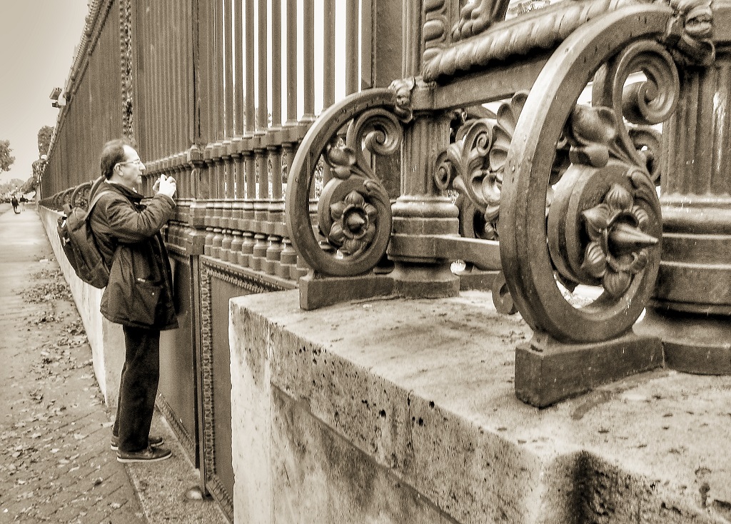
Original
About the Image(s)
Camera: Canon S95
Settings: 1/160, f.4, ISO 400
Description: The French love a fancy cast-iron fence and here's is a particularly massive example. This is the perimeter of the government complex in central Paris and they are very serious about security. The tourist obligingly posed for me (he didn't know) and I like how puny he seems next to the fence. I guess this is an architectural street image.
8 comments posted
Kathleen, indeed a very elaborated and interesting French fence with the added gift of the incidental photographer which adds interest to the image. Here gain your trademark quasi sepia color fits very well. I made the verticals straight. Posted: 02/07/2025 18:38:52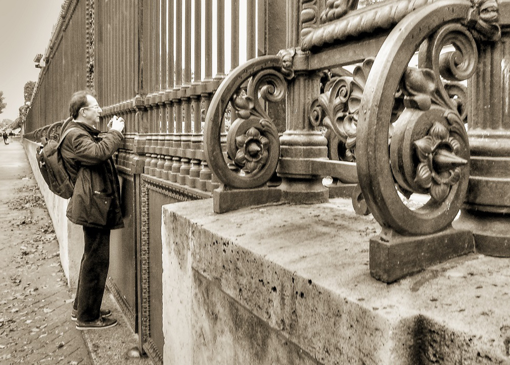
Thank you, Isaac. Posted: 02/21/2025 16:30:16
Sepia and the dramatic composition make the image. I would expect the focus to be deep in this image i.e. with higher F number.
Idea of the photo is nice . Great Work. Posted: 02/17/2025 01:54:48
Idea of the photo is nice . Great Work. Posted: 02/17/2025 01:54:48
Thank you very much, Pinaki. Posted: 02/21/2025 16:30:54
Kathleen- Nicely done. I like the scale of the image and your model photographer adds life to the photo. Sepia works well with the old cast iron. B Posted: 02/17/2025 10:53:53
Thank you, Bruce. Posted: 02/21/2025 16:31:27
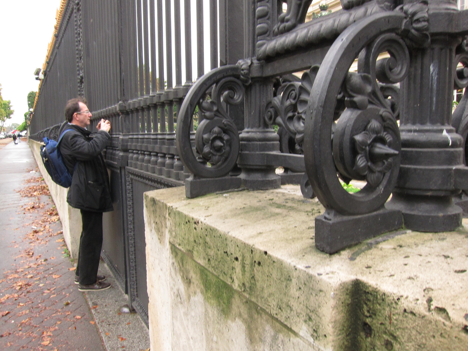
Other than as in Isaac's suggestion re: straightening the verticals, I would not change what you have presented, nor can I make any suggestions. The sepia gives the image a timeless feel, ie: from days past. I did try an older program I have that tries to recreate vintage film, etc processess and have included it here, other than the person is a bit more clear (his face) I have only added it to this comment as an afterthought on on my part It does not compare to the quality of yours
Posted: 02/20/2025 14:49:20
Posted: 02/20/2025 14:49:20
Thanks, Ed. Your version is interesting; the color almost seems green. The face is more readable, for sure. Thank you for your very nice comment. Posted: 02/21/2025 16:35:12