Pauline Jaffe
September 2023 - The Getty
About the Image(s)
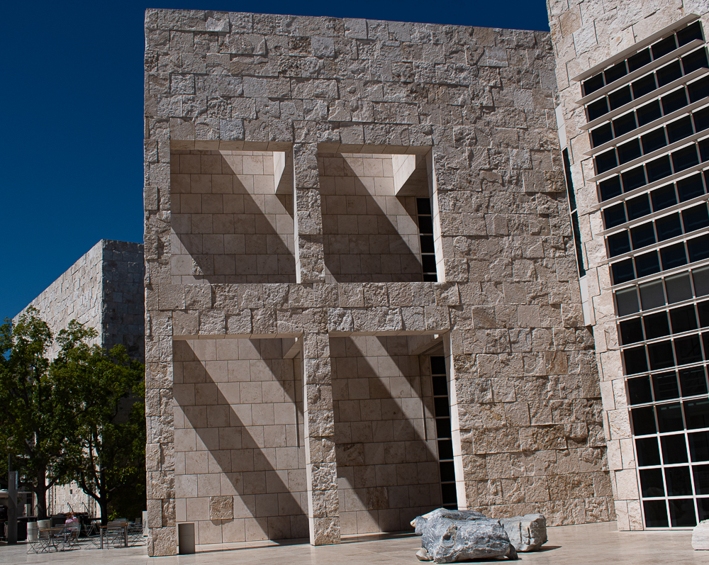
My image this month is an architectural image, from the Getty Museum in LA.
We were there about 2 ½ weeks ago and took an architectural tour of the Museum from an experienced guide who provided a wealth of information.
The guide mentioned Ita Barth, a particular photographer that photographed the building you are looking at.
That said, I could not find her work related to this building or exterior photographing of the Getty Museum.
I particularly love light playing angled shadows.
Tech: Nikon 5600, 18-55 mm lens, composited 3 images.
This round’s discussion is now closed!
8 comments posted
I have driven by the Getty Museum for years. One day I will stop and look at all that is there. Your focus is very good, and I do love the way the shadows fall. I have no idea what is to the right but now I'm curious. I wonder if you could have positioned yourself more to the right and just focused on the 4 openings and shadows? Posted: 09/10/2023 17:02:16
Hi Lori,
Thank you for your comment and critique.
I tried to eliminate the building on the right and hopefully this did the trick. Posted: 09/10/2023 19:34:23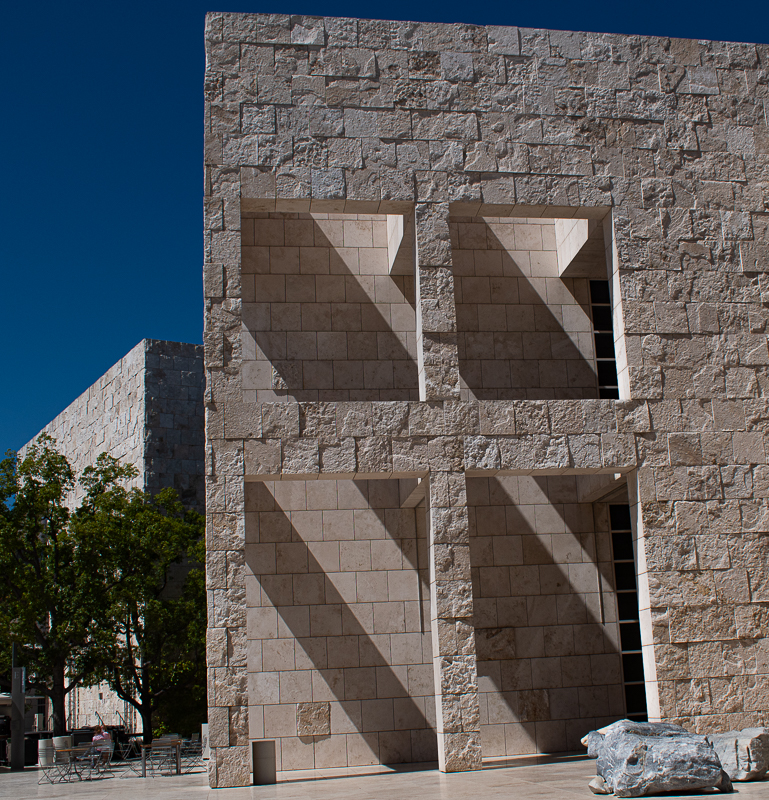
Thank you for your comment and critique.
I tried to eliminate the building on the right and hopefully this did the trick. Posted: 09/10/2023 19:34:23
Thumbs up. I like the shadows and don't often take advantage of them in my photography. Posted: 09/10/2023 20:23:28
This is an interesting shot of a most unusual building. The lighting is very nice for the effect you are after...the angled shadows inside the square openings. It also has the effect of really bringing out the depth of texture to the stones making up the outer wall, which contrasts with the smooth stone of the inner wall that the shadow falls across. As for Lori's comment and your crop, personally I think the building on the right adds a bit to the shot, as do the two gray stones in front that you had to squeeze in on. There is a bit of keystone distortion with the vertical wall on the right which is probably unavoidable (I'm guessing you straightened your image with the left edge of the wall in the foreground). I think it adds something. The one aspect of your shot is the vertical line of black squares inside the opening and along the right edge of the shadow wall that mirror the wall of the building on the right. I am torn between liking it as a framing element within the openings (and also liking how it mirrors the wall of the second building) and thinking it distracts from the shadows. So just as Lori suggested, if I were trying to shoot it again I would consider taking a step back and to the right...not to get rid of the second building but to try and block out that column of black squares while keeping the other building in the shot. It would be interesting to look at both shots to see which one works best. Nice shot, though. Posted: 09/20/2023 15:28:15
(Groups 7 & 67 & 73 & 97)
Pauline ~ you certainly focused on the most interesting part of the building, i.e., the angled shadows. What I find though is my eye wanders - both buildings to the left and right are brighter than the subject building and therefore grab the eye as does the rock in front of the building - that it's there is fine, but it does nothing to enhance what you found so interesting. Also, due to the angle you shot from and the lens (18mm) you have quite a bit of distortion - I tried reconciling that in the Transform panel of LR but it was a no go.
See my attached Visual Feedback - obviously I added canvas on the left to balance the subject (I also increased the texture and clarity to help the image pop. Now if you were documenting the scene, then forget my comments; my goal was to try to prepare the image for a photo club competition.
Posted: 09/22/2023 13:12:50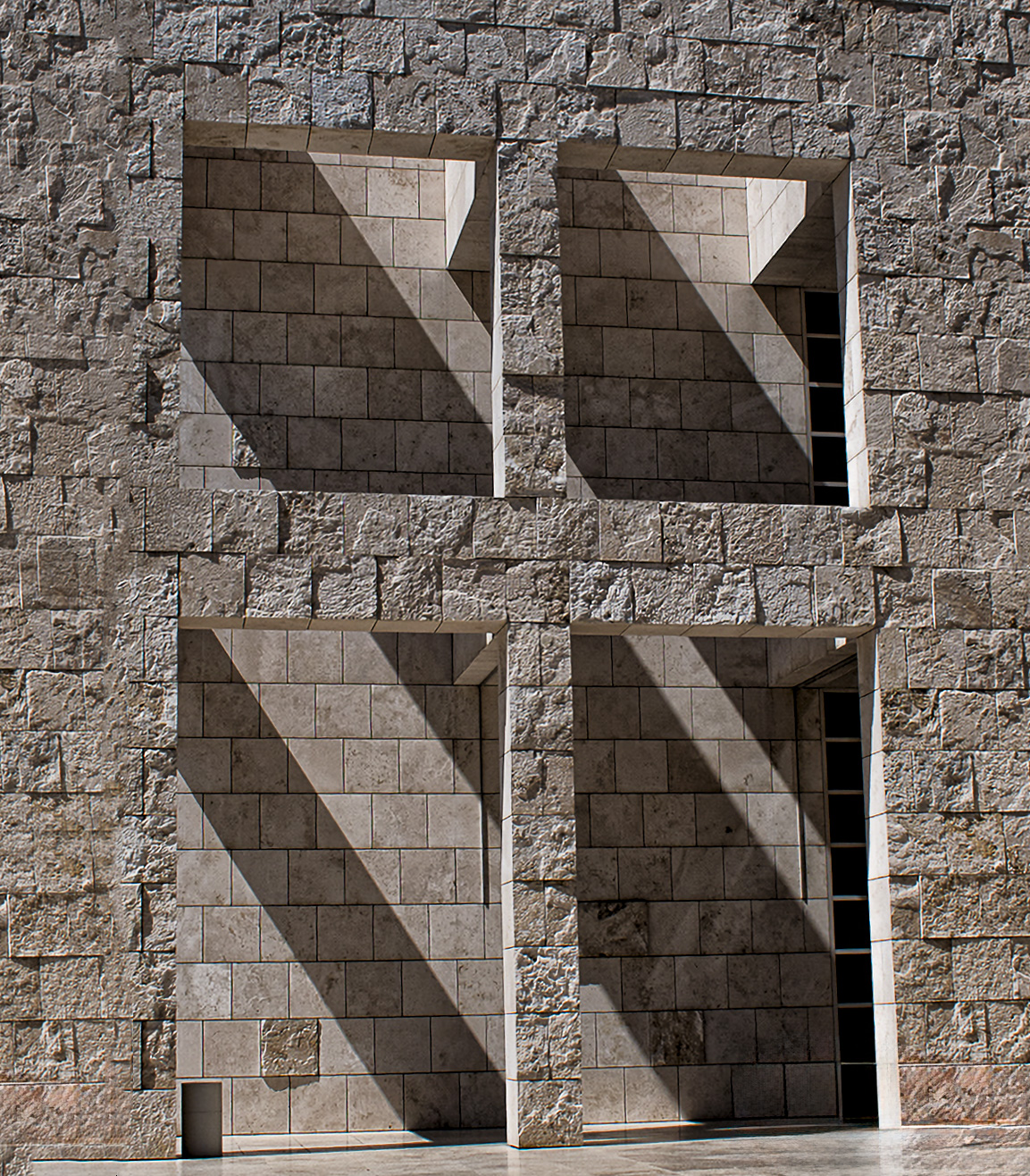
Hi Butch,
Welcome to the Group.
We are all so thrilled to have you join us!
I just reworked the image again.
What do you think? Posted: 09/24/2023 14:34:34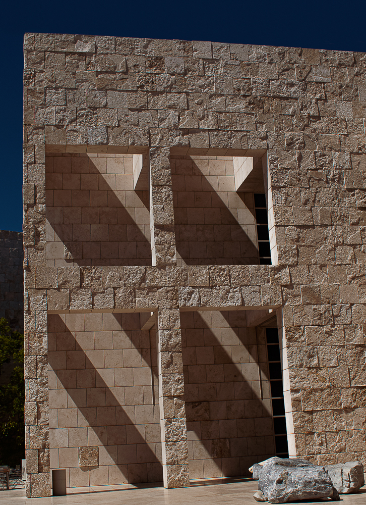
Welcome to the Group.
We are all so thrilled to have you join us!
I just reworked the image again.
What do you think? Posted: 09/24/2023 14:34:34
(Groups 7 & 67 & 73 & 97)
I think it looks great :-) nice job! Posted: 09/24/2023 16:54:47
I'd vote for the crop that Butch produced. I think that the major elements of light, shadow and texture are best emphasized by that crop. Posted: 09/25/2023 06:17:34