Robert Pantazes

November 2026 - Devils Mountain
About the Image(s)
We were on a bus tour of Wyoming parks and the Devils Mountain was not a scheduled stop. The tour director did add the mountain and it was a stop at the gate of the Park.
6 comments posted
This is an interest image of Devils Mountain in Wyoming. I think you framed the image well with the trees in the foreground to give the Mountain context. I also think you did a good job using the tree on the right and side of your image as a border. It seems to me that you might have a polarizer on your lens because the sky looks overly blue? Nice image. Posted: 11/06/2026 01:15:06
Robert Pantazes
Thank you. Posted: 11/06/2026 07:39:56
Nice capture of Devil's Mountain given it was an unscheduled add-on quick stop at the gate to the park.
I agree with what Pauline has already noted in that the sky is both overly blue and also the inclusion of some of the trees in the foreground to offer some context.
I do find that I find there is too much of the foreground included and that it has a tendency to pull my eye away from the primary subject. The same for the small bit of tree in the foreground on the upper right-hand side.
The included interpretation changes to a 1 x 1 aspect ratio to allow for framing the mountain as the subject while also reducing the amount of foreground included. Used Lightroom to remove the tree from the upper right-hand corner, then selected just the blue color channel and dialed it back a bit so the sky appeared more natural to my eye and also allowed the few clouds that were present to offer more texture. A very slight darkening vignette was also applied to help keep the focus on that main subject.
I also tried this in monochrome but found I liked it better as a color image as you have done. Posted: 11/08/2026 14:28:05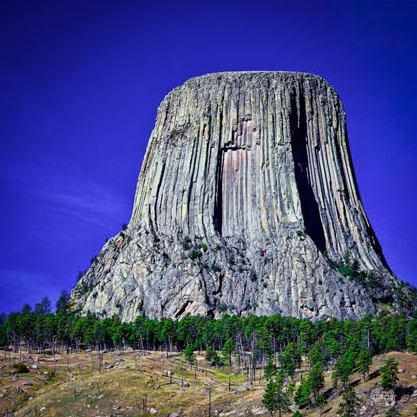
I agree with what Pauline has already noted in that the sky is both overly blue and also the inclusion of some of the trees in the foreground to offer some context.
I do find that I find there is too much of the foreground included and that it has a tendency to pull my eye away from the primary subject. The same for the small bit of tree in the foreground on the upper right-hand side.
The included interpretation changes to a 1 x 1 aspect ratio to allow for framing the mountain as the subject while also reducing the amount of foreground included. Used Lightroom to remove the tree from the upper right-hand corner, then selected just the blue color channel and dialed it back a bit so the sky appeared more natural to my eye and also allowed the few clouds that were present to offer more texture. A very slight darkening vignette was also applied to help keep the focus on that main subject.
I also tried this in monochrome but found I liked it better as a color image as you have done. Posted: 11/08/2026 14:28:05
Nice image. While I agree that some of the foreground should be cropped I wouldn't go as far as James's version. And I quite liked the tree leaves at top right - however I would have preferred a bit more of that tree to help show the depth & distance. Posted: 11/16/2026 20:09:18
Where is Richard Dryfus and the spaceships? I like that you retained some of the foreground in the photo. Maybe just crop at the beginning of the tree line. I do wonder if the blue of the sky was that intense? Maybe using a sky replacement would have made a little more interest. Posted: 11/17/2026 15:48:18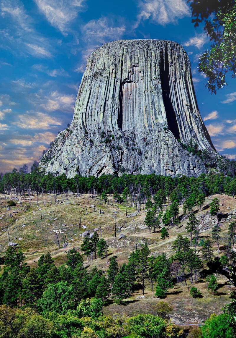
Very nice image. I do agree with making the sky less blue and removing the tree in the upper right hand corner. Both the crops look very good and so different! Posted: 11/21/2026 18:53:42