Sandra Michaelis

March 2025 - Redondo Beach
Original
About the Image(s)
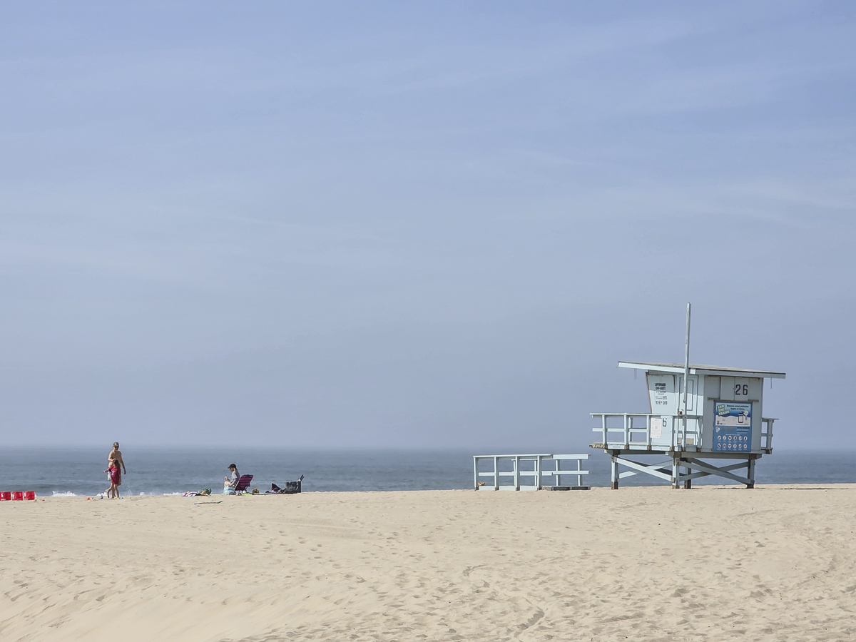
I had a quick trip down to LA and enjoyed a couple of days near the beach. This photo was taken with my Samsung S25 because I didn't want to lug my real camera with me!
I used lightroom AI to remove the people from the beach. I made a couple of local edits adding vibrance in the sky and adjusting the exposure. I played around with removing the texture of the footprints in the sand but then ended up keeping them.
This round’s discussion is now closed!
6 comments posted
This is an interesting image and I love the lighting. This to me, seems to be an architecturally focused image. I love the light blue color of the lifeguard station and the destinctive design.
In the airport in Miami there are several photographs of "unique lifeguard stations" in the Miami area. https://www.wanderlustchloe.com/miami-lifeguard-towers/ Posted: 03/18/2025 16:19:21
In the airport in Miami there are several photographs of "unique lifeguard stations" in the Miami area. https://www.wanderlustchloe.com/miami-lifeguard-towers/ Posted: 03/18/2025 16:19:21
The setting is evocative of a beach at rest, with all of the summer fun gone. The subdued tones match the mood, and the lifeguard station is the perfect color. This is a very nice image and amazingly so because it was captured on your Samsung. Posted: 03/20/2025 18:14:40
Linnea Matthiesen
This is a very nice image and it is a very good job of removing people/things. You just missed a basket on the pier. It is tiny, and if you were doing this on a phone, it is even smaller. The monochromeish feel to the image is great as the tonal values match. The intensity of the color in the sky is similar to the intensity of the color in the sand. I would leave the footprints. They add texture to the image. I really enjoy images that are this simple and clean. Posted: 03/21/2025 23:15:45
I like the simplicity of the shot...nice composition. Two impressions: it seems a little too bright to me. I would consider playing with exposure a little, maybe the levels tool, to try to get a little more detail it it. The other thing to consider (always personal opinion) is the crop. I think the dead space on the left is important, but maybe too much of it? Anyway, I tried playing with those variables. See visual feedback. My edit may actually be a bit too dark, but for a different perspective. Posted: 03/24/2025 20:11:07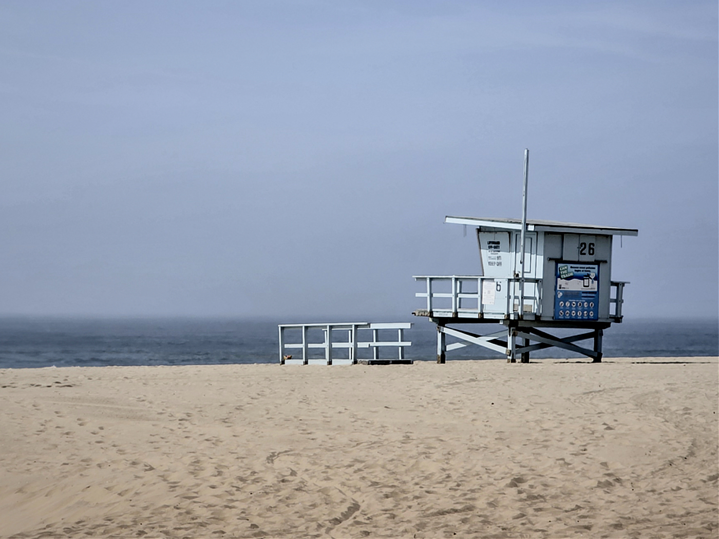
I love it. I love the negative space to the left. I like the contrast the Rick put in the photo. The only thing I may have done differently would be to crop the top sky down. I think that would break the photo down from top to bottom into thirds. Posted: 03/26/2025 21:52:54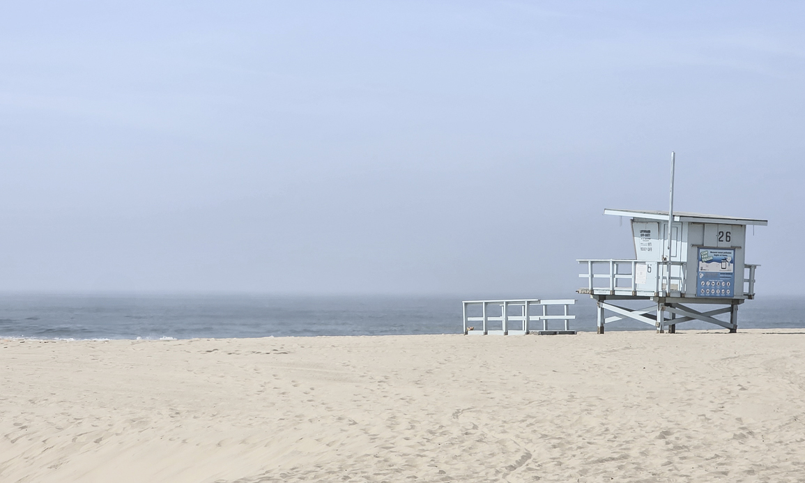
Sandra, this is my kind of photo. I want to take Miami lifeguards stands but haven't stayed over there since taking up photography. Plus to take good skies, it's early morning in summer…both tough to do for heat and so early.
I like your blues and the feeling it gives. Position of the stand is good with good negative space leading the eye along to the stand nicely. Posted: 03/31/2025 23:45:44
I like your blues and the feeling it gives. Position of the stand is good with good negative space leading the eye along to the stand nicely. Posted: 03/31/2025 23:45:44