Lori Azevedo
About the Image(s)
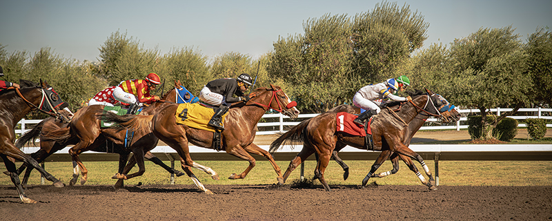
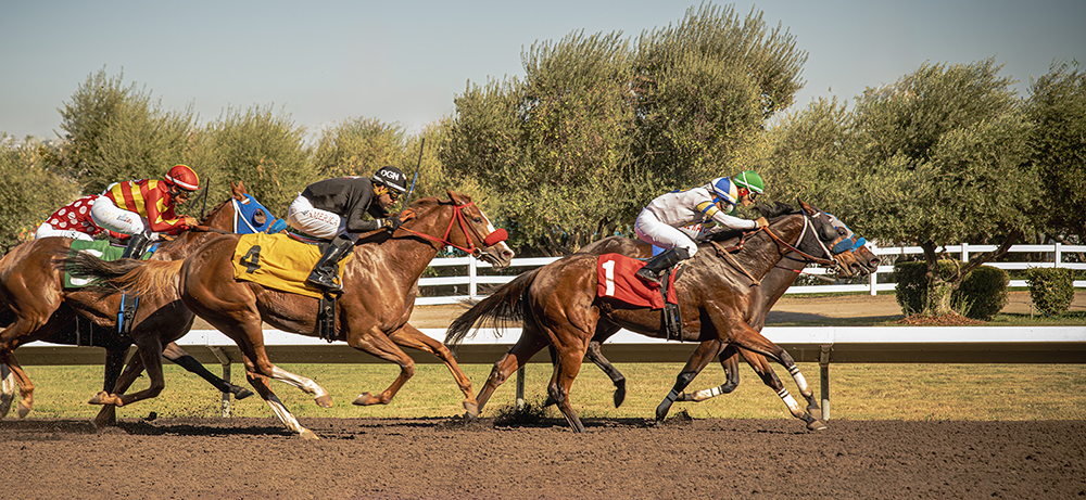
Our local camera club volunteered this year to work in the Fine Arts and Photography exhibit of the county fair. One afternoon I was able to get away to the horse racing. My biggest issue was trying to see over the 6-foot fence when I'm only 5'4". I had to stand on a box and balance my camera on the top of the fence. No way could have used my tripod.
I shot this photo finish with my Nikon D850. My ISO was set at 320 with f/4 and exposure at 1/1000.
5 comments posted
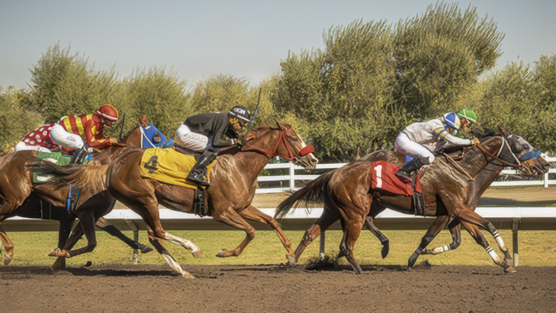
This is a marvelous action photo with extraordinary color! It's quite sharp thanks to your use of 1/1000. The only problem that I see, from my perspective, is the left hand side showing the horses head and the arm of the jockey as a distraction. Here is a tighter crop, for your interest, eliminating the horse on the left. Posted: 11/08/2024 20:21:54
Maybe my crop wasn't such a hot idea! Posted: 11/08/2024 20:49:11
Lori,
I agree with Alec that this is a very nice action shot, especially given the gymnastics you describe having gone through to get a line of sight to take it in the first place!!As for the crop issue, I sort of see his point about the jockey's arm in a bright red sleeve being a little distracting (although I do not have that problem with the horse's head). That said, I think his crop is a bit too tight on both sides: On the left, I like the horse's head, even if you crop out the sleeve, because it emphasizes the action element and the fact that this is a pack or galloping horses. My bigger concern is with the right side: it is important to leave some dead space so the horses have space to run into. In that regard, your original crop is spot on and I would not mess with it. Alec's crop cut out all of that dead space area, which to me decreases the impact of the shot. Posted: 11/16/2024 08:22:22
I agree with Alec that this is a very nice action shot, especially given the gymnastics you describe having gone through to get a line of sight to take it in the first place!!As for the crop issue, I sort of see his point about the jockey's arm in a bright red sleeve being a little distracting (although I do not have that problem with the horse's head). That said, I think his crop is a bit too tight on both sides: On the left, I like the horse's head, even if you crop out the sleeve, because it emphasizes the action element and the fact that this is a pack or galloping horses. My bigger concern is with the right side: it is important to leave some dead space so the horses have space to run into. In that regard, your original crop is spot on and I would not mess with it. Alec's crop cut out all of that dead space area, which to me decreases the impact of the shot. Posted: 11/16/2024 08:22:22
Lori, what a fun shot to have captured. I get why you escaped and climbed up to get it. Great color and focus throughout! The horses being neck and neck prevent separation- makes me wonder who won. Maybe take the color down on the left jockeys arm, as I agree that you need him in the image to balance and keep the movement going. Maybe a bit more in front of the horses, but action shots happen so quickly, I think it's ok. Perhaps darken the bushes behind so the horses stand out even more? It's a great image with great impact. Posted: 11/18/2024 00:25:42


