Kirsti Näntö-Salonen
November 2023 - Old Sailor
Original
Original 2
Original 3
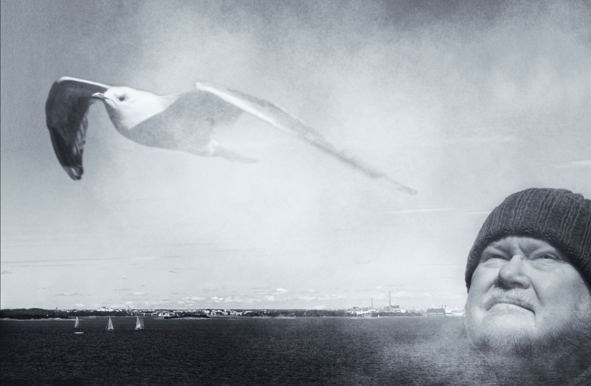
About the Image(s)
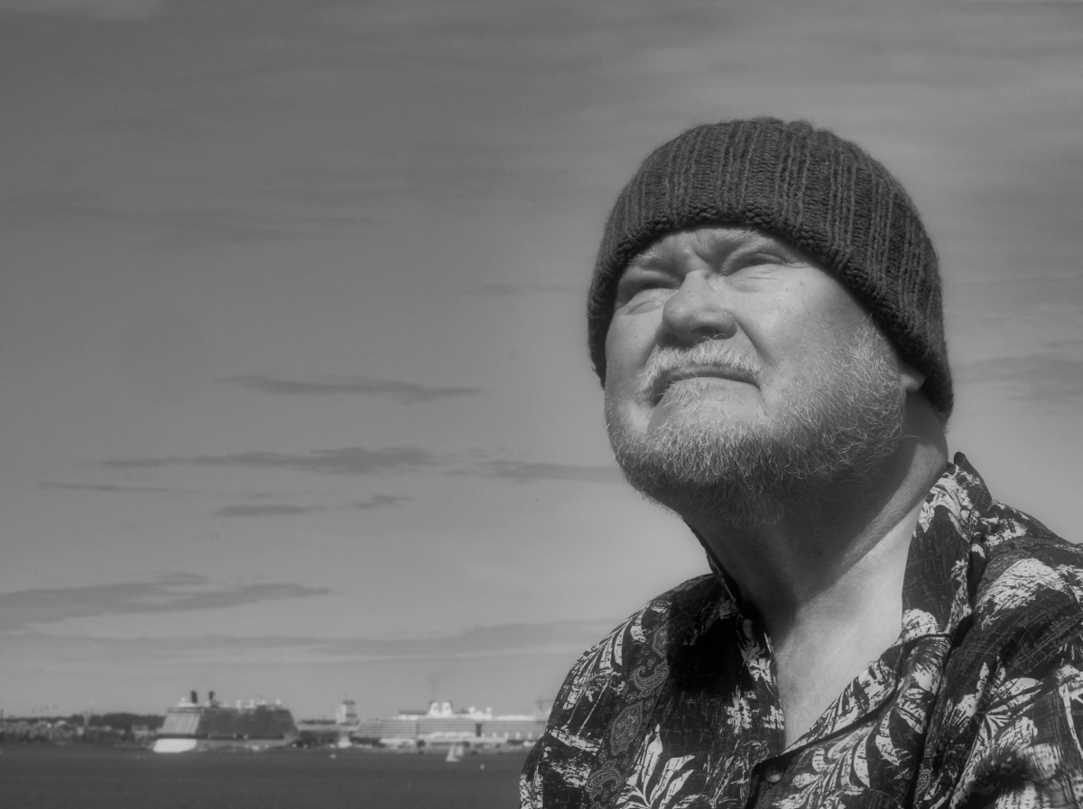
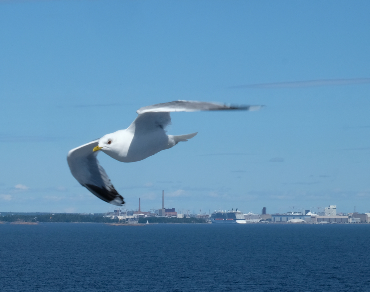
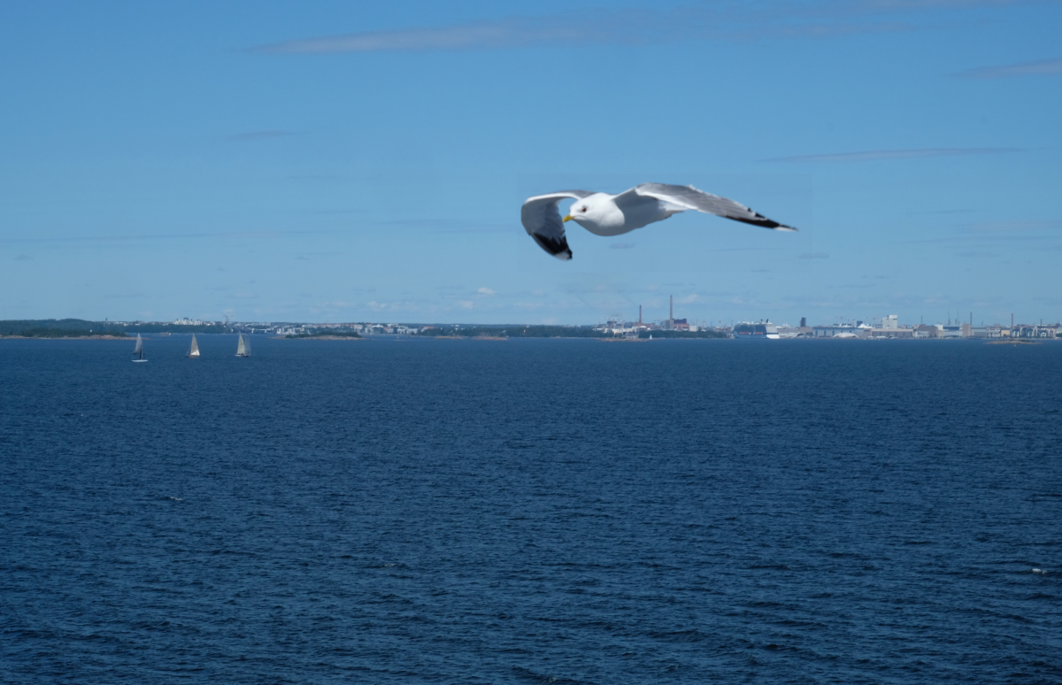
At a photo workshop, the first assignment was to take an image with the title ââ¬Old Sailorâ⬠during the ferry trip to the site. I thought of a lovely sentimental ballad with the same title. It is about two childhood friends, one of whom ran off to sea as a boy while the other continued at school and did a boring career at an office. The latter is sitting on the pier and contemplating their respective fates. He sees the soul of his friend as a proud albatross gliding tirelessly over the oceans, while his own soul is more like a common gull who never reaches outside the harbor basin. - Orig. 1: my husband posing as the old sailor, Orig. 2: a seagull posing as the albatross, Orig. 3: Helsinki skyline. There is another layer of the background with low opacity on top of everything, partially erased, and mist plume from Affinity assets for a dream-like effect. The finish is NIK Silver Efex High Contrast Smooth preset with a selenium toning, and some grain. - I kept flipping the image horizontally back and forth, thinking about the message in the direction of gaze and movement, but this version felt right to me. What do you think?
This round’s discussion is now closed!
10 comments posted
The original image is very pleasing. Why not work with that placement of your husband and explore adding other elements. Maybe this bird and your husbands head just don't easily coexist in this type of framing. You could consider expanding the edges of the image with generative fill if you want to create a different spacing Posted: 11/06/2023 21:32:15
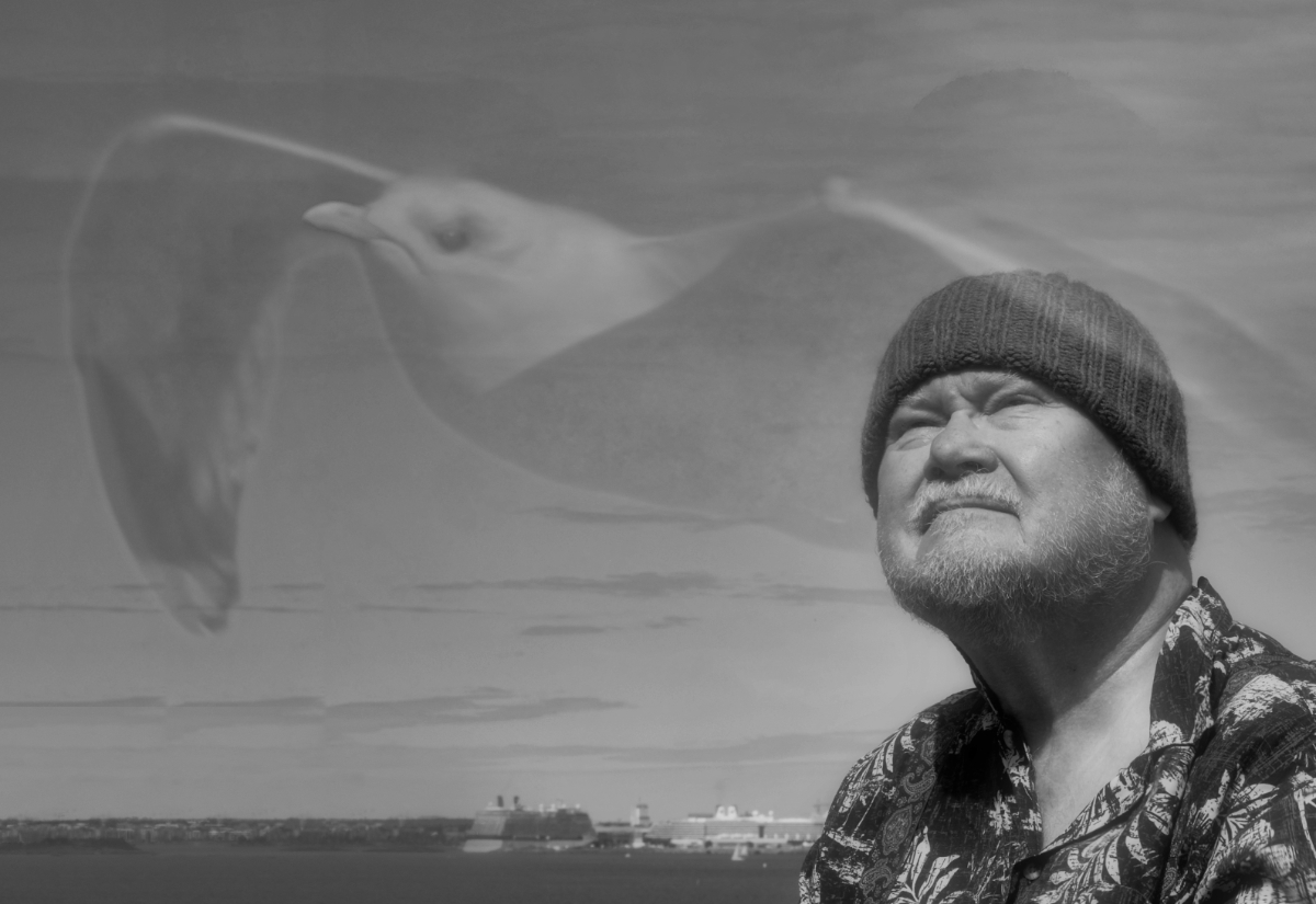
Your husband has the perfect expression on his face - straining to see, dissatisfied, and perhaps regretful. I think you've got the bird at the perfect opacity - I know exactly what it is but it doesn't obscure the sailor or the background. I really like how the bird is determinedly flying away, with an apparent frown that echoes the frown on the man's face.
About whether to flip the image - I think it works either way. I have a slight preference for the way you have it.
I really like this in b&w. I wonder if a warmer tone might be a little closer to the emotional tone. Posted: 11/08/2023 20:49:05
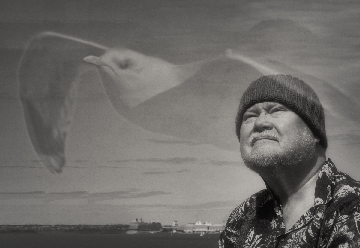
The inclusion of the seagull works well, and the opacity level is just right, creating the impression of a free soul living in the sailor's memories.
My only suggestion is to consider removing the shadow of the hat over the sailor's head, as it could be mistaken for a double wing of the bird. Posted: 11/18/2023 04:43:42