Kirsti Näntö-Salonen
September 2023 - The Portal
Original
Original 2
Original 3
About the Image(s)
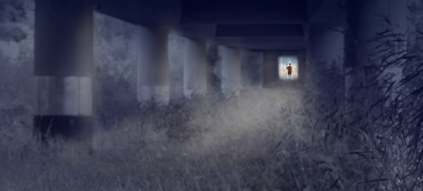
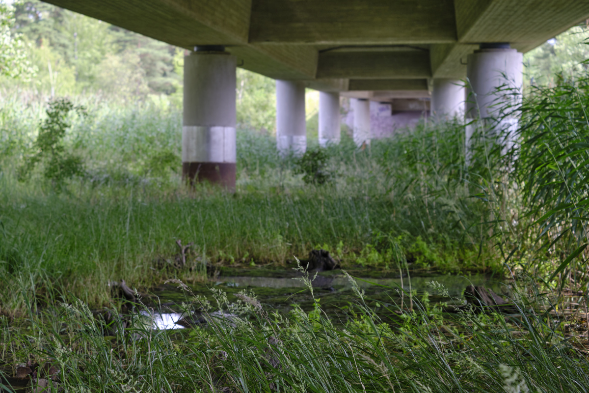
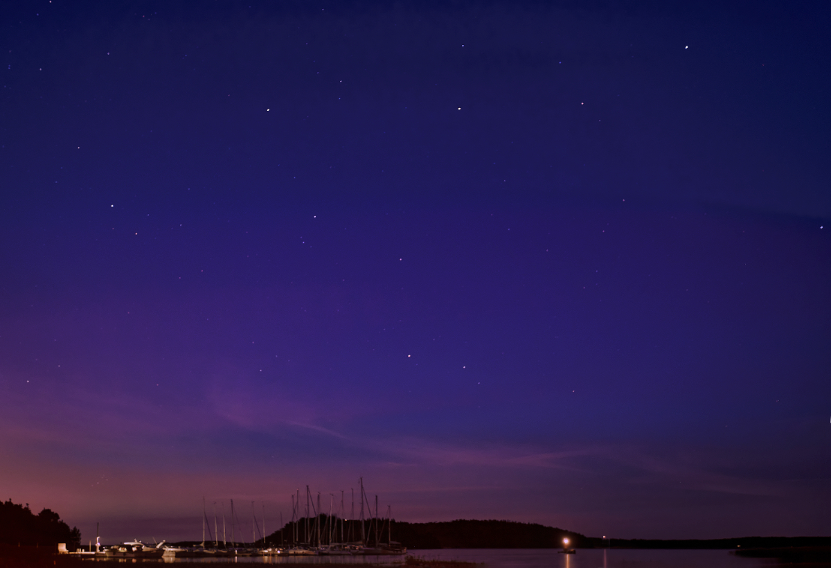
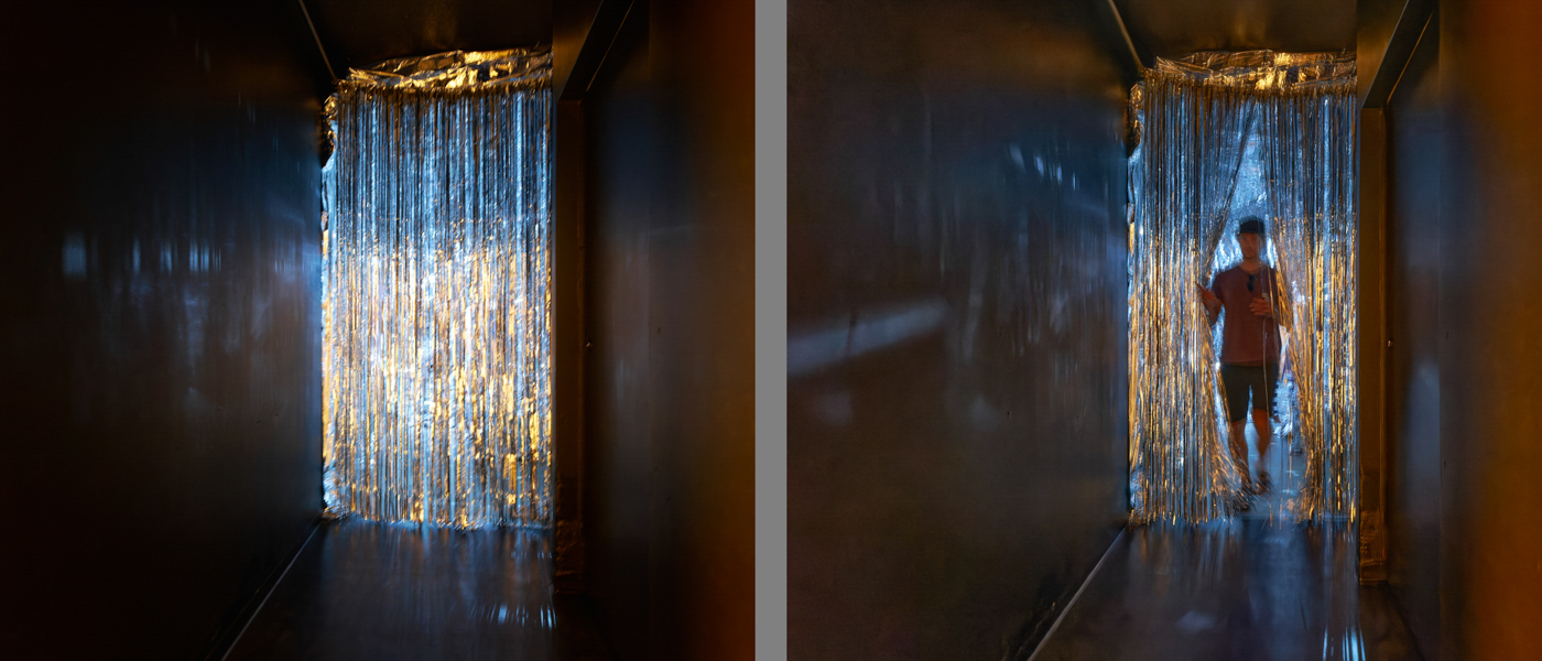
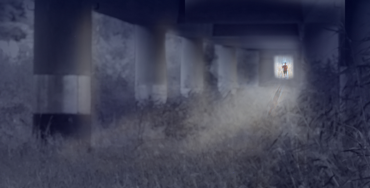
I started to dream about ââ¬The Portalâ⬠under the bridge (Orig. 1) with the lovely light and shadows on the pillars, and the black pool of water in the foreground. However, my narrow depth of field did not work at all, and the scene looked busy and cluttered with the partially blurred reeds and grass stalks in the background. I ended up with using only the out-of-focus part of the image, and turned it into black-and-white. The color comes from an overlay of a night sky image (Orig.2). I thought that the pinpricks of stars would make a nice addition but decided to remove them in the final version. The portal and the figure passing through (Orig. 3 and 4) are from an art exhibition. - I think that the project became more of an exercise about lighting and perspective, and look forward to your comments and advice. There is the daylight (moonlight) falling on the pillars from the sides of the bridge, and the light that radiates from the alternate universe through the portal. Should the latter have a different tint?
This round’s discussion is now closed!
14 comments posted
I love how everything is moonlight purple except the person and their portal. I think the light shining through the door, highlighting the mist, works really well. Those columns lead my eye right to the bright door.
It's a little confusing to me that the person is so clearly in focus, given the softness of most of the rest of the scene.
I might try adding a little fog and a shadow in front of the person. I cropped it a bit too, because I like the strangeness of the night world being in soft focus.
What do you think? Posted: 09/11/2023 16:30:52
Hi Kirsti,
You did it again, creating another wonderful story.
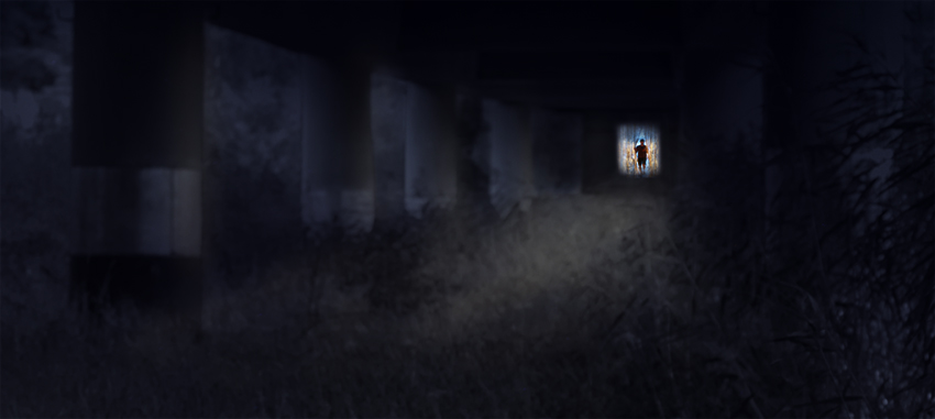
I really like the softness of the light and color in this scene. The composition leads the eye directly to the portal and the figure at the end. I really like Peggy's suggestions about adding shadow and a bit of fog.
the Peggy's suggestions about adding shadow and a bit of fog.
Posted: 09/15/2023 22:38:57
And then we are jolted back to reality by the sharp figure in the opening. Well done. Posted: 09/16/2023 16:26:15
(Groups 41 & 44 & 46)