Alan Kaplan

September 2023 - Prodigal Son
Original
Original 2

Original 3
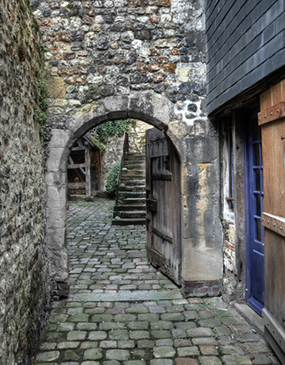
About the Image(s)
This is basically a cut and paste image. Each of the people in this image were moved
from their original photo using Photoshop’s Select > Subject tool (in options bar across the top). The Levels Adjustment layer darkened large areas that I felt needed darkening.
I tried to place a closed door under the arch and eliminate the garden, but I found I liked having the depth the open door provided. I also tried placing the prodigal son in the center of the image, but he blocked the depth I liked. In addition, having him against the wall provides a bit of disequilibrium.
This round’s discussion is now closed!
9 comments posted
Hi Alan, I think that the characters are just perfect for the story, the gentle-looking father who is in for a surprise, and the wayward son hesitating to make the contact. His posture shows that he is a little ashamed, and his clothing tells that he has been down and out. I think that much of the tension in the image is built by the placement of the son - it is like looking at the moment just before the father notices him, drops the umbrella and opens his arms for a hug. I am glad that you left the door open: the view into the garden really adds to the sense of depth. Posted: 09/07/2023 09:49:35
Thank you for your kind words and for noticing the son's posture and clothes. Sadly, I find subtlety is becoming a lost art. Posted: 09/16/2023 08:59:20
This is a wonderful reinvention of a classic story, Alan.
I love the way you've added green to the pavers and brightened the green beyond the gate. It helps camouflage the son as well as giving a feeling of hope and new beginnings. I think your placement of the father and son works really well, especially with the arch of the open gate yawning between them. The height of the wall above the gate emphasizes the space between them for me.
I think the staircase beyond the gate adds an important element, again giving a feeling of hope.
In short, I like everything about this image. Well done, Alan! Posted: 09/12/2023 15:42:49
This is one of my favorite composites, partly because of the colors which I had nothing to do with. Thank you for such positive feedback. Posted: 09/16/2023 09:01:25
Alan, I agree with the others, this has a beautiful balance and tells a great story. On my first view I was a little bothered by the size of the son as he seems to be an adult and seems a little short relative to his father who is further away but I'm not 100% sure of this. Would be interesting to play with size to see how it effects the overall feel of the image (I suspect you've already done that and settled on these proportions which work) Posted: 09/15/2023 17:22:26
Thank you for our feedback. The story of the prodigal son is one in which a teenager/young man argues with his father, leaves the home, and returns, wiser, as a man to seek forgiveness. This explains the size of the son as I saw it. Posted: 09/16/2023 09:06:25
Hi Alan,
This is a great image and it conveys a lot about the feelings of these two characters: the father at the door and the son somewhat hidden, creating anticipation about what will happen next. My only suggestion is to darken the area around the boy who is facing the wall to enhance the feeling that he is a bit concealed from his father's view.
Posted: 09/15/2023 23:06:33
I'm glad you like the composite. As I explained to Kristi, I feel that subtlety is a lost art. So is anticipation, which helps create tension. I'm happy you saw the anticioation. I don't see the son as facing the wall. To me, he is looking in the direction of his father. Posted: 09/16/2023 09:11:12
Another beautiful image telling a wonderful story. I find the light too uniform for the entire image. Perhaps some of the tiles should be darker. Like under the arch.
I really like the colors on the tiles. Posted: 09/16/2023 16:06:30
I really like the colors on the tiles. Posted: 09/16/2023 16:06:30