Kirsti Näntö-Salonen
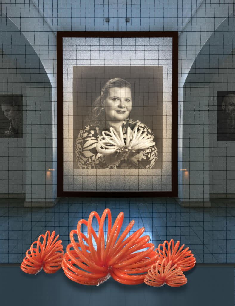
October 2026 - Museum Visit
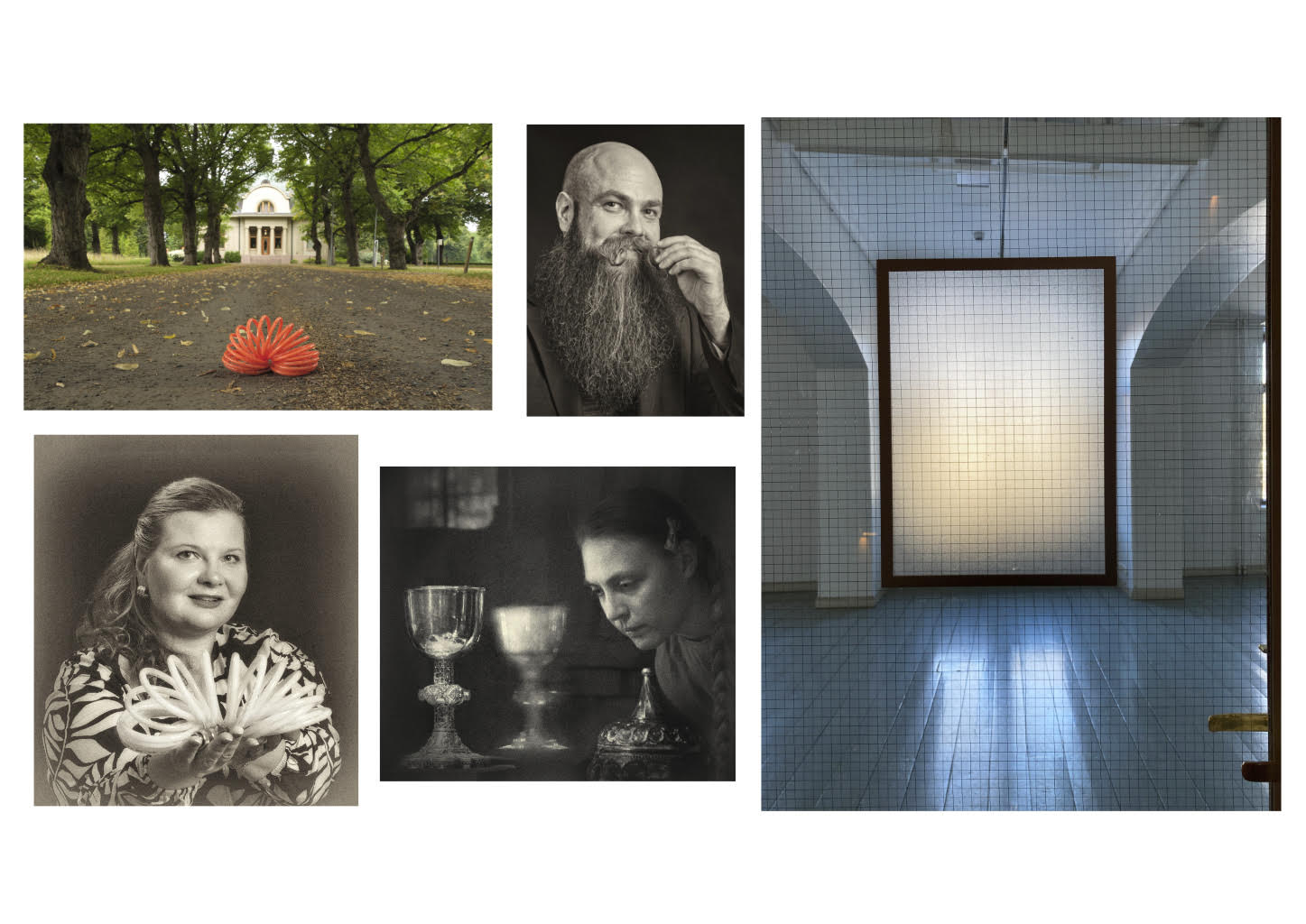
Original
About the Image(s)
Here is ”Museum Visit”. It is an episode of a saga that seems to be growing round the orange compressor cord (Orig. 1) that served as a very versatile prop at the portrait workshop I participated last summer. The center portrait (Orig. 2) is from the workshop. - I started with the background (Orig. 3), an iPhone image of a gallery through a glass door with an embedded wire net. I corrected the perspective, flipped the image horizontally and pasted one half of the mirror image on the original to keep things simpler. As I could not get rid of the grid, I decided to make it a safety barrier between the imaginary exhibition area and the audience. I added a narrow fill layer with the color picked from the gallery floor on the bottom part of the image to serve as the floor, and copied the baseboard from the back wall and pasted it on the junction. I pasted Orig. 2 on the big central frame in full opacity and Normal blend mode, and the two other portraits (Orig. 5 and 6) on the walls of the side rooms. I added a duplicate layer of the background in Normal blend mode in 35% opacity to put the portraits behind the grid. Then I cut out my orange cord from Orig.1 and pasted four copies on the top layer in different sizes. I used the Mesh Warp tool to tweak their forms a little. - I thought that the light comes partially from the illuminated center frame and partially from a window in the roof, and used a soft Dodge brush to continue the lighter area on the gallery side of the floor. I added Outer Shadow layer effects on the coils in Soft Light blend mode in 25 - 50 % opacities and darkened their middle parts slightly with a soft burn brush. The top layer is Average Blur in 10% opacity in Soft Light blend mode. - I am afraid that my coils still look pasted on? What do you think of the little lights on the columns and the fixtures on the roof? I could not decide if they are unnecessary clutter or if they add to the illusion of a real gallery space.
Here is the workshop model?s (Orig. 2) information that I am supposed to share when I use her image: https://www.instagram.com/elinann1ka/
4 comments posted
Your attention to detail in this image is remarkable! The composition is so strong on its own that I agree the compressor hoses, fixtures, and side lights are unnecessary distractions. What impresses me most is the lighting on the portraits-it's so well executed and believable. Nice work! Posted: 10/09/2026 00:54:39