Matt Conti
July 2025 - Miami Vibes
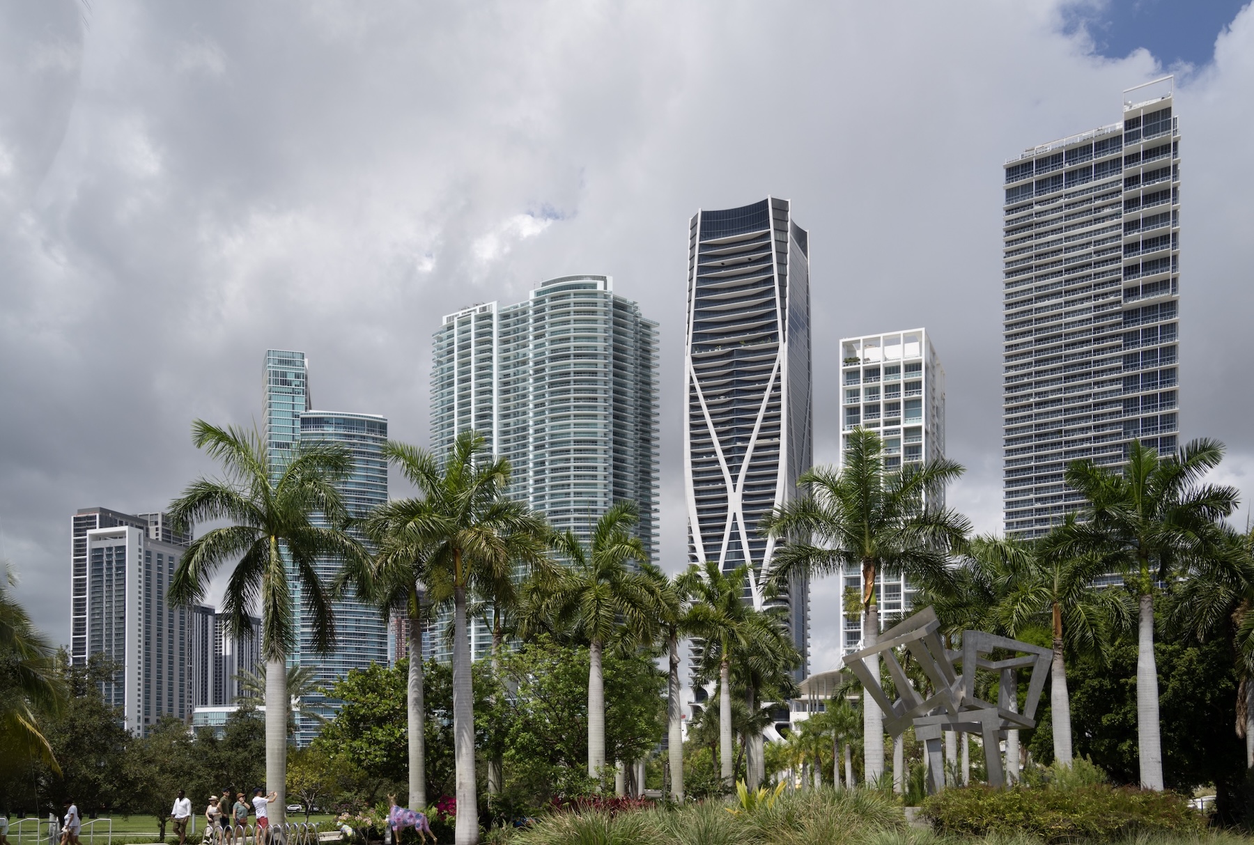
Original
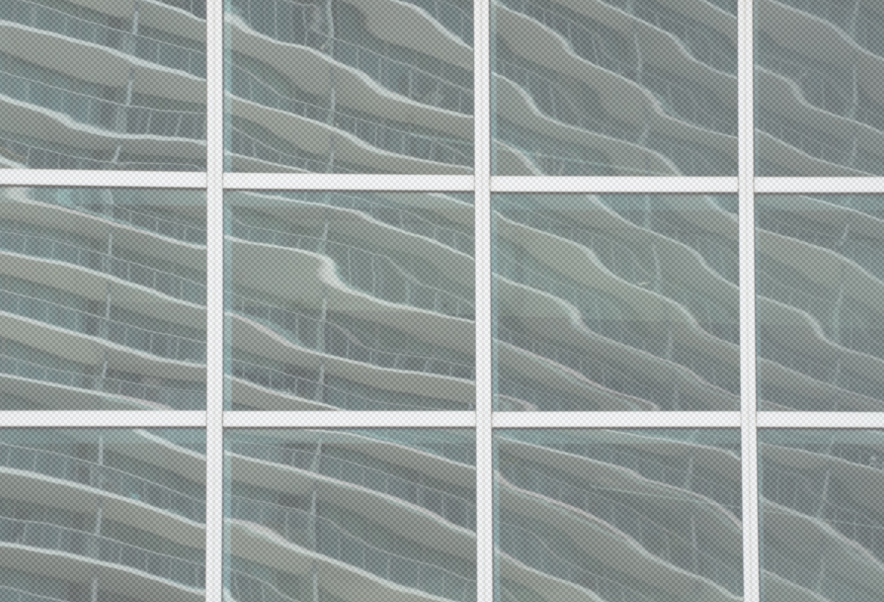
Original 2
About the Image(s)
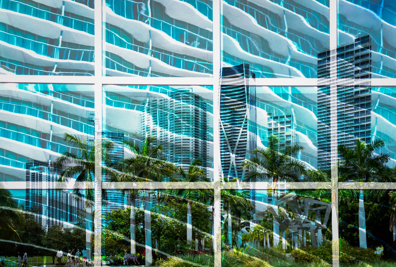
Few cities have changed in the last 10-15 years as has Miami, Florida. In a recent visit, the skyline continues to grow, including the Biscayne Blvd section shown here. The city is now largely neighborhoods of glass and metal high rise buildings. With that, the city still has that tropical palm-tree vibe that I tried to capture by overlaying the wavy building architecture and then add a teal layer to interest with the white and grey of the cityscape.
9 comments posted
You have the height of a large American city in the skyscrapers, the heat of Miami in the rippling reflection, the flora of the tropics with the palm trees, the compression of space in the window frames in the foreground, and the pace of a large city with the vibrant blue and green. All of this is woven together in a way that the final composite is easy on the eye. Nice work. Posted: 07/04/2025 18:12:57
Thank you for your kind thoughts, Alan. --Matt Posted: 07/13/2025 20:52:33
I can really feel the Miami vibes here! I love the color - it makes the wavy lines feel like water for me. The wavy lines also feel like the image is shimmering in the heat. The palm trees really pop, with their color standing out from the high rise buildings.
I think the white grid works well; it feels to me as if we need the reinforcement to contain all the energy and excitement on the other side.
The reduced opacity of the white grid towards the bottom is clearly intentional, but for me it's a little distracting. Personally, I'd consider keeping the grid opaque. But that's a personal preference. Posted: 07/07/2025 15:47:30
Appreciate your idea to refine the white grid, Peggy. I think that will make it more impactful. Thanks also for your comments. --Matt Posted: 07/13/2025 20:51:23
Hi Matt, I have visited Miami once many years ago, and this is very much like the impression the city left on my mind. The image is like seeing it all through sunlit turquoise water that you conjured up with the colors and the wavy reflections. I like the severe grid that holds everything together. - I wonder if keeping the grid layer on top of everything, pure white, might work. I think that it might add to the sense of depth, and maybe add a pop art type flavor? Posted: 07/07/2025 17:46:41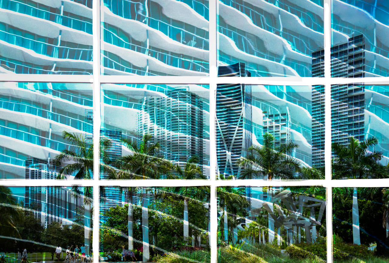
I agree with you, cleaning up the white grid makes for a better image. Thank you for that, and your thoughtful comments. --Matt Posted: 07/13/2025 20:49:58
Matt, I haven't been to Miami in 40 years, your image and description has peaked my curiosity on the current look. I also like your composite and can think Peggy and Kirsti's handling have a different and also interesting vibe. Posted: 07/12/2025 21:05:31
Hi Matt,
I love the colours and the graphic design in your image. The grid,like frame sets the scene beautifully, and the diagonal lines introduce a sense of movement that makes the image very appealing to the viewer.
I have just one suggestion that, in my opinion, could enhance the image: consider clearing the white lines of the window, as they currently retain some details of the vegetation and buildings behind them.
You've composed a lovely image that truly makes me feel like I'm enjoying the city and the tropical weather.
Posted: 07/13/2025 18:55:42
That's a great suggestion Maria to refine the white lines. And, I appreciate your kind words. --Matt Posted: 07/13/2025 20:48:03