Maria Mazo, PPSA
March 2025 - Dancing
Original
About the Image(s)
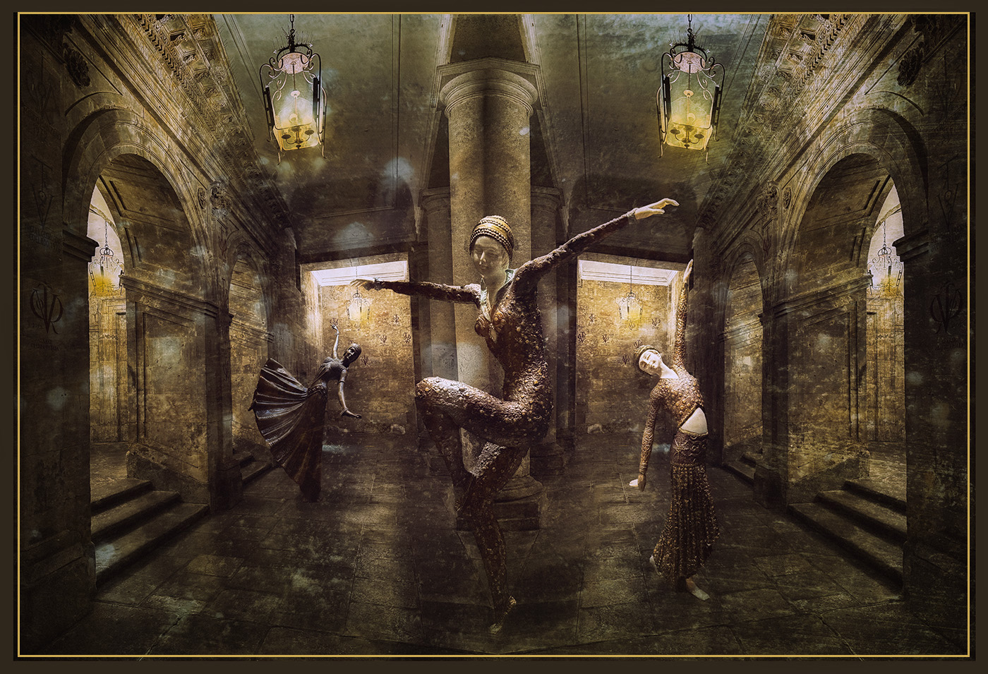
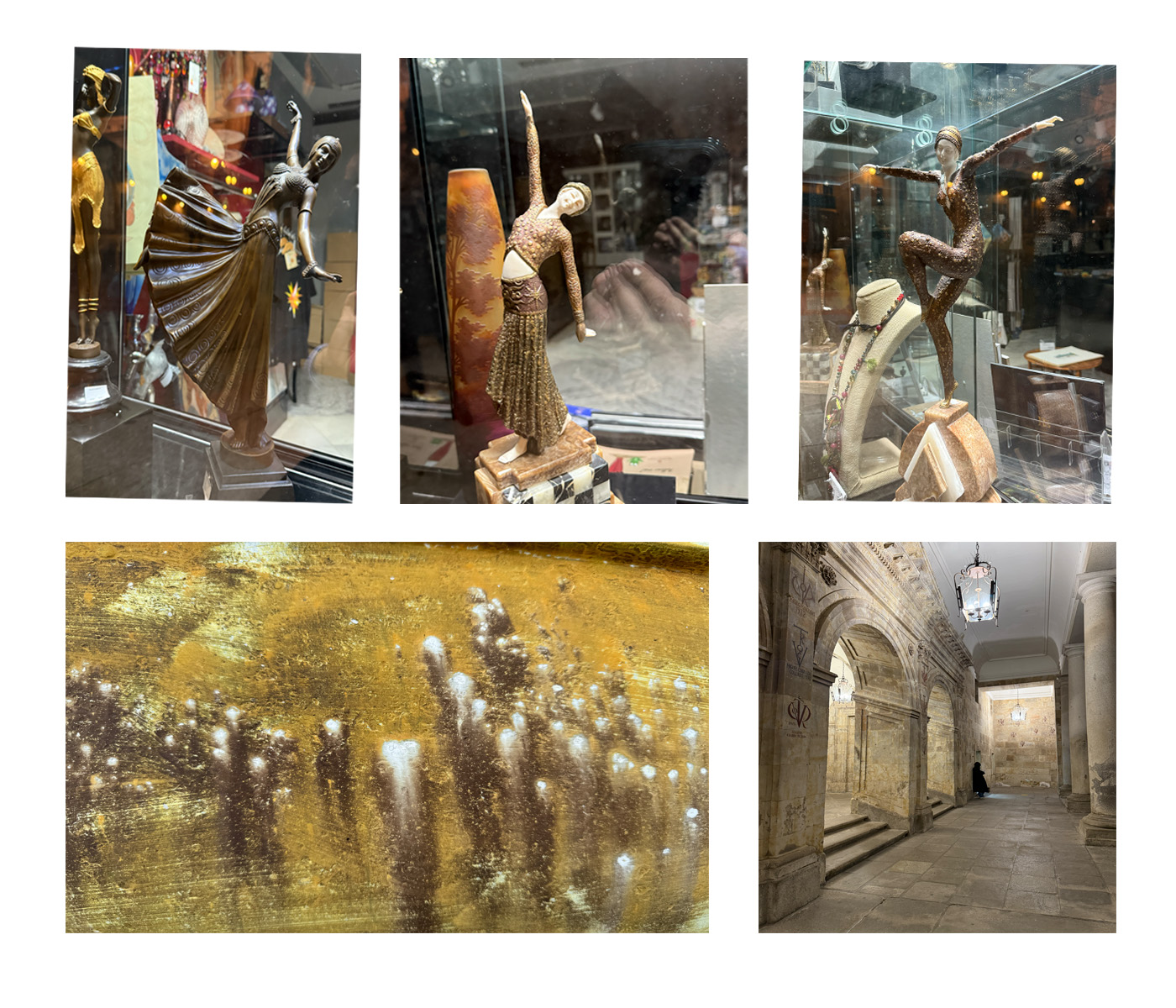
For this month's image, I created this composition. As the background, I used a shot from a recent weekend trip to Salamanca, a beautiful and monumental city. I mirrored the image to expand the background and create the scene.
Then, I selected three dancers that I photographed in a shop window in Salamanca. Using the transform tool, I positioned them in the scene, cleaned up some edges, and added shadows beneath their feet to ground them in the composition.
To unify the elements, I applied a texture layer??”a photo of boat paint I came across while my husband was buying wood at a nearby hardware store.
I then opened the image in Camera Raw to adjust the light and shadows. After that, I used Nik Efex to apply a vignette and a stylized filter, reducing their effects by lowering the opacity of the layer. Finally, I painted a yellow tint over the lights to enhance their warmth and luminosity.
This round’s discussion is now closed!
10 comments posted
Thank you and your wife for such a nice comment! When I saw these little sculptures in a shop window, they immediately caught my attention. I quickly took some shots because I knew they would make a great subject for a future composite. Posted: 03/12/2025 13:04:19
Thank you for your comment and suggestion. I agree with you that lighting the dancer could improve the overall impact of the image. It looks fine on my monitor, but I think that's because its luminosity is a bit high. Posted: 03/12/2025 13:07:39
Thanks for your comment and suggestion. While I was positioning the dancers, I struggled with their sizes and perspective. I wanted to make them as realistic as possible, but now I agree that making this one a bit bigger would help achieve more consistency. Posted: 03/12/2025 13:11:10
As always, our eyes are drawn to the brightest part of an image which are those white panels in the back. I don't mind it since it brought me to the back of the perspective, maybe something to think about. Overall, just terrific, congratulations Maria! Posted: 03/10/2025 07:22:40
Thank you for your kind comment! I'm glad you like it. I agree with you that areas with more luminosity or contrast act like magnets for our eyes, drawing attention away from the main subject of the scene. I will revise the luminosity in those areas. Posted: 03/12/2025 13:14:28
The brown border is effective when the image is on a light background, but I didn't even notice it against the black background on this page. You might consider adding a stroke outside it, or perhaps inside it.
Posted: 03/19/2025 16:42:23