Kirsti Näntö-Salonen
February 2025 - Reception Committee
Original
Original 2
Original 3
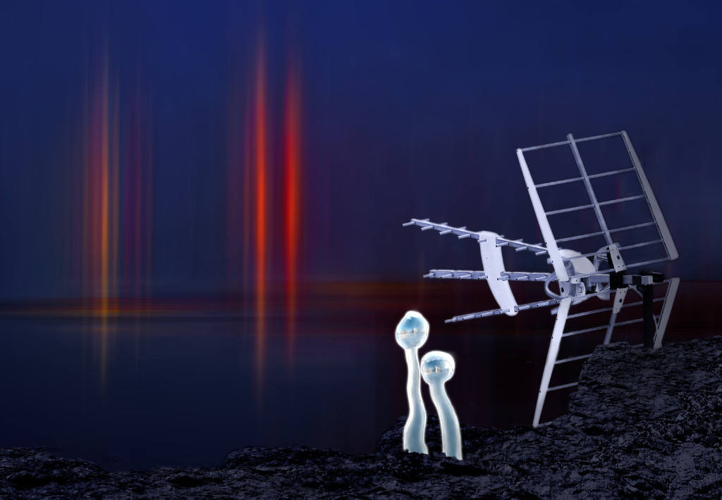
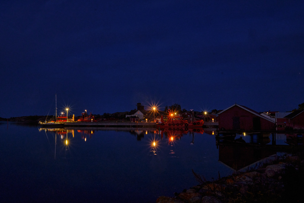
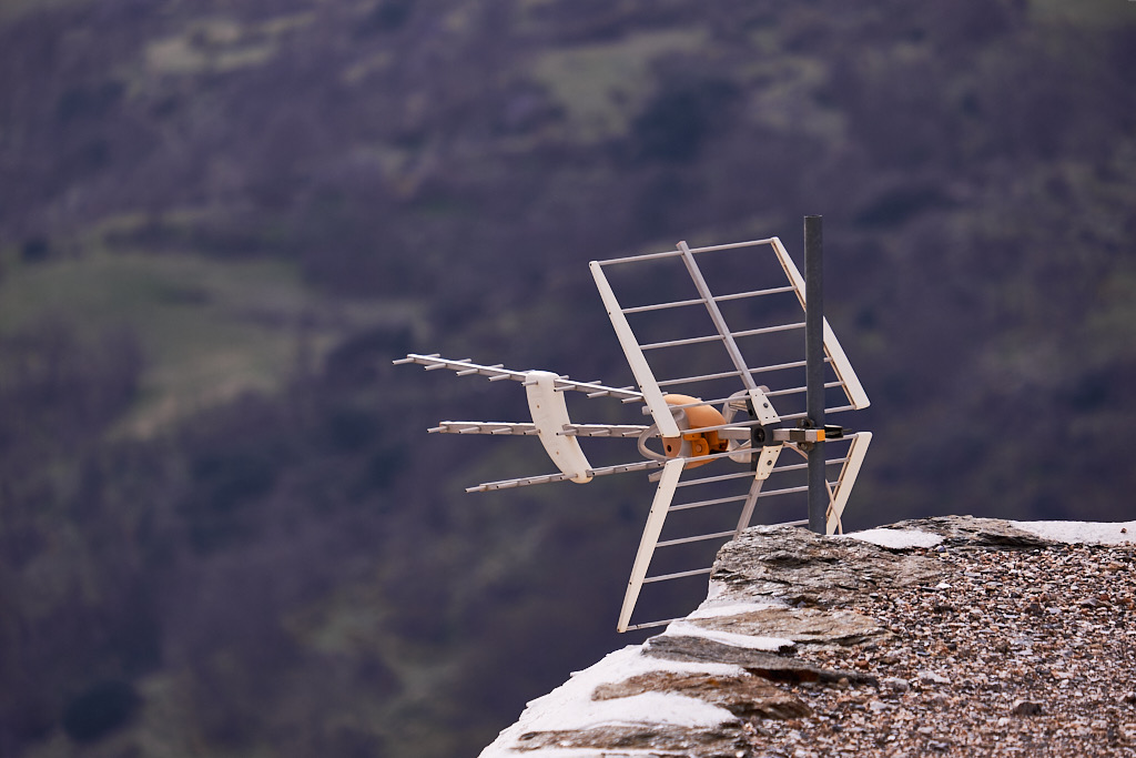
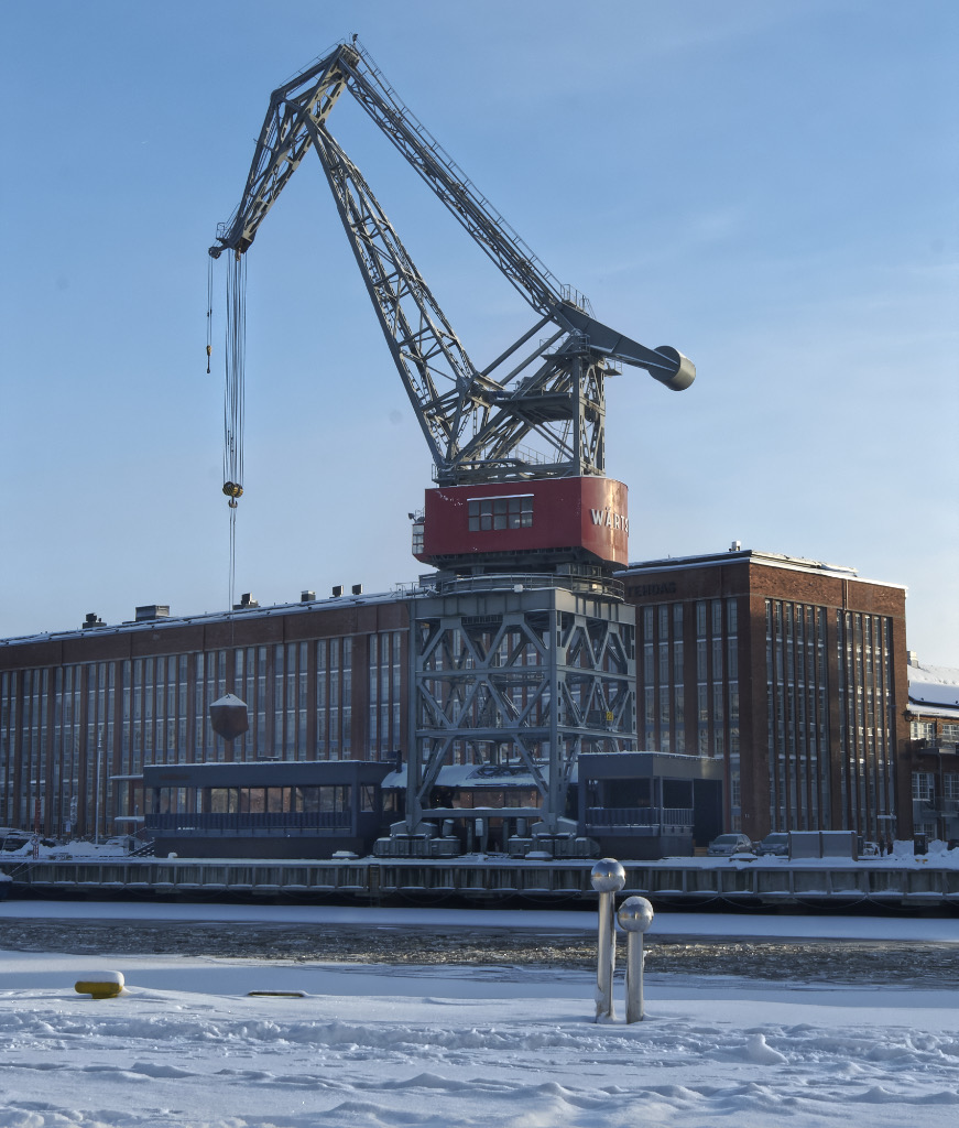
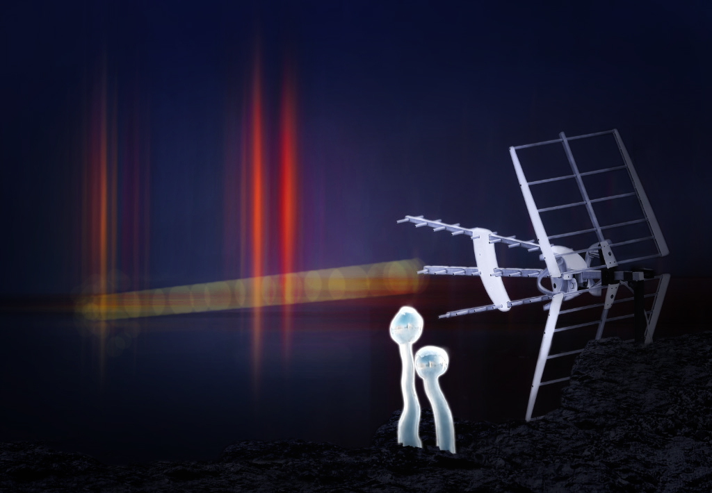
About the Image(s)
Here is ”Reception Committee”. This one started with motion blur experiments, including an attack on a nightscape of a tiny harbor (Orig. 1). The background consists of three layers of the image: two layers with vertical motion blur upon each other in Color Dodge blend mode (that for some reason seemed to infensify the reds and yellows?) On top of them is a layer with horizontal motion blur, erased partially to reveal the vertical streaks, that forms a line for the horizon. At this point, it started to look like something extraterrestrial was trying to approach from the sea, so I added a beacon (Orig. 2) and a pair of Aliens (Orig.3) to meet them . The beacon was converted to B&W with a bluish tint. I shaped the Aliens with the Affinity Liquify tools and treated them with both Inner and Outer Glow. The rocky shore was constructed by cloning bits from the base of the antenna, and finished with a texture brush, but I think that it looks quite clumsy. - I tried to bind everything together with an Average Blur layer and by adding shadows. I tried to give the Aliens a halo, or a pool of light to stand in, but could not make that work, and I am afraid that their coloring is not quite right, either. I am again very much looking forward to all your ideas.
14 comments posted
1. To connect the explosions with the aerial I have added a ray. Method - new blank layer>blend color dodge> select color of choice> set to 4% opacity with hard brush paint between the subjects in straight lines until happy. Then paint single blob at 9% opc down the line to give interuptions in the ray.
2. Using NIKS EFFECTS ADD glamour glow and selective vignette on subjects and close rest of the image into darkness. This softens and brightens and also hides some of the bits that were frustrating you.
Thats it. Please ignore if you think I have lost the plot. Me thinks this a good sfi image. Cheers Bruce Posted: 02/11/2025 14:13:53
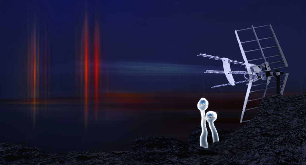
I think Bruce's version with the beam defined more clearly really tells the story.
I don't have any useful suggestions, but I do really enjoy this image. Posted: 02/14/2025 18:00:31
I agree with Bruce's suggestion about the beam; it completes the story so well. I also prefer the panoramic format, as I believe it suits the scene better. Posted: 02/21/2025 18:16:04
Posted: 02/21/2025 19:20:36