Maria Mazo, PPSA
About the Image(s)
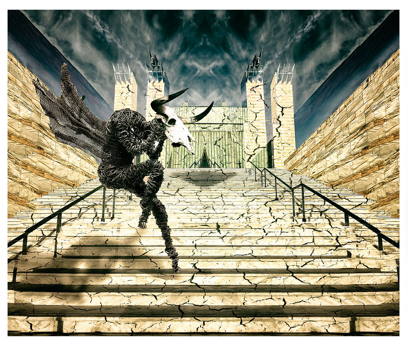
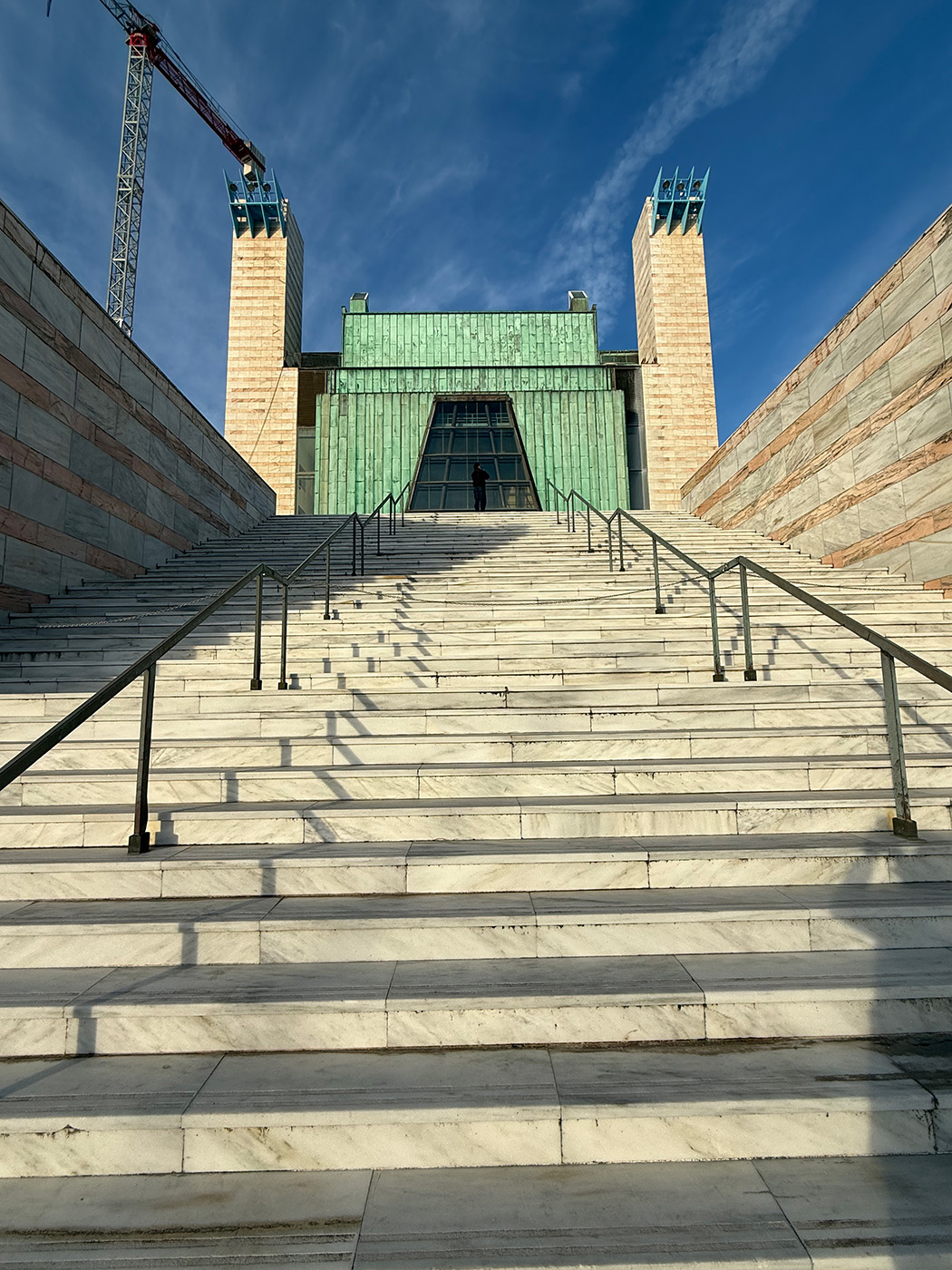
For this month's image, I’ve put together some shots taken with my phone over the last month. As the base layer, I chose an image of the Palacio de Festivales in Santander. I duplicated and mirrored it to create a symmetrical view of the building.
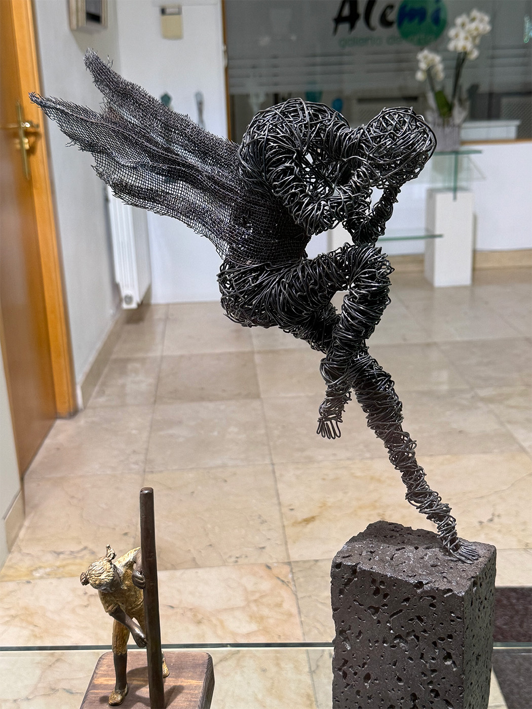
Next, I added an image of a fallen angel sculpture I spotted in a shop window. I created the shadow by duplicating the figure, flipping it downward, and transforming it. I finished this effect with a layer of Gaussian blur to soften the shadow.
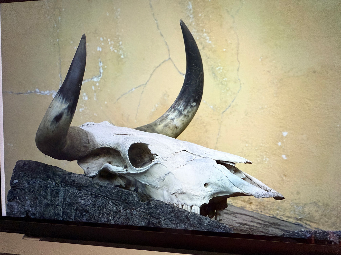
I also added a texture layer to create the cracks on the building and stairs. To complete the scene, I included an image of a cow’s skull.
Finally, I applied a Nik Analog Efex Pro filter to give the image a more dramatic look and added a vignette effect.
13 comments posted
I like the sky but it seems a bit artificial which is odd to say in a scene like this one. Maybe it's the transition from the smooth sides to the top.
Overall, you've created a fantasy masterpiece! Posted: 01/09/2025 17:43:00
Thank you for your kind comment. I agree with you that some areas of the sky could be improved to create a more refined version. I'll take another look and see what I can do.
Posted: 01/20/2025 13:00:48
Thank you for your kind comment. I was struggling with another image that had a completely different story, so I decided to start fresh with entirely different files. From there, the path became much clearer, and I ended up finalising with this image.
Posted: 01/20/2025 13:05:04
I really like how you kept the triangle of shadow at the top of the stairs, and how it leads into the shadowy triangular entrance.
All of your elements are beautifully integrated.
My one suggestion would be that you might consider doing a levels correction. Posted: 01/12/2025 19:02:23
Hi Peggy,
Thank you for your kind comment. I agree, a level correction really enhances the image beautifully.
Posted: 01/20/2025 13:07:00
Composition wise is very good, nice placements and details.
The cracked stairs are a good addition.
However the railings are a distraction and clutter, also their shadows are at conflicting with the angel's.
I am also confused with the side bits of sky above the walls.
The verticals are all bang on, the mirrored sky is a nice touch. In summary great composite, story, colour, lighting, interest. Maybe loose the railings and shadows ? Posted: 01/13/2025 17:09:18
Thank you for your thoughtful comment. You always have a keen eye for detail and offer the perfect suggestions for improvement. I agree that the sky could use a bit more work-it currently has a noticeable mirror symmetry that could easily be removed. I also agree that the mirror rail shadow creates a conflict with the direction of the overall shadows in the image.
Posted: 01/20/2025 13:14:19
Thank you for your lovely comment. I'm glad you like the symmetry effect in the image! I agree with the overall feedback that the sky could benefit from some improvement. I also see the point about the rail shadow-it could introduce some confusion with the natural light. However, these images are meant to be imaginative, and I think they can carry a touch of unreality.
Posted: 01/20/2025 13:18:48
Thank you for your nice comment. I completely agree with everyone about the sky, but as you pointed out, what I really liked was the effect the clouds created-it gives the impression of a face looking at the fallen angel. Posted: 01/20/2025 13:32:15


