Bruce Harley, EPSA
About the Image(s)
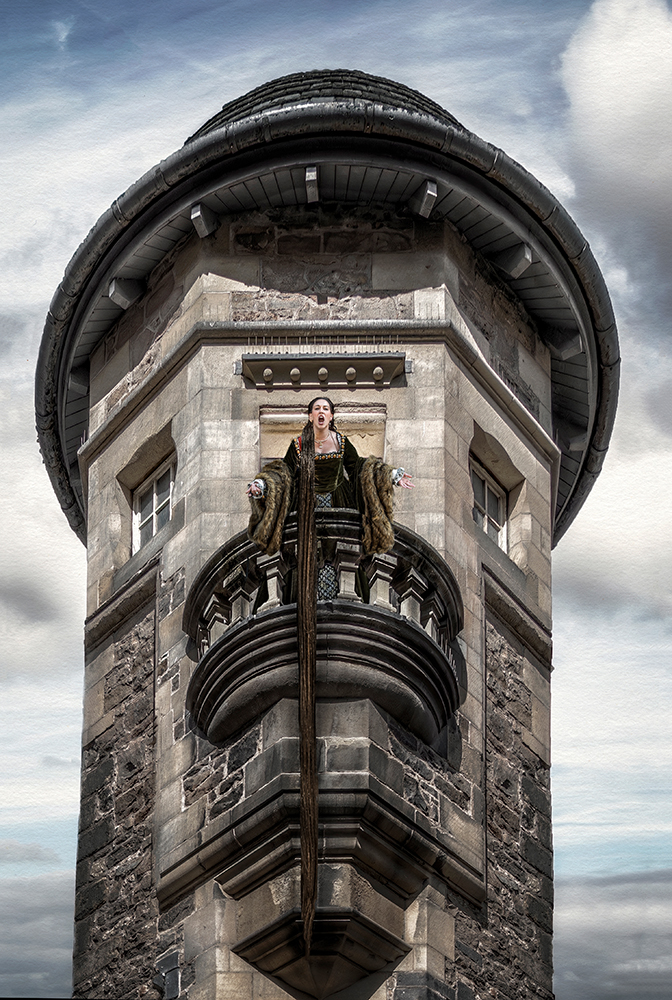
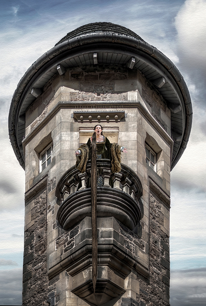
From the famous Shakespeare romantic novel. Brand new, just created over the holidays.
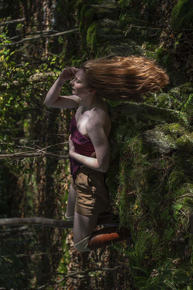
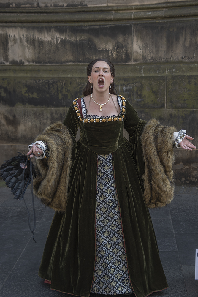
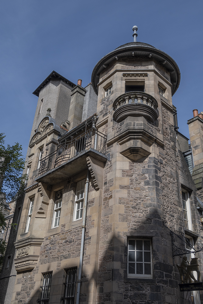
Composite of background, subject and hair extension.
Build process.
Found this lady singing and performing in Edinburgh on the street. Very regal so it set me off looking for a background of a castle.. at first.
I then found the Turret in my library of Pics, and began to imagine Romeo and Juliet, and how feasible it would be. A great story for a photograph.
Then I needed hair for Romeo to climb up to her with. This I found in my library of assets in amongst the model section. The model and I were trying to create the "Wind in the Hair" image that never came off.
I cut a section of hair out and formed it into the shape by WARPING in PS.
Took a new blank page in PS.
Pasted on the background and transformed it using free transform tools in PS. (To get the right attitude and POV) Used blur to send the background further out of focus, but retained the front of the balcony in focus.
Pasted in the subject onto the balcony and blended her into the stonework, transformed her attitude and POV to match the background.
Enhanced the joins between the subject and the background with light, colour, and blur to make it look holistic.
Pasted in the hair and using transform warped the hair into position.
Worked on the whole composite to create the look and feel of an old master. Ie. Applied one of my textures to give a painterly effect, and aged it, while still retaining the sharpness and crispness of modern photography.
Finally checked levels and curves to make sure light, colour and contrast were correct before saving away.
Has entered its first international competition today.
This round’s discussion is now closed!
9 comments posted
I noticed the line between the sky and the building on the left side is a bit skewed and not sure you did that intentionally (but w/o so on the right). The figurine's skin tone is quite pale, again perhaps intentionally. Overall, I really love it. Posted: 01/09/2025 15:22:18
The balcony frames her so nicely, and the sky provides an interesting frame for. the tower.
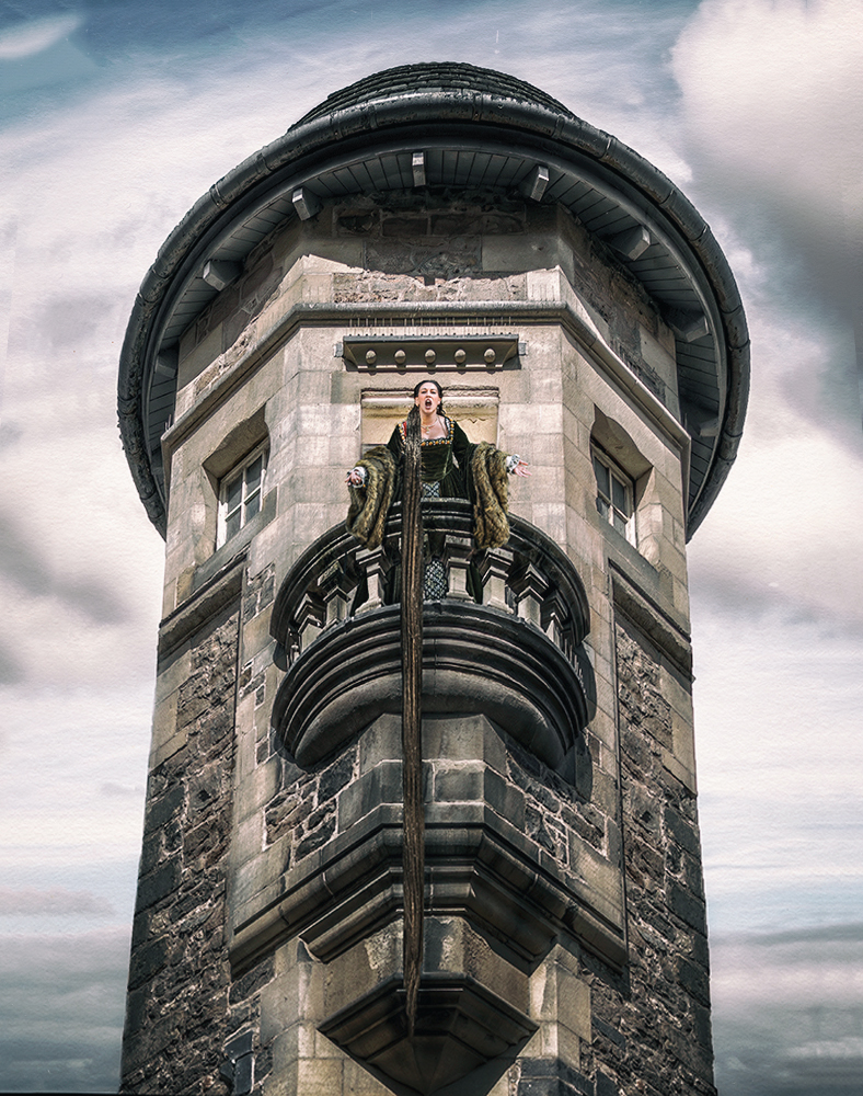
I really love her Rapunzel hair. It feels to me to be very similar in shade to parts of the tower. I shifted that a bit here by adding a B&w layer in luminosity mode, with the red and yellow sliders moved to the right, masking in her hair. Just a matter of taste. Posted: 01/12/2025 14:12:46
Your image tells a great story, and you've done a wonderful job putting all the elements together.
I agree with the other comments. For me, the hair gets a bit lost in the tower and isn't very noticeable at first glance. Peggy's editing definitely helps improve that.
I also feel the crop is a bit tight. I'm wondering if a little more space on the sides of the tower might enhance the overall composition.
Finally, one thing that seems a bit off to me is the perspective of the tower. It feels a little too straight. I know straight lines are essential in architectural shots, but the natural perspective of the human eye when looking up tends to make structures look wider at the base and narrower at the top.
Great work overall! Posted: 01/20/2025 05:39:32
