Kirsti Näntö-Salonen
January 2025 - Homecoming
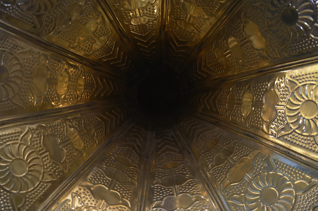
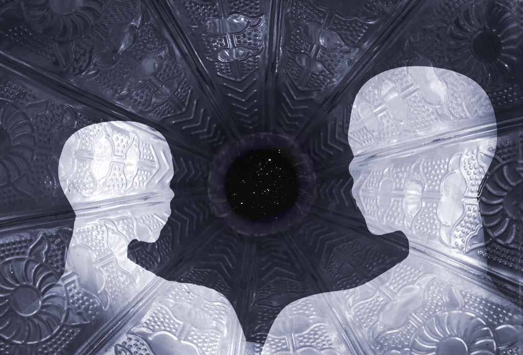
Original
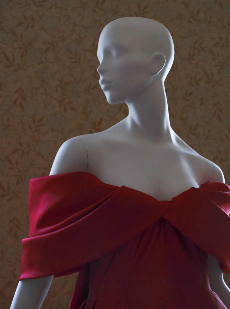
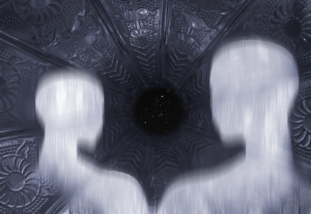
Original 2
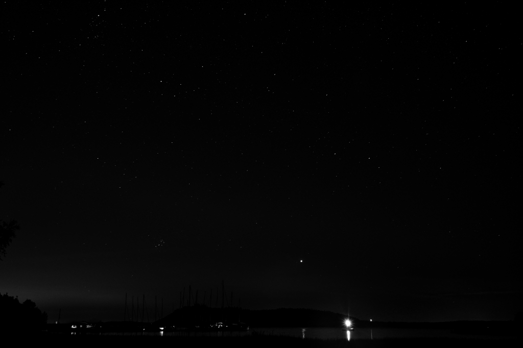
Original 3
About the Image(s)
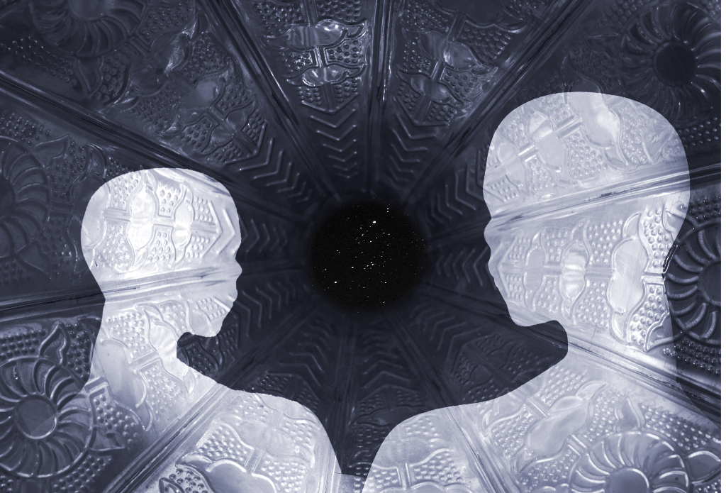
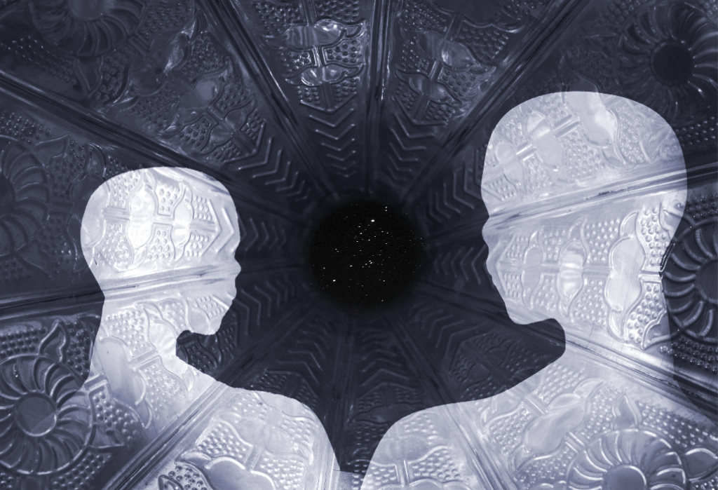
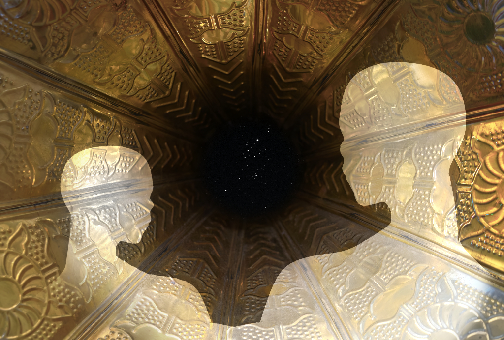
I started with the background that is the view inside the ornate horn of an antique gramophone (Orig.1). I had a vague idea of an opera-related scene, and pasted on the mannequin (Orig. 2). I added a Levels layer on her, and started to move her into the right spot, and then things got out of my hands. Accidentally, I grabbed only the Levels layer, and realized that I had created a movable transparent ghost whose tones I was able to freely adjust. I gave her a companion by flipping the image horizontally, and then cut off the original pixel layers. I added a starry sky at the end of the tunnel (how I wish I?d had one of Brad?s glorious Milky Ways). I quite liked the golden colors a lot but started to worry if the clear textures made the image too restless. I finally turned the lot into BW with a bluish moonlit tint.. - I?ll post the color version in as a comment. Which one do you prefer? I am so looking forward to all and any improvements.
Best wishes, and a wonderful New Year!
17 comments posted
I might have toned down the opacity of the background (or darkened it) within the 'ghosts' to emphasize them a bit more. Either way, it's a real pleasure to view. Posted: 01/08/2025 17:56:27
It is interesting to see the color version; my preference is your moonlight version.
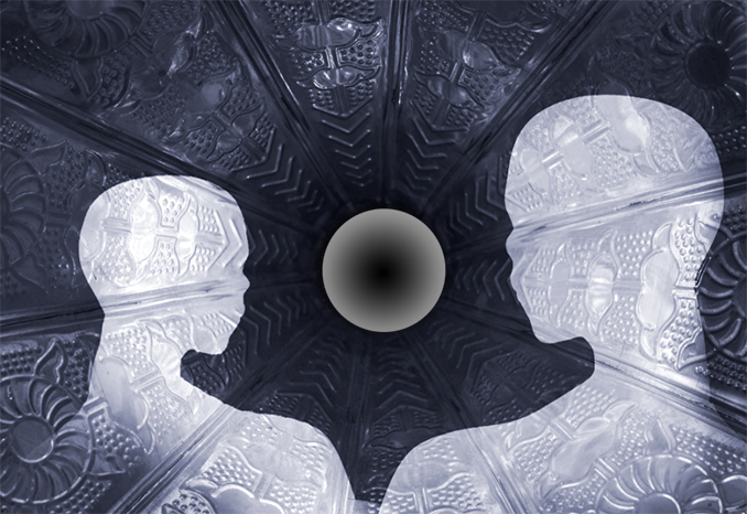
I really like the stars. It might be interesting to accentuate that opening. I did it here by copying one of the circular patterns from your gramophone (linear dodge/add mode at 16%, then removing the center). Posted: 01/12/2025 18:06:10
The ghosts for me let the side down, there is no form to them, they just look like cutouts. Ghosts are fuzzy creatures so I have done a mock up of what you could do. 1. Apply vertical motion blur to ghosts only (layer) Copy the base layer and motion blut that too only under the ghosts. The effect is more real I feel and has some form and shape albeit fuzzy, Cheers. Posted: 01/13/2025 16:35:13
I absolutely love the futuristic feel of this image! The use of the gramophone texture works so well, adding an intriguing point of interest to the background. The transparency of the mannequins creates a unique effect and complements the story, especially with the tunnel at the end.
I also really like Alan's suggestion to add the gradient-it gives me the impression of an interstellar planet or the moon. As for the "gosh," it feels more like inhabitants of other planets to me, but I also like Bruce's version where the "gosh" are left with a more blurred look.
Really great work! Posted: 01/20/2025 10:55:35