Peggy Nugent
About the Image(s)
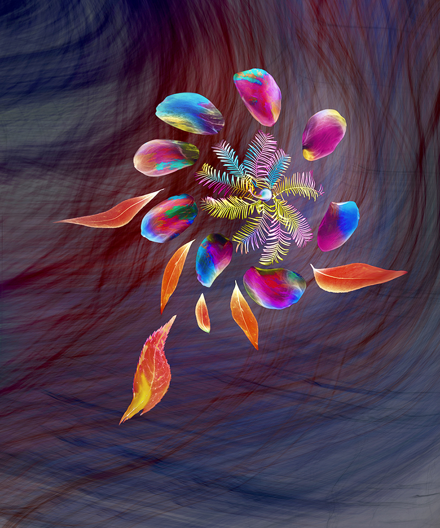
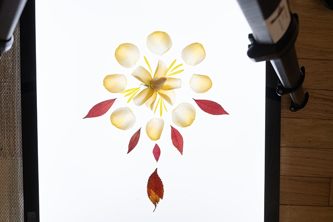
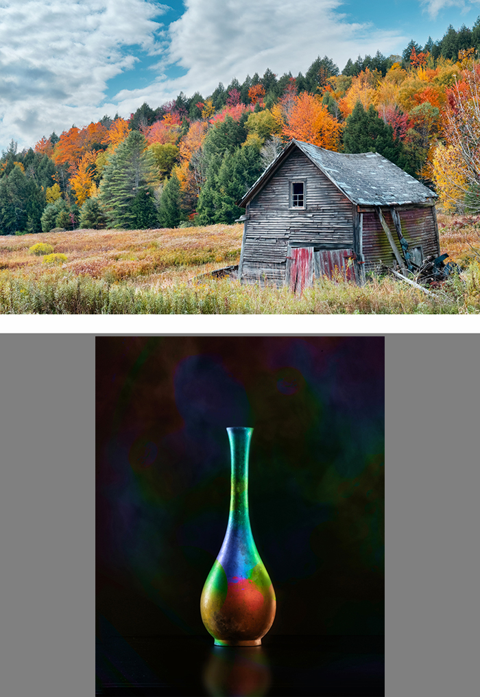
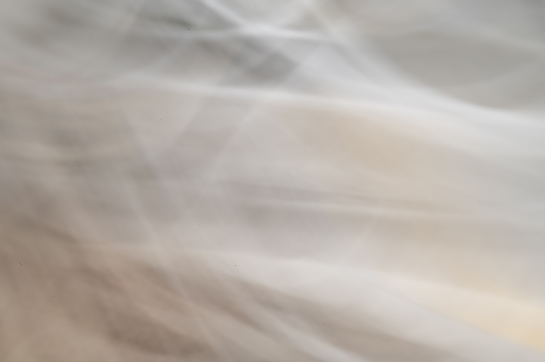
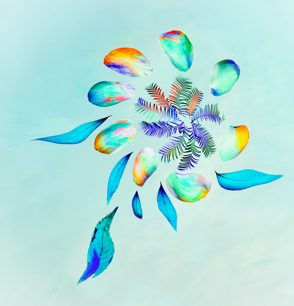
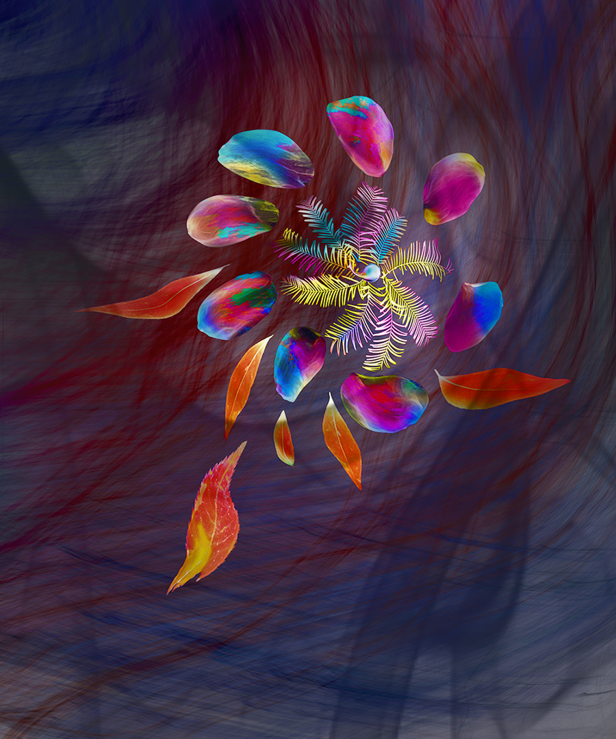
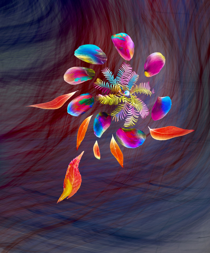
I started with a flat-lay shot of flower petals on a light box. I added the landscape shot in color mode to give some random color variety, then applied a hue/saturation layer to shift the colors. I applied distort=>twirl and tweaked the result with Liquify. I used the brown layer under the flower to add texture to the background. I needed a center for the flower head, so I shrunk a copy of the vase and used Liquify to make it fit. I then did a stamp copy of the layers and inverted it, and did a levels correction.
I like the idea but I think the background feels more 3D than the flower.
13 comments posted
Peggy, I think that it was a brilliant idea to use the landscape layer for the random colors. - The two versions represent totally different moods. The bright happy fairy flower in translucent rainbow colors is peacefully floating in the air. It may be tame but it is absolutely beautiful. However, I love the wild movement of the version with the background where you make the flower run in the storm - I wonder if it could use an additional texture layer on top for extra depth? To demonstrate the idea I added, in luminosity blend mode, a duplicated layer that I touched with a wide smoke brush in black. It gave random swirls that partly covered the flower. What do you think? - I am not totally sure if you need the center for the flower? Posted: 12/07/2024 09:42:01
Thanks, Kirsti!
I see what you mean, adding another texture on top does help unify the flower and the background. I think in this particular case I'd need to add shading and shadows to add dimension. You did make me think about what I could easily change, and I realized that less contrast in the background might help. Posted: 12/17/2024 13:27:45
I see what you mean, adding another texture on top does help unify the flower and the background. I think in this particular case I'd need to add shading and shadows to add dimension. You did make me think about what I could easily change, and I realized that less contrast in the background might help. Posted: 12/17/2024 13:27:45
Peggy, You always amaze me with how you create textures. This one is particularly impressive. The image is magical and feels complete how you've shared it. I prefer the final version over the second one you share. You could certainly pay with this endlessly but I find it a compelling image. Posted: 12/09/2024 02:51:58
Thanks very much, Brad! Posted: 12/17/2024 13:28:28
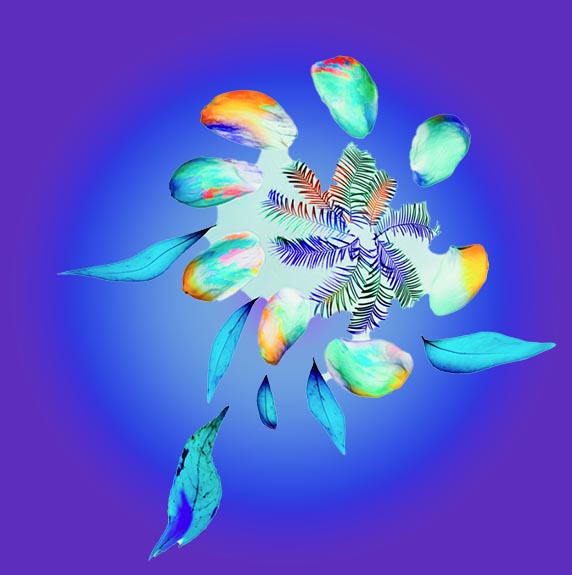
Your work with bright colors this past year has been quite eye-catching. This one has tremendous non-representational (it's not abstract art) value. However, I find the hair distracts from the beautiful arrangement of colors. I've separated the colors and have added a (rather weak) gradient as the background. I find Gradients can solve a lot of problems. In any case, the colorful array is top-notch. Posted: 12/11/2024 01:47:11
Thanks, Alan!
I haven't used a radial gradient before and now I'm wondering why. Your example shows how much it can enhance an image. It's definitely something I'm going to add to my toolbox.
Posted: 12/17/2024 13:51:09
I haven't used a radial gradient before and now I'm wondering why. Your example shows how much it can enhance an image. It's definitely something I'm going to add to my toolbox.
Posted: 12/17/2024 13:51:09
Find a tutorial because gradients can be frustrating. I'm currently working with gradients and love the potential. Good luck. Posted: 12/17/2024 22:44:32
A Fine Art Abstract that works for me.
Great use of contrasting colours from the Colour wheel, attracting the eye.( especially Orange/Blue) The original version presented is still the best version, the colours just work. Skilful use of a variety PS tools in the making.
I see it in two dimensions as there is no shadows or shaping to create depth, and 3D effect. However the 2D still works fine. I see this abstract design having a commercial appeal, for beauty product packaging, feature wall wallpaper etc. Posted: 12/11/2024 16:52:26
Thanks very much, Bruce! Posted: 12/17/2024 15:01:21
Peggy, I immediately noticed the 3D effect on your image, from the size of the pedals front to back, that are quite striking the way you maneuvered the pieces relative to the background. I love the creativity of using the fall colors to compose your palette. While abstract, you can certainly make out the leaves and flower pedals and the texture just adds to that impact.
I was trying to think of how to 'ground' the image a bit, so it's not just floating. I'm not sure what the answer is with that. You could possibly add some shadows to the bottom making it look like it's in a box or room.
Overall, it's terrific. Posted: 12/14/2024 14:15:38
I was trying to think of how to 'ground' the image a bit, so it's not just floating. I'm not sure what the answer is with that. You could possibly add some shadows to the bottom making it look like it's in a box or room.
Overall, it's terrific. Posted: 12/14/2024 14:15:38
Thank you, Matt!
I know what you mean about how it feels as if it's floating. I'm going to give Alan's radial gradient idea a try to see if that helps. Posted: 12/17/2024 15:04:46
I know what you mean about how it feels as if it's floating. I'm going to give Alan's radial gradient idea a try to see if that helps. Posted: 12/17/2024 15:04:46
Hi Peggy,
I'm always amazed by how you create your images and how beautifully the forms and colors come together. I love the dimensionality you've achieved in this image and how the colors create a nice separation from the background.
However, I find the texture in the background a bit prominent, which might draw attention away from your floral arrangement. I'd suggest a square crop to remove the lighter lower area of the image, as it pulls the eye toward the edge.
Apart from that, I agree with the comments suggesting that adding a shadow could help anchor the arrangement more effectively.
Posted: 12/19/2024 08:47:53
