Bruce Harley
About the Image(s)
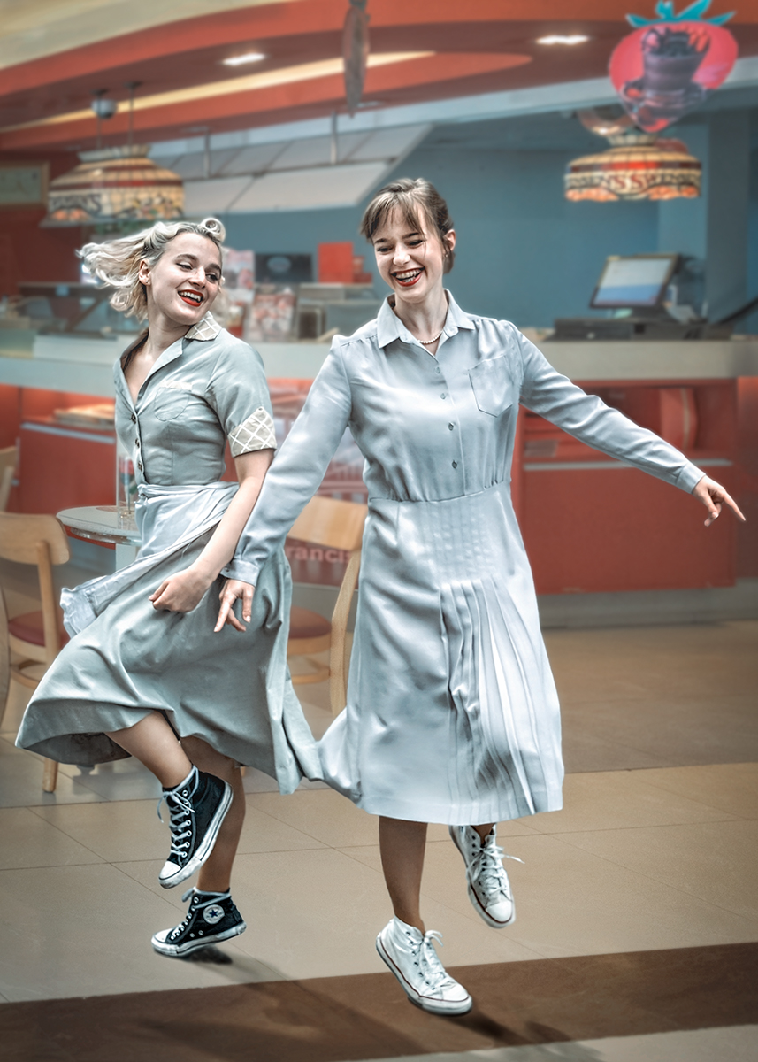
Description : Two Diner waitresses bored with their jobs. Put some Bill Haley music on the Jukebox and begin to Jive during their Tea Break to brighten up their day.
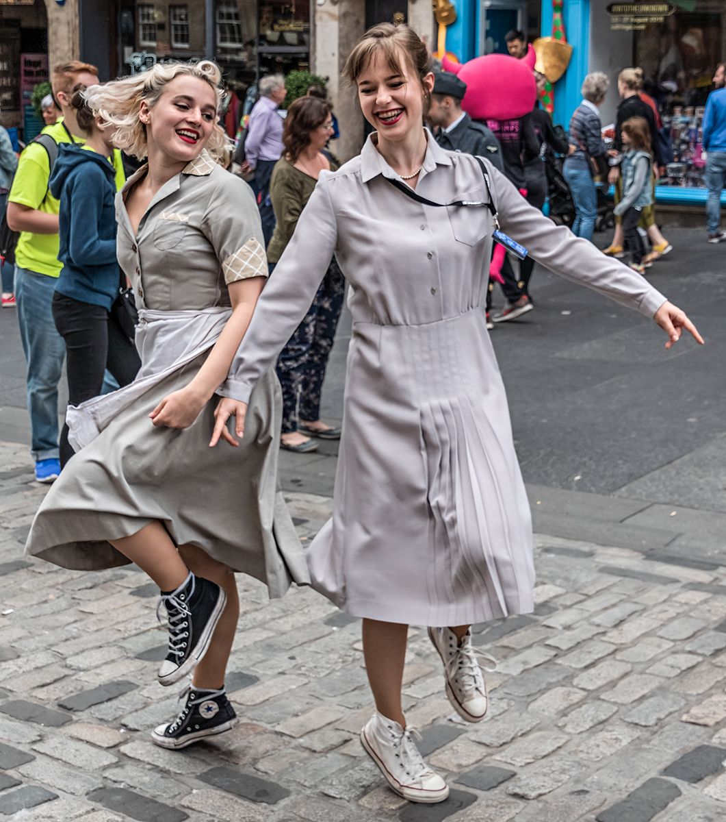
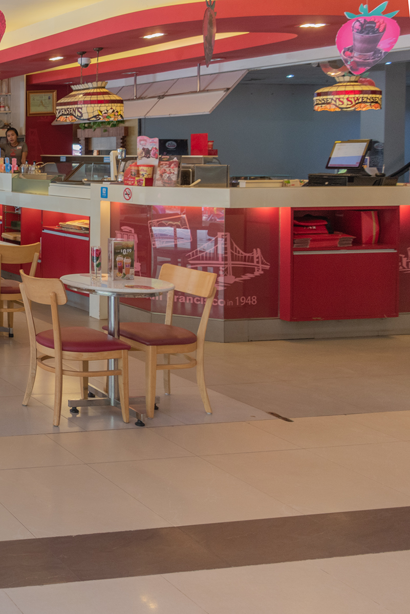
Composite made from just two images, the subjects and a Diner background.
The subjects shot was at the Edinburgh Fringe on the High Street, they just suddenly started dancing, to attract the crowds.
The background shot was taken in Siem Reap, Cambodia.
Basic edit to both images.
Desaturated and cut back the contrast, and blurred the background image.
Increased the contrast and clarity on the subjects image to make them stand out in the composite.
Cut out the subjects using the quick selection tool.
Created a new blank layer.
Pasted the background and subject layers onto this and blended them as I went.
Worked on the composite using, curves, blurs, and tools in Adobe Raw, to achieve the finished article.
That's it.
7 comments posted
Posted: 11/09/2024 06:34:34
I like the way the colors of their dresses is echoed in the diner scene behind them. Their shadows feel very real and make them fit into the scene.
I thought at first that maybe simplifying the diner by removing the table and chairs in the background would be useful, but it turns out that your version feels much more realistic.
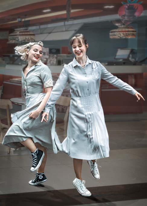
My only suggestion is that the difference in contrast between the background and the dancers feels a tiny bit distracting. I do feel that the dancers "pop", but perhaps a tad too much. I personally might consider the technique you described a while back, using the "average blur" layer at low opacity. Posted: 11/10/2024 23:07:34
Smack on - I agree - too much pop.
Going to reduce the texture and add average blur to tone the dancers down.
Its great to have a second pair of eyes look at your image - cant see the wood for the trees happens as you get too involved in the creation of the image, thank you.
Will let you know how it goes in competition.
Cheers, Bruce Posted: 11/11/2024 15:59:43
You nailed the perspective and foot placement with the shadows. At first, I was a bit confused why the shadows are in front when the light is on the front of their dresses, but with indoor images, you can get away with that as lights could be anywhere.
I can see what Peggy mentioned about the contrast, but I wouldn't tone the dancers down too much. The pop kind of goes with the story.
I know cropping suggestions are not always helpful, but you do have a fair amount of headroom with some edge items on top.
I really love it. I bet it does very well in competition. Posted: 11/13/2024 16:47:31
I have had this composite for years and never entered it into a competition, because of its issues making it unrealistic.
I have found over the years that sometimes when a composite doesnt work its best binning it, rather than keep reworking and wasting time. I think this image will suffer this fate.
Again many thanks for your help and assistance.
Cheers Bruce. Posted: 11/18/2024 14:33:09


