Alan Kaplan
About the Image(s)
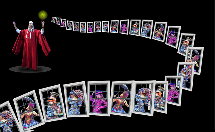
I’m a retired high school English teacher so by law I must quote Shakespeare. This composite was a “joyful trouble.” I started by placing 4 women behind her own window. Then, I used a layer mask to trim the overlap of each woman to fit comfortably behind her window and Merged the two Layers giving me a total of 4 women behind windows. After all of the Layers were Merged, each window occupied its own Layer so overlapping the windows was simply a matter of moving one layer on top of another and using the Layer Mask to correct any conflict that the overlapping might have created. I used Photoshop’s Free Transform tool to control the size, perspective, and slant of the 25 windows that comprise the composite. There was a lot of Layer copying and resizing involved in getting the final 25 windows. My original vision was to have the Wizard’s sweep of windows appear in 3 levels, but the small windows were just too small. Trying to form 3 levels while controlling the sizes of more than 25 windows contributed to the “joyful trouble.” Nik Software’s Viveza helped bring out the color in the women’s outfits. I find it’s more sensitive than Photoshop’s Hue/Saturation Adjustment Layer. The disk on which the wizard is standing was created by Photoshop’s Ellipse Tool.
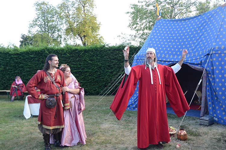
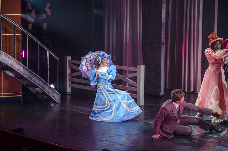
I can’t afford models so I create my own when I find them. The woman in Original 3 was a London street performer enjoying being the mad hatter. The other three women were performers in stage productions on various cruises. The wizard was an actor at a costume-party wedding. All wedding guests were invited to come in medieval costumes and join the actors who were dressed in their medieval attire as they performed their roles.
This round’s discussion is now closed!
12 comments posted
added the disc. Posted: 11/06/2024 16:03:31
My favorite part is that you made them windows rather than cards, so we can see the windows that are behind another window. I think it adds depth and interest to this floating procession.
I think having the windows going out of the corner of the frame gives a nice additional sense of motion.
I wouldn't change a thing. Well done! Posted: 11/10/2024 21:50:05
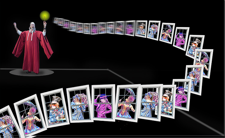
Let me explain. See attched mock up.
1. In the interests of more is less, I just added a line the same color as his base, behind the guy and the windows, to give grounding, like he is on a stage.
2. Applied path blur the rear windows to give them pace and tapering out before they reach the viewer. Gives depth and momentum.
3. There was lighting issues under his arms that were confusing so merge them into the black background.
That's all as I love the story and concept - the layout was on the thirds and had a lovely leading line into the image, where the windows were sharp and could be appreciated by the viewer. Great stuff ! Bruce Posted: 11/11/2024 16:21:34
(Groups 20 & 81)


