Kirsti Näntö-Salonen
About the Image(s)
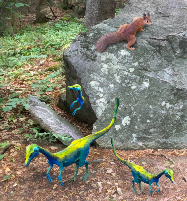
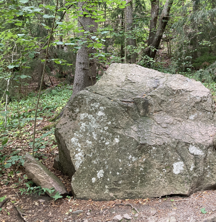
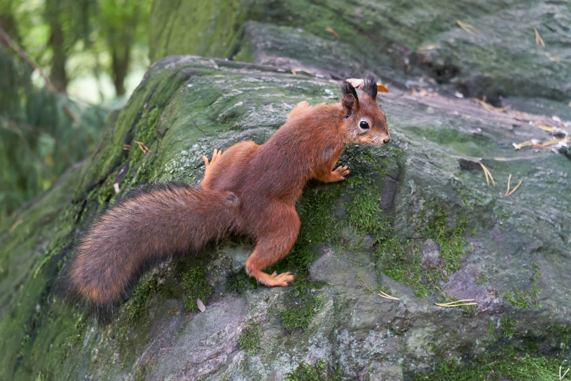
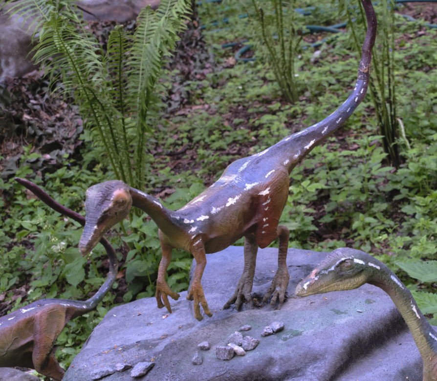
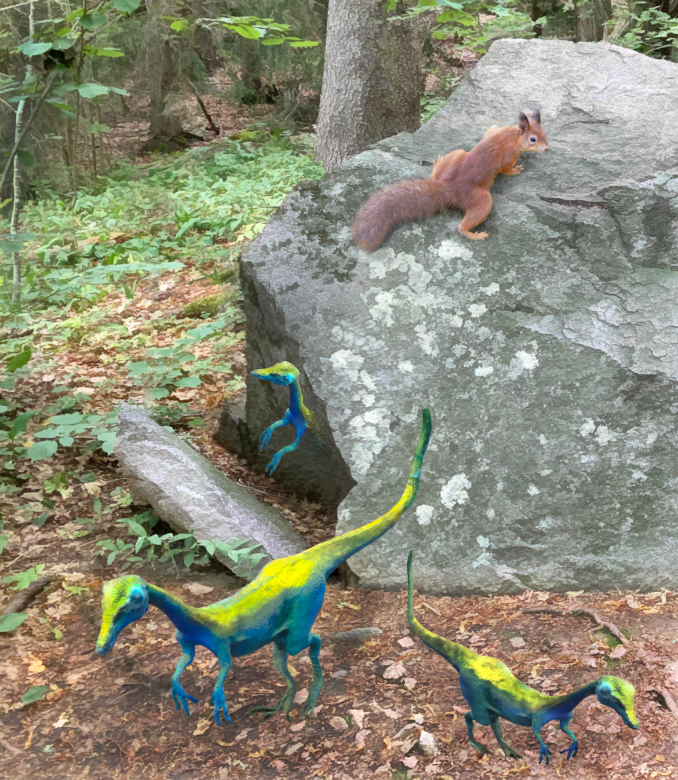
Here is "A Crack in Time". Orig. 1. is a rock along one of our favorite walking routes that I always stop to watch and wonder about; Orig. 2 is one of the tame squirrels in the same area, and Orig. 3 is a snapshot from a dinosaur theme park.. - I started by cleaning the busy background a bit, and tried to make the grey rock stand out by changing the color temperature of the grey slightly colder. I added a Topaz Studio Buzz Sim 2 filter in 50% opacity to soften the details. In HSL, I changed the hue and saturation of the dinosaurs to give them a more exotic coloring, and tweaked their neck and limbs a bit with the Liquify tools. The squirrel and the dinosaurs were then just pasted on. I added another layer of the background on the dinosaur who is emerging from the crack, and erased it partially. I softened the contours of the dinosaurs slightly with the blur brush tool and tried to add some shadows. All the images were taken on overcast days with a dull ambient light, so I am not sure how they should fall. The squirrel was cut with its original shadow. Finally, I used the average blur trick, and left it in 10% opacity and soft light blend mode over the entire image. - I wonder if the crop is too tight? I think that the dinosaurs still have a pasted-on look? and I am not sure if their colors are the best choice. I am again looking forward to all advice!
This round’s discussion is now closed!
9 comments posted
The vibrant colors of the dinosaurs are intriguing - who knows what colors they were? And those colors could well blend into a thickly forested area, like parrots who blend into tropical environments.
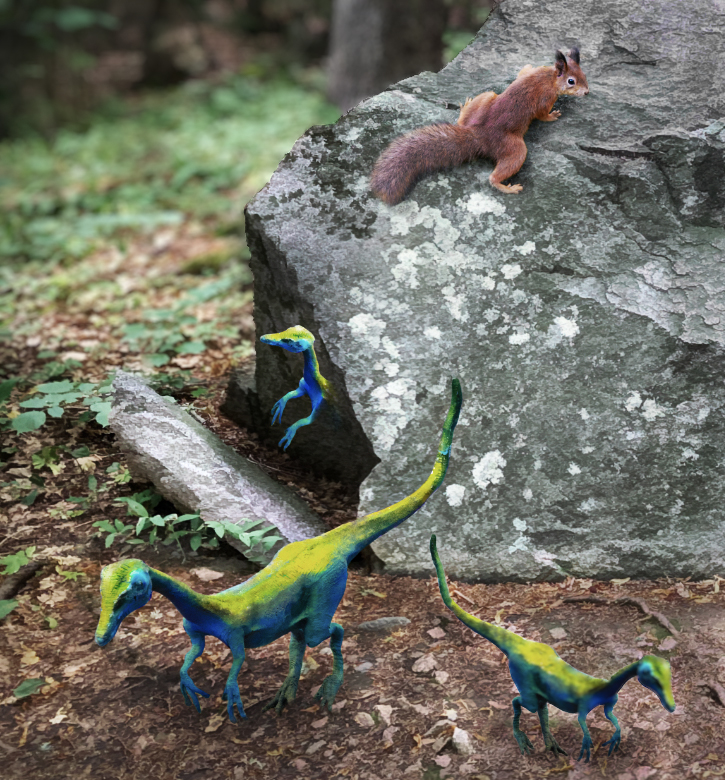
I like your updated version.
When I look closely, I can see the difference in sharpness between the dinosaurs and the rest, but for me that isn't significant.
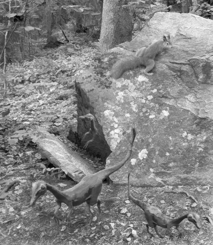
When I change your image to b&w, the dinosaurs feel more real to me. So even though I appreciate and applaud the creativity of the vibrant colors, I think that maybe they make it a little harder to believe in the dinosaurs as living creatures. Posted: 11/10/2024 21:33:11
I have attached a mock up of what I mean.
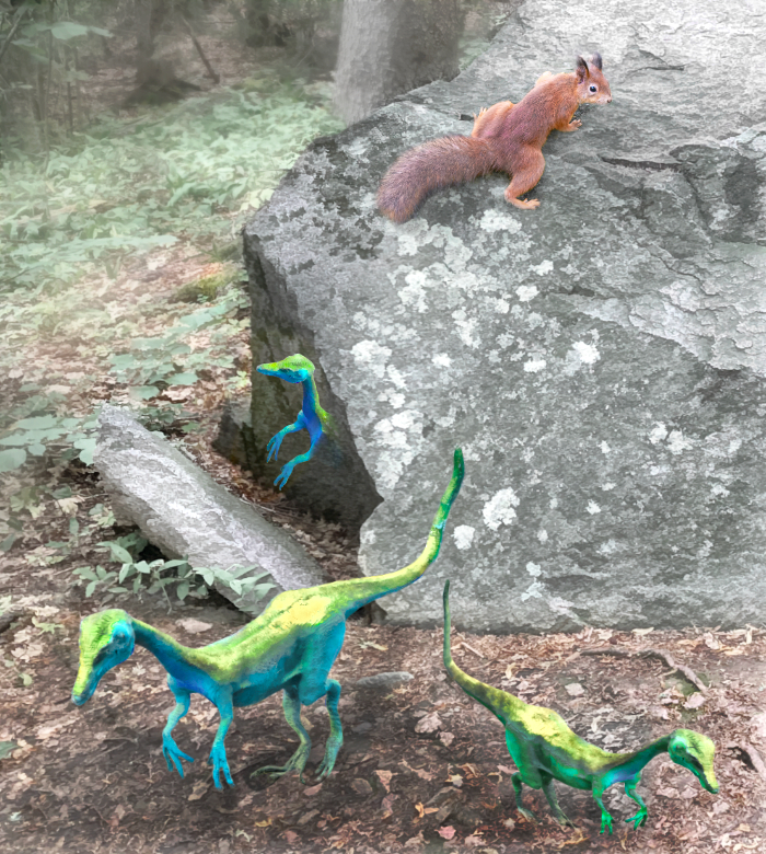
1. whole image upped the contrast to give body to the subjects and separate. Contrast is great for that, but in doing that increases the saturation so cut that back.
2. Increased selective texture on all subjects to make them stand out and added a dark floor for them to stand on to hide the connect with base image, and also negate the need for shadow detail.
3. Used PS NEURAL FILTERS - DEPTH to fuzz the background behind the stone as the detail doesnt add anything to the story.
Apart from that its a great story one that I have seen recently on Instagram where a guy cracked oen a rock with a hammer to reveal a prehistoric monster thing. !! cheers, Bruce Posted: 11/11/2024 15:54:46
