Peggy Nugent  


Enchanted Forest by Peggy Nugent

November 2024 - Enchanted Forest

November 2024 - Peggy Nugent

Original

November 2024 - Peggy Nugent

Original 3

November 2024 - Peggy Nugent

Original 2

About the Image(s)

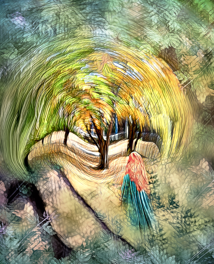
I've been enjoying the fall colors here very much, and so turned to some recent shots for this image.
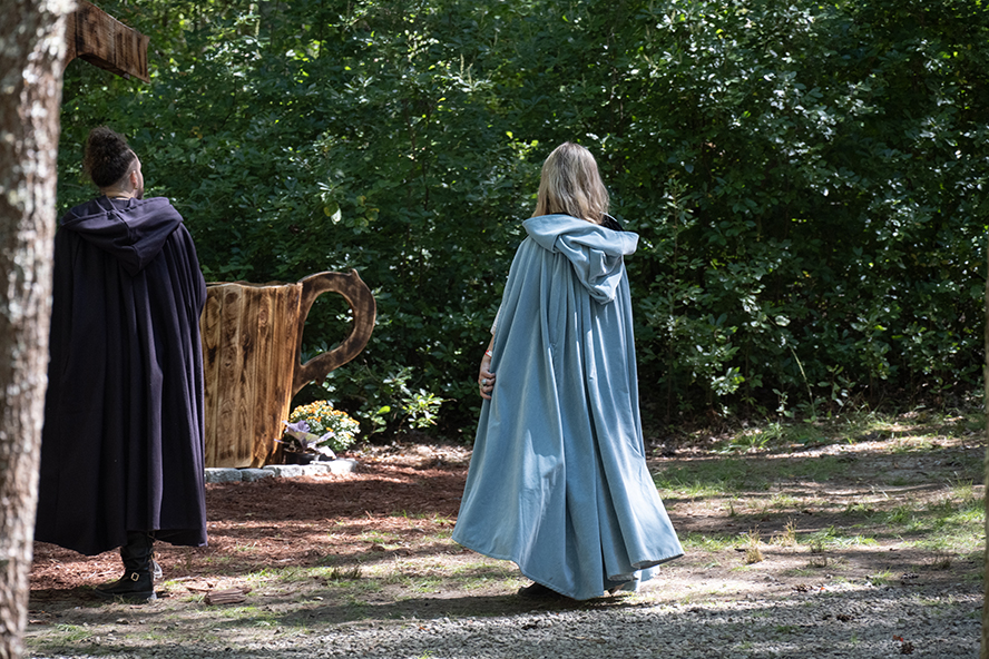
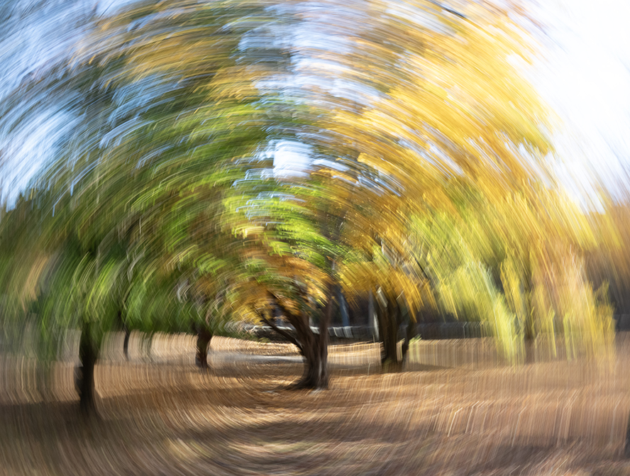
I started with the tree, taken with a rotating camera movement. I used Liquify to exaggerate the flow of the leaves at the ends and to add a wavy texture in the ground surrounding the trunk. I put the second original (an in-camera multiple exposure) above it twice, in hard light mode for the layer at the top of the frame, and upside down for the copy at the bottom of the frame. I added the cloak from Orig 1 and the hair from last month's image on another layer. I applied a Topaz Glow filter at lowered opacity and added a vignette.


8 comments posted


Matt Conti   Matt Conti
This image really works well as you brought the pieces together marvelously. The ICM and liquify combo made for a neat effect. The girl in the cloak adds an intriguing subject, like she is walking into a portal of some type. I also enjoy the color palette that you brought out with the glow filter. I don't have any significant suggestions as I think it's a complete image as is. Maybe deemphasize the dark branch that is a bit distracting in the center of the image.   Posted: 11/05/2024 17:34:25
Peggy Nugent   Peggy Nugent
Thanks very much, Matt!
I agree the dark branch is distracting, thanks for the suggestion. I somehow managed to overlook it.
And welcome to the group!   Posted: 11/10/2024 18:13:33


Kirsti Näntö-Salonen   Kirsti Näntö-Salonen
Peggy, this is like a stained glass window with light coming through the translucent tiny panes, making the soft colors glow bright. You have truly created an enchanted forest, or garden, for the maiden to walk into. I love Orig. 2 and the way you used it to frame the image. - I think that the wider dark line at the bottom left corner (the trunk of the tree?) may be a little prominent?   Posted: 11/07/2024 17:21:09
Peggy Nugent   Peggy Nugent
Thanks, Kirsti!
Yes, that dark line is distracting; I'll figure something out for that.   Posted: 11/10/2024 18:16:01


Bruce Harley   Bruce Harley
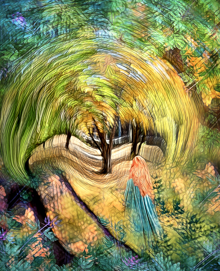
Hi Peggy, Stain glass / Mosaic images are very popular the now. They are meant to be colourful and vivid as yours surely is. The story of the girl in the cloak approaching the magic tree is there ....but for me lost in the business surrounding the story.
I have done a mock up using your image. Its based on the brightest and standout thing on the image has to be the subject/story.
1. I have reduced the contrast, saturation and texture of the frame around the story.
2. Have masked the story with a graduated circular mask, where I increased the brightness, texture, etc
3. Increased the contrast on the girl to bring her forward of the tree and slightly reduced the saturation on her hair to blend.
In summary I have tried to emphasis the centre and reduce the background, to make the story pop out from the rest.
Hope you dont mind me rehashing your image, but I love the idea and concept and also the composition so much. Bruce x   Posted: 11/11/2024 14:42:55
Comment Image
Peggy Nugent   Peggy Nugent
Wow, thanks so much, Bruce! What a difference that makes!
I have to admit that I added the girl as an afterthought because I felt it lacked something with just the tree, but I love what you've done. I'm definitely going to follow that up. Thank you!   Posted: 11/11/2024 18:57:52


Alan Kaplan   Alan Kaplan
A lot has already been said about your image, but I'd like to add that the detail and rich colors of your original are quite appealing to me. The darker colors give more energy to the center of the image, and the girl seems mesmerized and drawn to swirl of energy. The girl is appropriately placed in the frame to be captivated and drawn into the maelstrom. The forest is, indeed, "enchanted" by the energy that is visible in your composite.   Posted: 11/14/2024 02:38:47


Brad Becker   Brad Becker
Peggy, I join the group in applauding you for a beautiful image. My first impression was along the lines of Bruce's in finding the subject a little lost int he intense background, although it wasn't enough to bother me. I also agree with others regarding the dark at the base of the woman's feet being a little distracting. Other than those two minor points I really like this months artistic creation.   Posted: 11/18/2024 02:00:33


Please log in to post a comment