Brad Becker
About the Image(s)
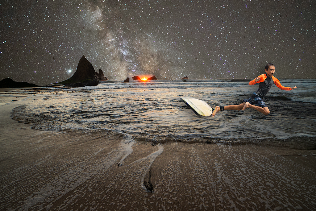
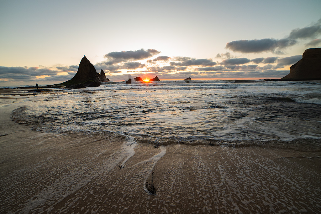
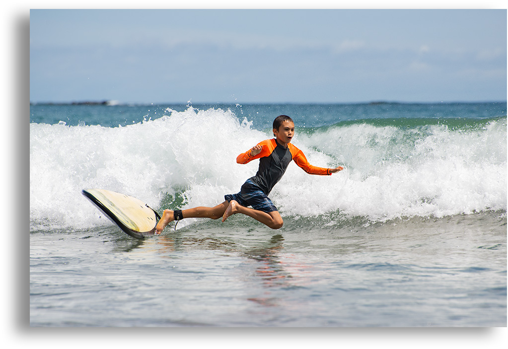
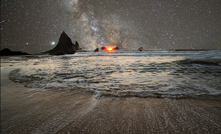
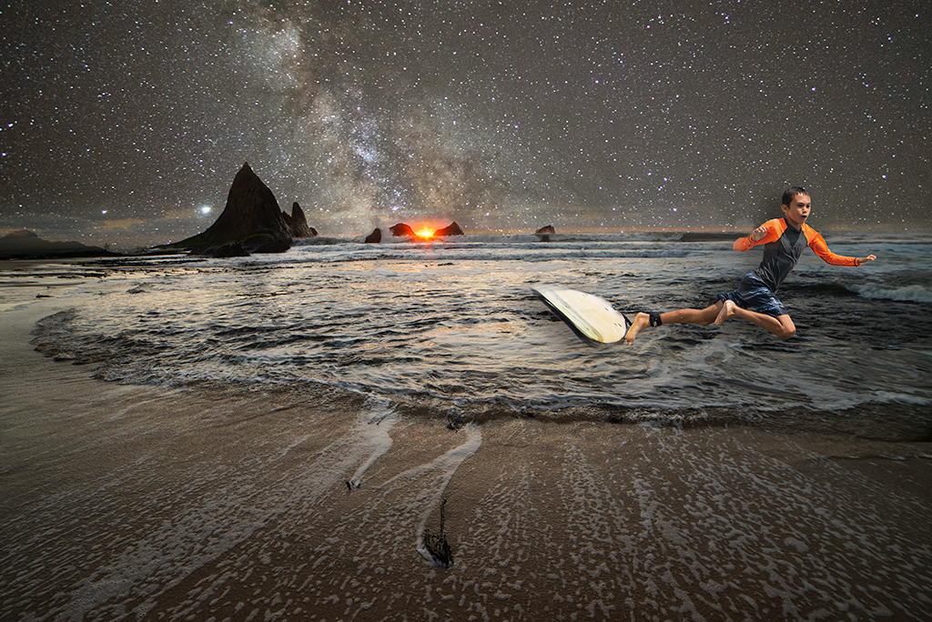
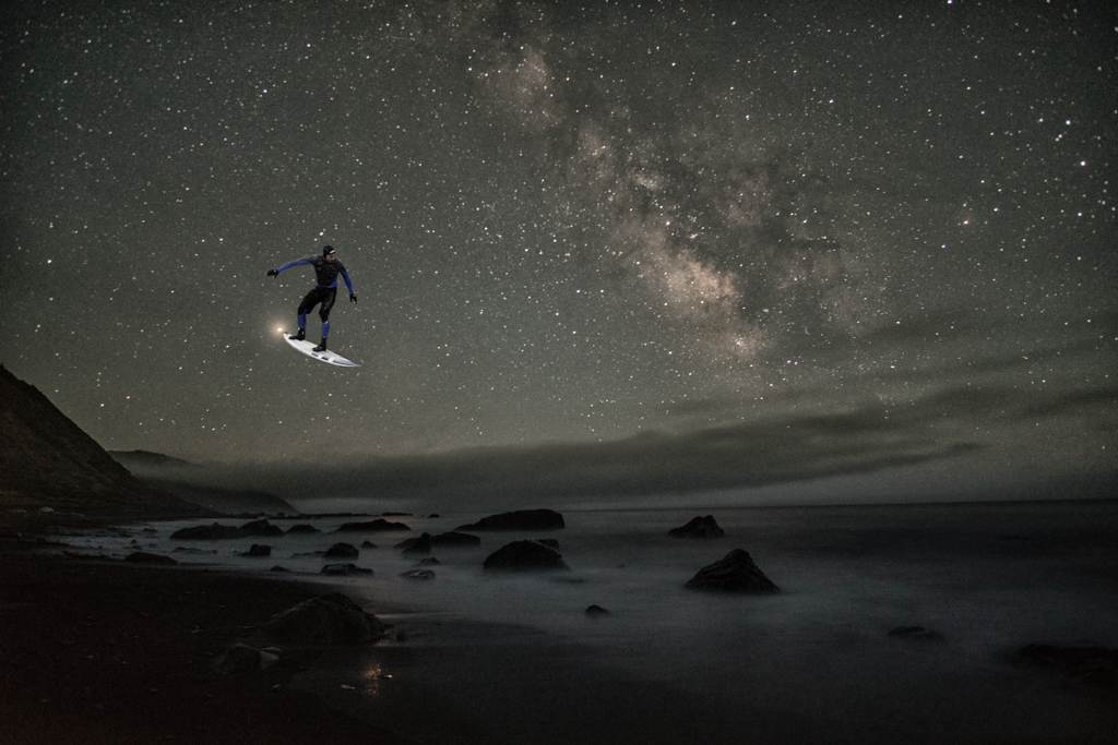
This composite combined a beautiful sunset image I took off the coast of California with a stunning Milky Way image from a backpacking trip in the Eastern Sierra with a shot of my son learning to surf. As with many of my photos lately, I didn't have a specific message in mind. I enjoyed combining the sunset and nightscape, as I've done before. I added my son as the orange in his wetsuit added a balance to the color schema and also balanced the lines of the image. I added a drop shadow to his figure to create a little focus on the subject. The title refers to the speed with which the Earth is moving through space.
11 comments posted
You have 3 good original images here. The expression on your son's face seems to be saying, "No, not again." The beach scene is absolutely inviting, and the starry night sky reminds me of how my friends and I lay in the grass in South Carolina summers at night looking at a sky full of stars not spoiled by light pollution. However, the combination of these 3 successful images does not work for me. I took the liberty of removing your son and cropping the result to make the beach scene an welcoming place for a campfire. Posted: 11/03/2024 22:55:54
Alan, I agree with you completely. I remember when I joined group 54 I was a 2 image only guy. It often is a stretch for me to create a 3 image composite. Often when done I look back and prefer the original images without all the fuss. The sunset by itself is a beautiful image. Lately I've been struggling to find my surrealist roots and creative spark, hopefully it will come back soon. Posted: 11/18/2024 02:29:05
Your surrealist roots are just on hiatus. When I hid a wall, I look over some of my old composites that never made it to the PSA Digital website and see how I can improve them. It usually starts the juices flowing again and sometimes I even get a better image. Posted: 11/18/2024 03:25:20
The Milky Way blend for the sky worked well, although it would be impossible to have the sun shine like that and actually see the stars like that. But, I'm perfectly fine with cheating reality! The reason it also works is the lighting of the beach is dark enough to make it match up well with the night sky. The boy and the surfboard add an interesting focus subject, but seem a bit out of context as the waves are not large enough and the lighting is off. You might try repositioning and darkening him. Still, I like the fun aspect! Posted: 11/06/2024 11:44:03
Matt, Guilty as charged on all accounts. Some images just weren't meant to be composites but I take my monthly commitment to group 54 (and 41) as motivation to try something different. Posted: 11/18/2024 02:30:17
Hi Brad, I think that you have blended the lovely sunset and the starry night into an enchanted twilight where it feels quite possible that surfers may ride on calm waters. I like the surreal aspect, and as you say, the orange wetsuit that repeats the color of the setting sun and contrasts beautifully with the teal hue of the water. - I like Alan's suggestion very much, too.- I was wondering if you could have a tiny sliver of the sunset sky to continue through the horizon, so that the sun would not be an isolated spot?
Posted: 11/08/2024 00:46:16
Posted: 11/08/2024 00:46:16
Kirsti, You bring up an interesting point. The moment this image was created was after we finished shooting and were packing up. I looked up and saw that single glowing orb flashing its last orange glow and it spoke to me in its subtlety. I believe I eliminated some of the orange horizon in the process of blending the stars. That was intentional but I appreciate your handling. Posted: 11/18/2024 02:32:41
Your images challenge me, Brad, and I mean that in the best possible way. I find it much too easy to slip into the thought patterns of the hundred judges I've heard expound when I see a conventional image. Your images always prompt me to stop and actually look and think.
You have a very powerful composition here. I love the strong circular water in the center which feels to me to be the core of the image. The Milky Way in the background draws me back to the water when I view the sky, and the receding waves do the same when I look at the foreground.
One of the first things I noticed was how your son's wetsuit is as orange as the setting sun; I think the dark rock jutting in the horizon completes the balance to his flying body.
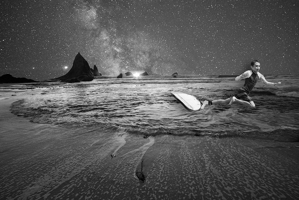
When I see it in b&w, I like it even better, but that's just me.
If you wanted to tell a story, you could have him surfing down the Milky Way, but that would be another image. Posted: 11/10/2024 22:24:24
Hi Brad, for me the original landscape was an absolute belter ! However as a composite it doesnt work and I have to agree with Alan Kaplan, and Kirsti Näntö-Salonen. Alan's mock up is a good guide and then mix in Kirsti's suggestion about the sun and sunlight, would probably make it better. There is ambient light on the water from the original that cant have come from the starry night. Using Kirsti's idea it would accomodate the light situation.
When cutting out the surfer I am wondering if it would have been possible to take along the wave he's on too, and mix it into the image, that might have made it feasible as the now its not looking real.
This composite is a brave undertaking - you are battling with light colours, shadows, and depth - nothing is easy - the original images are far apart with no natural linking.
I do love your original landscape is a credit it to you, could look at for hours, and look great on a wall. Cheers, Bruce Posted: 11/11/2024 16:39:28
Bruce, Thanks. I completely agree with your assessment. I've run into a bit of a creative block lately when it comes to photoshop images. I am quite pleased with that sunset image and will likely do as you say. It is hard to improve on Mother Nature. Posted: 11/18/2024 18:40:46
