Matt Conti  


Haunted Cathedral by Matt Conti

November 2024 - Haunted Cathedral

November 2024 - Matt Conti

Original

November 2024 - Matt Conti

Original 3

November 2024 - Matt Conti

Original 2

About the Image(s)

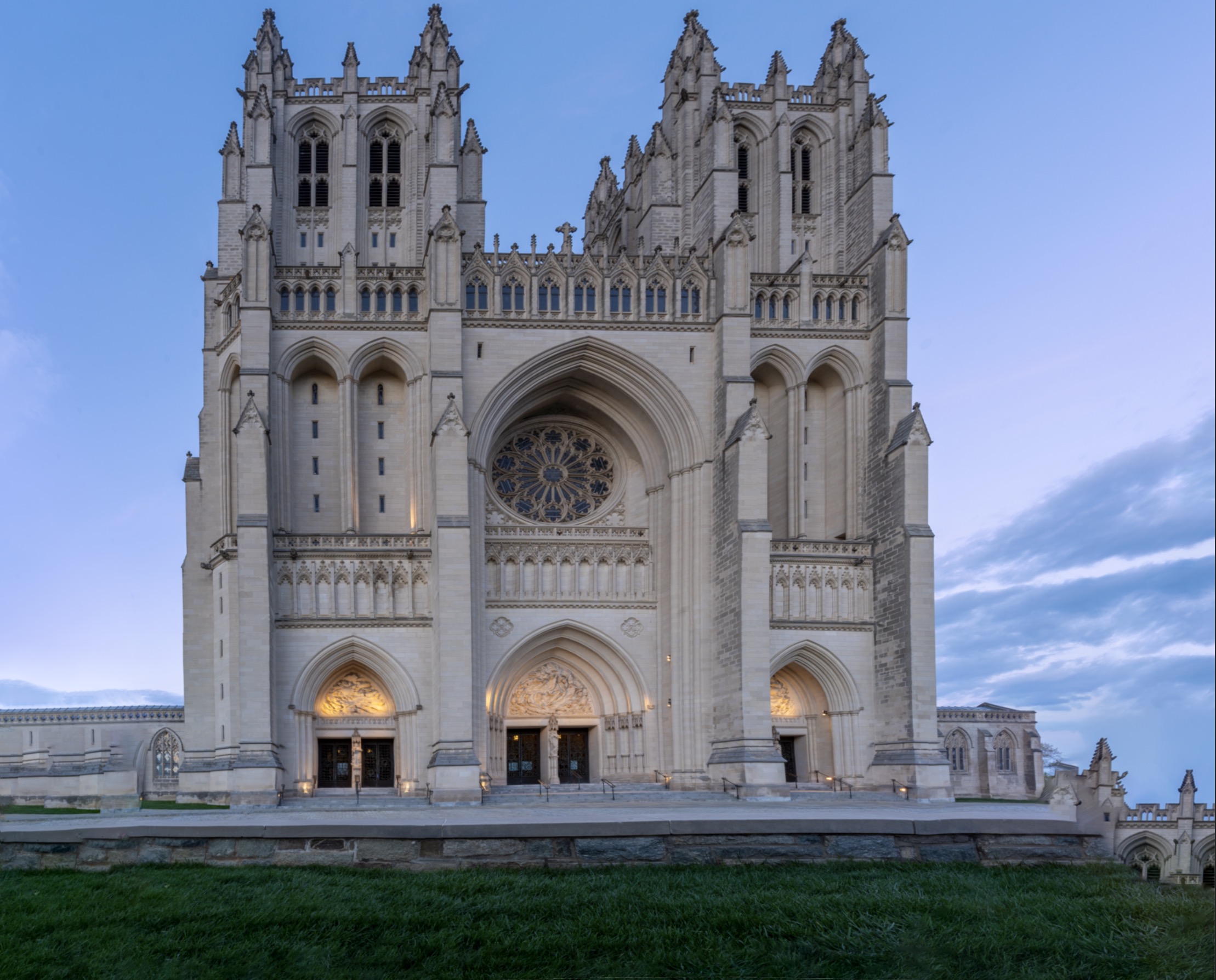
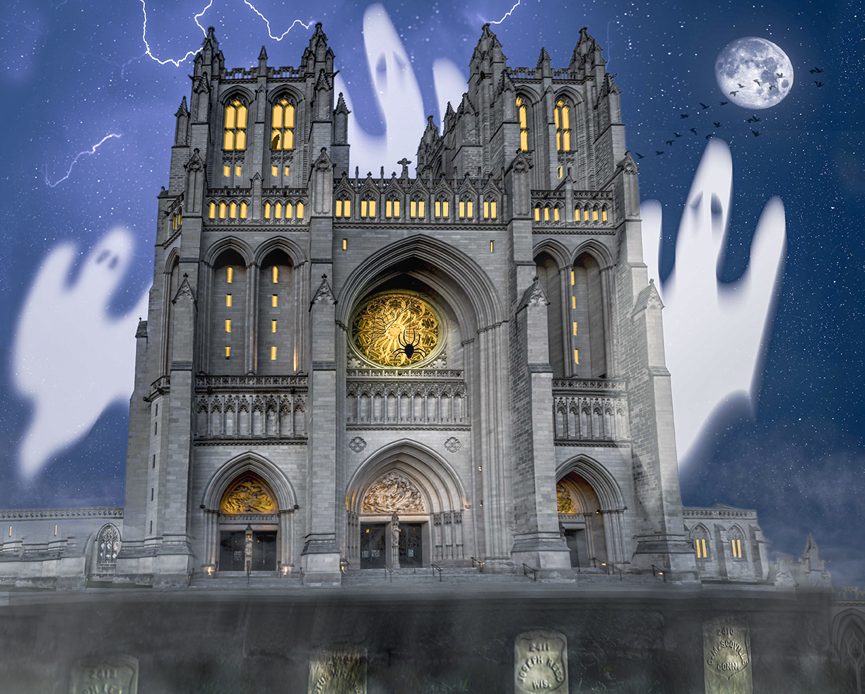
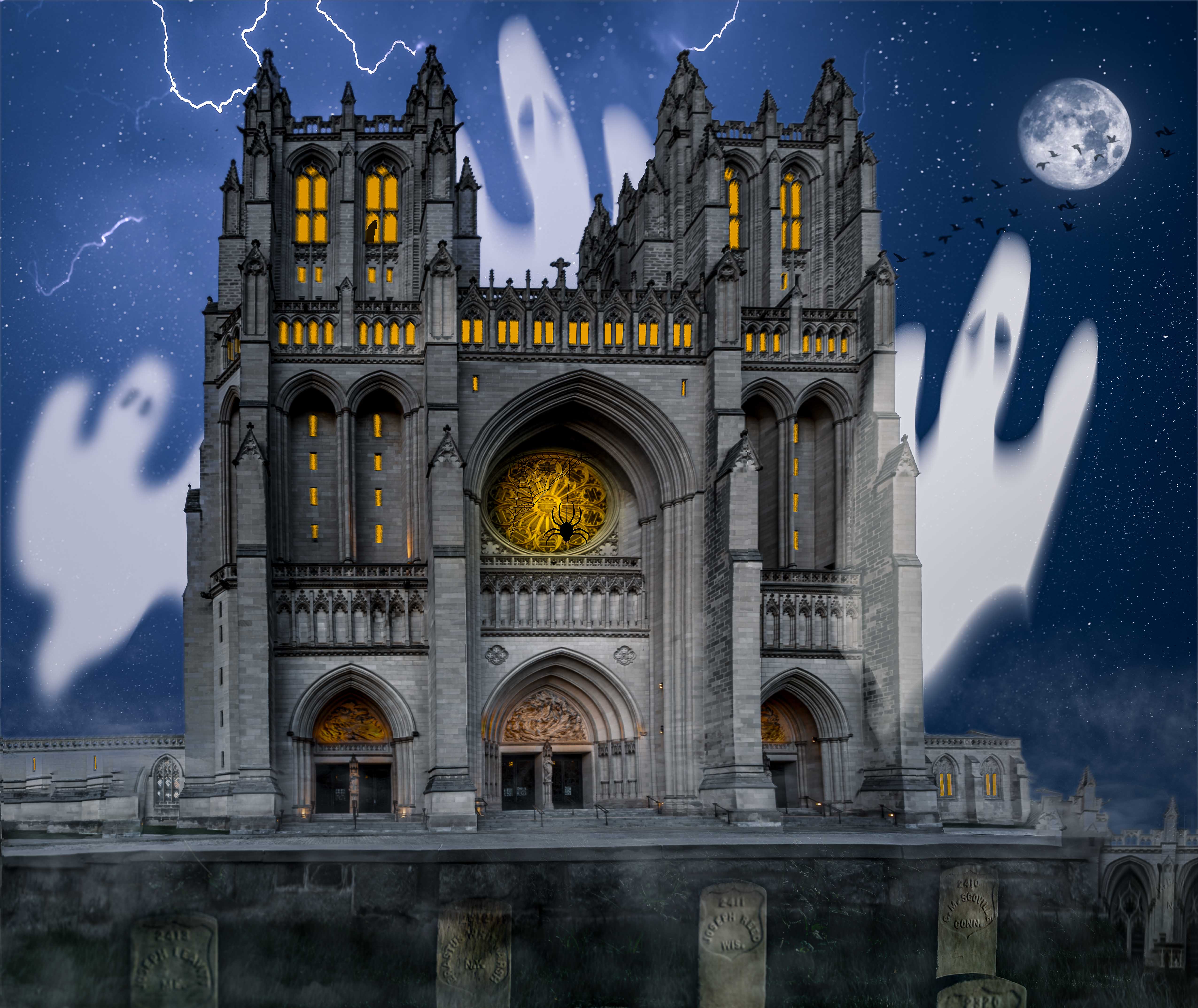
My goal was to make a haunted house out of the base layer which is a vertical pano of the National Cathedral in Washington D.C. I shaded the various sections to add texture, mood and shadows. I ‘lit’ the windows with a golden color fill adjustment layer.
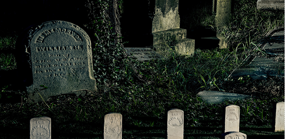
The gravestones in front are from another cemetery in D.C. which I blended using some smoke and fog brushes.
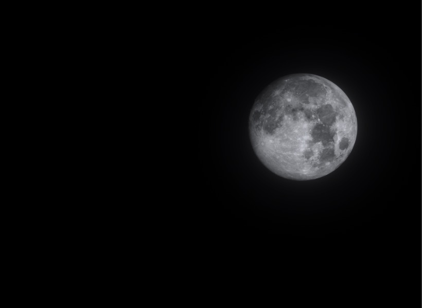
The moon shot was from a separate night that I sized and desaturated to match the scene.
The ghosts are ‘homemade’ using the pen/shape tool, warped and blurred.
There is some royalty-free clipart additions that I wouldn’t include in a competition but for a fun pic, I added the lightning, black cat, spider and flock of birds.


9 comments posted


Alan Kaplan   Alan Kaplan
The treatment of the cathedral is very different from the original. It looks like a treatment I could use on some of my surrealistic composites. Please tell me how you achieved it. When working on composites, my mantra (as I stated in October's "About the Image") is usually "less is more." I think that applies in this case. You have ghosts, birds, a spider, lighted windows, a black cat, tombstones, lightning, and the moon. The cathedral is such a powerful feature of your image, I feel it doesn't require so much support. Steven Jobs said, "Simplicity is the ultimate sophistication."   Posted: 11/03/2024 23:12:04
Matt Conti   Matt Conti
Thank you, Alan. I appreciate your 'less is more' suggestion and agree I got carried away with the add-ons. I hope to make this competition-ready and so most of those will have to go anyway.
I spent a lot of time shading the cathedral, first using a day-to-night lookup adjustment layer and then gradients that darkened the edges in a smooth fashion. For the darkening gradients, I selected the various sections of the cathedral, one by one, to enhance the effect. As you can see, I wanted the upper left to be darker than the bottom right. Thanks again for your comments.   Posted: 11/06/2024 11:47:42
Alan Kaplan   Alan Kaplan
Thank you for your description of your cathedral treatment. I'll give it a try.
  Posted: 11/06/2024 13:51:53


Kirsti Näntö-Salonen   Kirsti Näntö-Salonen
Hi Matt, I enjoyed the bountiful carnival feeling you created around the moody cathedral. It was fun to let the eye roam within the image and pick up yet another character in an unexpected place. The spider in the rose window is my favourite. - I do agree with Alan that the exquisite cathedral makes a powerful image without any props that dilute the effect.   Posted: 11/07/2024 16:54:38


Peggy Nugent   Peggy Nugent
This is such an imaginative image, Matt! It's fun and full of excitement. I really like the deep blue of the sky as counterpoint to the gold of the cathedral windows. Like Kirsti, I really enjoy the spider on the rose window.
Thanks for the description of your treatment of the cathedral. I think it looks very impressive, and that shading it more on one side than the other is very interesting.

I understand why the gravestones were added in the foreground, but at first glance I thought the cathedral was standing on a platform supported by pillars. Personally, I'd consider removing them since you already have plenty going on in the image above them.

I really enjoy this image.   Posted: 11/10/2024 18:27:20
Matt Conti   Matt Conti
Yes, I struggled with the gravestones. I think I have to either remove them or change their placement. Many thanks for the suggestion!   Posted: 11/13/2024 16:55:14


Bruce Harley   Bruce Harley
HI Matt, Welcome to our group. Read your BIO very interesting, so is your image this month.
The first thing that hit me was the building uprights were quite right. I know its meant to be a bit wonky as its a creepy Cathedral, but even in images like this I feel the uprights should be right. Because of this the image lacked reality. As ts a tall bulding in theory the top should like back to give the feeling of perspective.
I have done a mock up to show you what I mean. It improves from the graveyard at the bottom right to the top of ther image, it gives a feeling of DEPTH TO THE IMAGE. Having done this it automatically improves your gravestones at the front and they look less like holding the building up. I have also darkened behind them and the hard step behind them to blend the front to the building at the back.
I liked the lights in the building, but felt they needed brightening. Adobe Raw color mixer increase the brightness of orange and yellow. Bingo the spider shows up better. etc.
I like the image very much and diffrent to the others I like lots going on in an image it adds to the enjoyment of the reader if its done well. Congrats on a fine image. Bruce   Posted: 11/11/2024 15:29:45
Comment Image
Matt Conti   Matt Conti
Many thanks for that, Bruce. That's a good point about the 'rightness' of the building from this perspective. It's funny as I spent hours getting it straight! But, I see your point about the realism of the top being back more. I appreciate your taking a shot at darkening the step and brightening up the windows. Those both make a nice improvements. I'm still not sure about the gravestones and might rework them or remove them completely. Thanks again.   Posted: 11/13/2024 16:59:17


Brad Becker   Brad Becker
Matt, Welcome to group 54. This is a fun image with much going on. I join Alan in a preference for "less is more" but do find your image enjoyable. Given your choice of floating ghosts, stars, moon and lightning I would darken the sky to create more of a night feeling and also increase the creepiness of the image, unless you prefer keeping it more playful.   Posted: 11/18/2024 02:04:21


Please log in to post a comment