Adrian Binney, EPSA, LRPS  


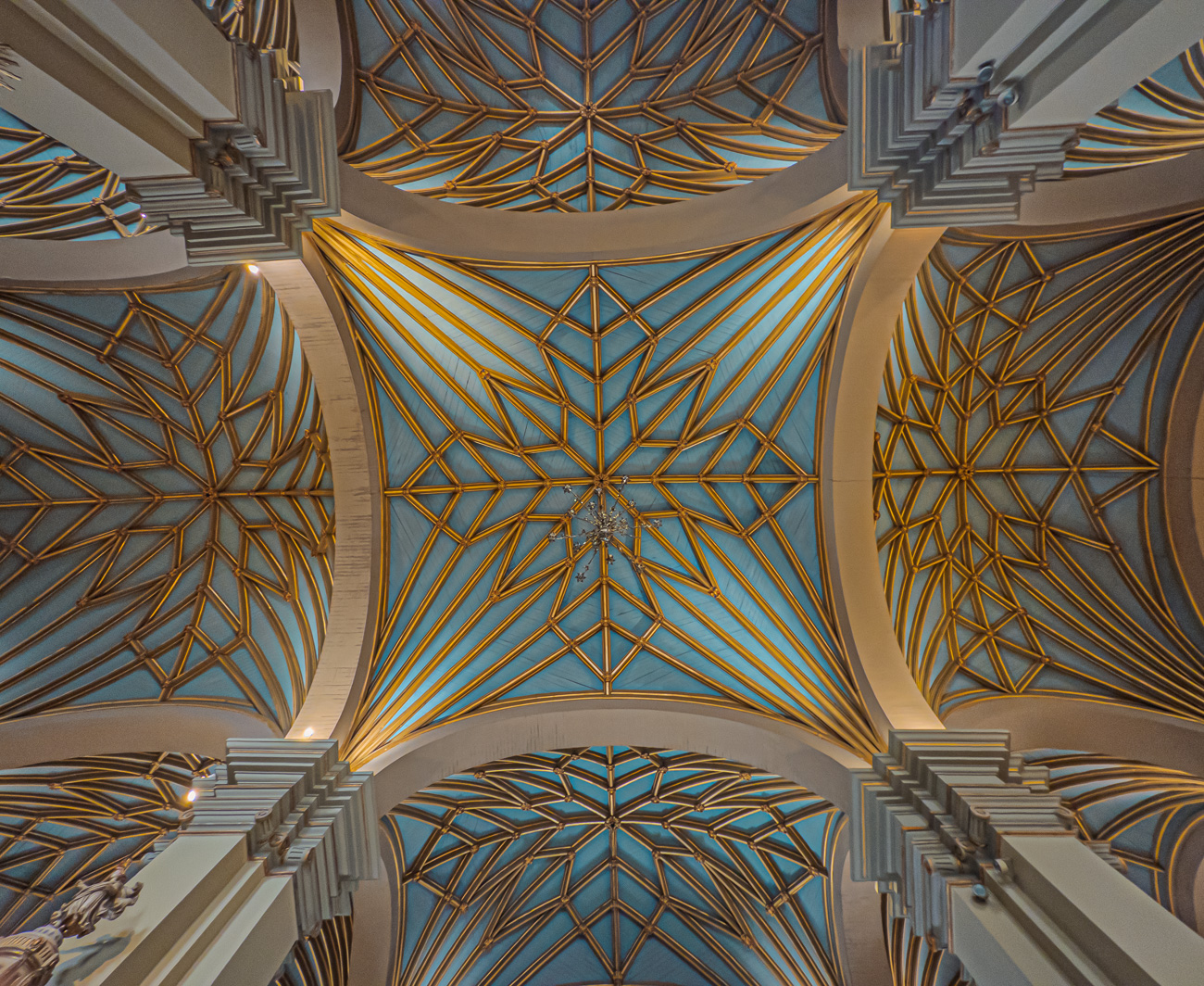
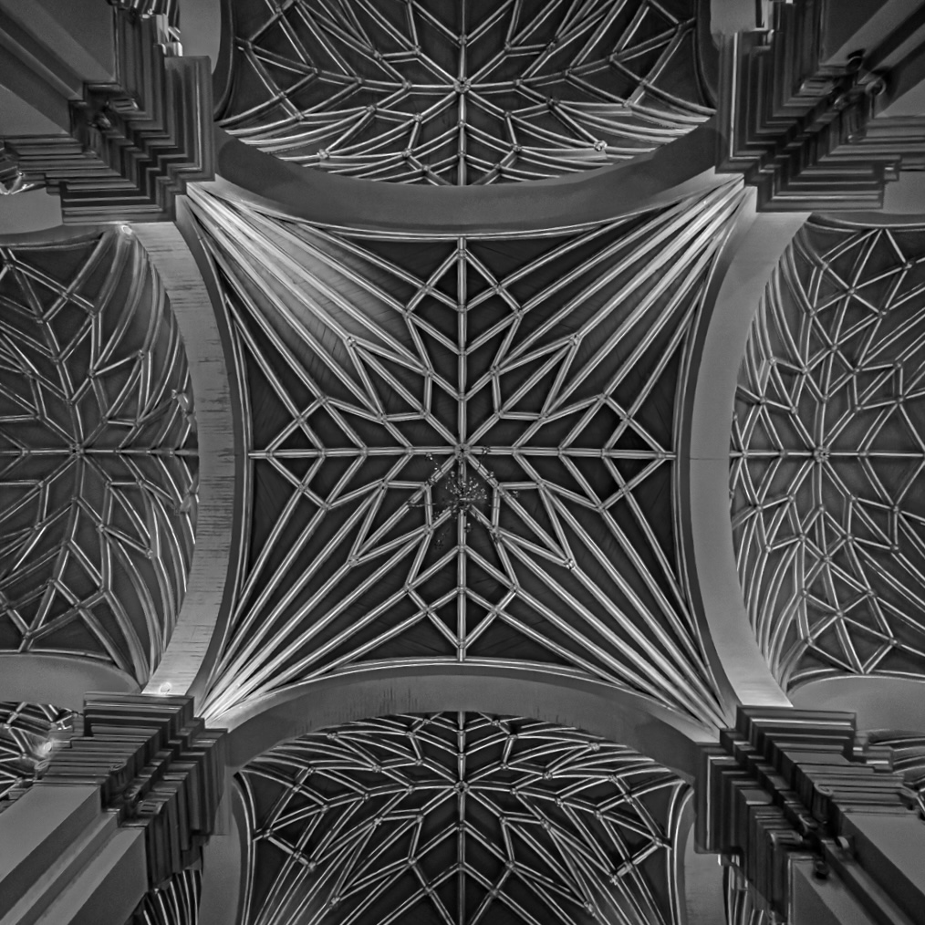
Lima Cathedral ceiling by Adrian Binney, EPSA, LRPS

August 2026 - Lima Cathedral ceiling
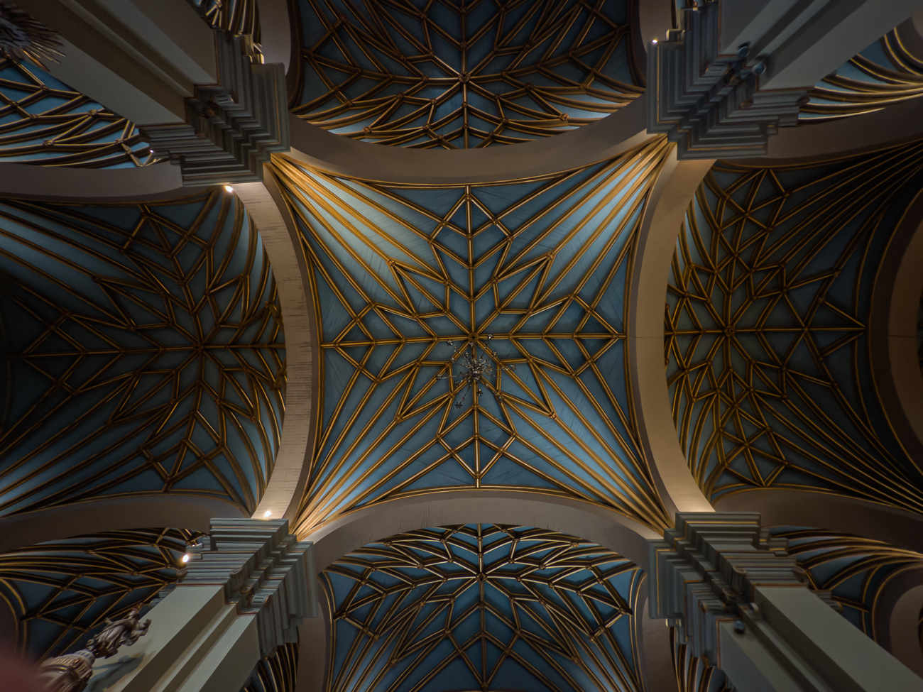
August 2026 - Adrian Binney, EPSA, LRPS

Original

August 2026 - Adrian Binney, EPSA, LRPS

Original 2

About the Image(s)

Keeping with an architectural theme for my image this month...... we visited Peru earlier this year during a round South America Cruise. We enjoyed the coastal desert landscapes and the coastal wildlife (including Humboldt Penguins) - but we also had 2 days exploring Lima which was developed by the Spanish in the 16C - the cathedral sits on a huge open square and suffered by huge earthquakes, the last of which was 1746. It was a fabulous building - I spent some time sitting looking upwards especially.

Anyway, as to this - I positioned myself as central to the roof patterns as I could and photographed the ceiling while on my knees looking directly up.

I've attached here the original Raw file as well as a Colour developed version. For better or worse, my workflow is to develop a colour version - then take a virtual copy for changing this in mono.

My work at phase 1 was to make the lighting more even across the ceiling panels - once working the mono version, much of the changes were to the B&W mix to bring out the contrast of colours as to light & dark more - finally I darkened the main pillars somewhat to help take the eye into the centre. That's what I tried to do anyway.


11 comments posted


Vincent Cochain   Vincent Cochain
As mentioned in June of this year I really like this kind to image, and there are not easy to take as the symmetry has to be correct from the picture shooting (difficult to correct it after). You did great job in the picture of June. The symmetry was perfect (just a small difference of length, but. it was really well done). I don't know why but this one is not as "accurate " as the one of June.
I tried with the guides in LR. There is still some difference between the left and right part. Your camera was not horizontal.
The ceiling is maybe too dark. I like the original 2. The colors are warm and there is more structure.   Posted: 08/05/2026 13:06:22
Comment Image
Adrian Binney   Adrian Binney
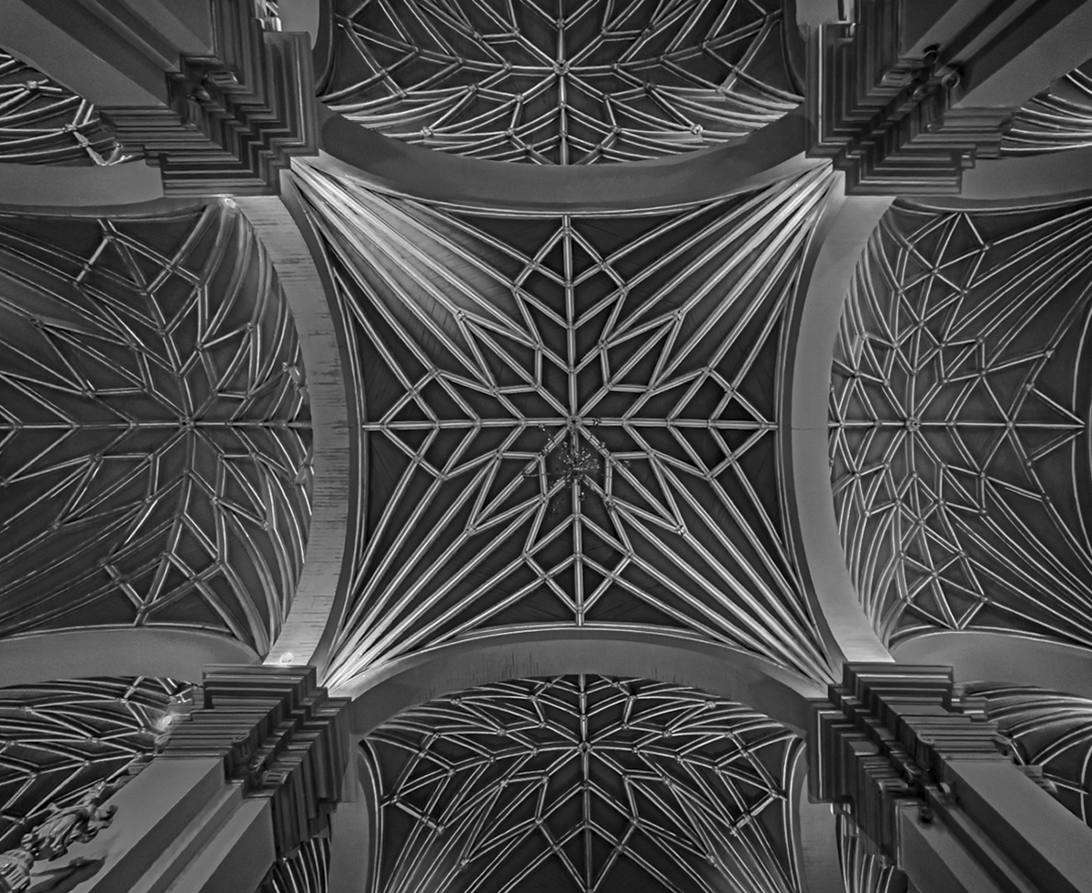
I'm very grateful Vincent for your comments and time here. I've made a square version below. I like the idea of the scene being dark, allowing the lines to shine by contrast - thoughts?   Posted: 08/05/2026 20:27:02


Bob Rickert   Bob Rickert
This is really a stunning subject matter for black-and-white! The difference between the color version, and the monochrome version is really incredible. The lines just work to create a great subject. As Vincent suggested, maybe adjusting the symmetry might help a bit. I'm not sure if you're ever going to get everything square but I might focus on the middle part of the subject and try to get that square first and let the rest fall off. Very nicely done.   Posted: 08/05/2026 20:15:03
Adrian Binney   Adrian Binney
Bob - many thanks for your comments. I've churned out a square version of my image above - no changes, just created the square crop and rotated it by 1%. I would welcome your thoughts. Many thanks Bob.   Posted: 08/05/2026 20:24:58
Comment Image
Bob Rickert   Bob Rickert
That made a big difference! Good job. When you said you were down on your knees taking the picture looking up, I felt your pain.   Posted: 08/05/2026 20:43:54


Mary Ann Carrasco   Mary Ann Carrasco
Adrian, this makes for a nice monochrome image with the lines of the architecture as well as the light. I like that you darkened the outer section to highlight the light that brings the view into the middle. Your square edit with the 1% rotation makes it that much better. I admire your effort to take the photo (on knees looking up)! It was worth it...you have a nice image here.   Posted: 08/09/2026 22:37:16
Adrian Binney   Adrian Binney
Many thanks Mary Ann!   Posted: 08/10/2026 20:44:58


Paul Hoffman   Paul Hoffman
This is my bread and butter and I love doing this, you have done very well with this and have captured the image well. Your symmetry and alignment is very good and no convergent. The detail is spot on and the shades is very good. To answer the question of the different sizes is owing to the Nave size and the altar and side chapels. This is very good. Well done.   Posted: 08/12/2026 09:22:38
Adrian Binney   Adrian Binney
Many thanks Paul!   Posted: 08/13/2026 10:22:03


Paul Smith   Paul Smith
This image could be a design for snow flakes...very interesting geometry. I agree with your response to Vincent...the dark background allows the lines and patterns to stand out. How high was the ceiling?   Posted: 08/12/2026 22:11:06
Adrian Binney   Adrian Binney
Many thanks Paul. Just under 100ft - whole structure has a lot of timber in its construction - earthquakes!   Posted: 08/13/2026 10:21:15


Please log in to post a comment