Group 39 Bulletin Board
5 threads - 18 total comments
This page is dedicated to discussions about our theme (Monochrome) that are outside the scope of our monthly images.
Thread Title: Photographic Society of America (PSA) Critique Groups are Educational-Focused Spaces
Photographic Society of America (PSA) Critique Groups are Educational-Focused Spaces
There is a big difference between a photographic image that is structurally balanced (what I often refer to as an images ââ¬Å“Compositional Structureââ¬), imbuing attributes that necessitate a viewers long term attention; the revealing of a subject in the best light and developing contemplative narratives, even for visual work deemed abstract, and alternative photographic work that negates these attributes, which are often refereed to as the so called ââ¬Å“snapshotââ¬. Learning to consistently create engaging photography is not an easy task, indeed, and much practice, along with constructive guidance are positive steps in achieving our creative goals. As such, one of the wonderful features or design of the PSA Digital Dialogue Critique groups (regardless of the format each operates under) is the ability for the participants in these groups to both critique others work while having their own work reviewed under acute scrutiny.
As such, what I speak about today is a reminder the atmosphere in critique rooms should foremost, be focused towards educating participants. Of course, many rooms also enjoy the added comradely between fellow photographers sharing personal stories imbued with emotion and joy. Having both of course seems ideal, and we would argue, indeed, it is. However, comments that otherwise only console or pacify a photographers work can stymie their creative progress.
As such, PSA Critique group that avoid a clear and transparent message in helping othersââ¬â¢ develop their photographing skills can be interpreted as missed opportunities the PSA critique formats suppose to offer, as well, in my opinion, the local camera club, where similarly, club participants are, sometimes, seemingly pacified and pampered rather than informed and educated in how they should think about their approach and practice of the art of photography. Thankfully, this type of instruction is usually an exception rather than the norm.
The PSA Critique Group is an Educational-Focused Space designed to, hopefully, funnel photographic ideas and concepts (both old and new) to each participant fueling their individual photographic journeys. The best PSA experience (and, again, allow me to include the local camera club in this discussion) includes a balance between aspects appreciated in education and the comradely cherished in our wide and diverse photographic community. Missing one or the other aspect can possibly make a critique room experience less joyful, while omitting the education aspect altogether when commenting on someoneââ¬â¢s work, can result in a counterproductive experience.
In summary, the best atmosphere for critiquing ones work includes a space sharing both an educational vibe while also sharing and hearing personal stories central to the art of photography which can include the appreciation for a certain camera system and / or our favorite vacation destinations that promise amazing photographic opportunities, but must also avoid language that has the potential to stymie creative goals through the use of pampering, consoling and pacifying the developing artist photographer, that is not accompanied with a clear and concise critique.
As always, I look forward to your feedback and including sharing experiences that will inspire others in their photographic journeys. Thank you.
Lance A. Lewin, Fine Art Photographer/Lecturer
PSA Global B&W Photography Director
PSA South Atlantic Area Membership Director
International Visual Sociology Association (IVSA) North American-Canada Region Think Tank
lance.visualizingart@gmail.com
Posted: 09/08/2024 07:13:55
Thread Title: Black & White Photography: ââ¬ÅIs my picture better in color, or black and whiteââ¬Â?
Committing to the Black & White Photograph: ââ¬Å“Is my picture better in color, or black and whiteââ¬?
ââ¬Å“I especially urge students of photography to disengage from serious contemplation on how the color original connects to them as a prerequisite for critical analysis of the Black and White converted oneââ¬. L. A. Lewin
Nowadays, and for all practical purposes, every digital image is first rendered as a color image ... I suggest this forced, initial color rendering, is unique in its influential status: we are dictated to interpret the color image first ... even edit the color image in post-production before converting it to a black and white (BW) alternative. This process is much different from shooting a roll of BW film where the photographer is never introduced to color. In this scenario the photographerââ¬â¢s interpretation is (unbiased) or not heavily influenced by viewing a color version first; that is, choosing and studying a color image before converting to BW is not part of the equation when shooting BW film. So, the question ... ââ¬Å“Is my picture better in color, or black and whiteââ¬? ... is not part of the normal workflow when shooting, developing, and eventually presenting a BW tangible photograph.
Nonetheless, here we are, examining the color (original) first and then making a decision if the image is worthy for rendering in black and white. I argue, this (digital) workflow is interfering with how we learn to appreciate BW compositions for what they reveal on their own merits. It is for this reason I especially urge students of photography to disengage from serious contemplation on how the color original connects to them as a prerequisite for critical analysis of the black and white converted one. Instead, the initial evaluation of your work should be centered only on your BW rendering: this will lessen the tendency to judge our Black & White photography based on preconceptions learned from studying color images. Much like the artist painter who chooses to use only one or two colors in all their work, they never make and present a full-colored version for comparison, similarly, the serious photographer that practices composing work in black & white is fully committed to his or her ideals, visions and philosophy that ultimately directed them to create in this manner ... and comparisons to natural color alternatives have no place in the conversation.
The serious or advanced artist-photographer who centers her art in Black and White imagery does so, not by choosing from an assortment of color originals, but instead, the artist is impervious to the color version: her thoughts are not...ââ¬â¢will this look better...ââ¬â¢ but instead moves forward and (digitally converts) the color original to BW. It is not uncommon, too, to convert the color original to B&W and not like it at all. This is no different from the reaction the artist-photographer exhibits viewing his latest roll of B&W film and decides a particular subject is not as engaging as she would have hoped.
In the future, do not ask... ââ¬Å“Is my picture better in color, or black and whiteâ⬠... if you are an artist-photographer who strives to showcase your creativity through a mostly White to Black tonal gamut, then instead, direct the spectator to your B&W fine art photography for what (it) is. In this sense, we are presenting the work ââ¬Å“as isââ¬.
I look forward to hearing like experiences and comments regardless if in support or ones that challenge the proposed work process. In the end, it is all about sharing ideas in though-provoking discourse. Thank you.
Lance A. Lewin Fine Art Photographer/Lecturer
PSA Global Black & White Photography Mentor
PSA South Atlantic Area Membership Director Posted: 09/01/2023 06:16:09
Very simply, I never ask ââ¬Å“Is my picture better in color, or black and whiteââ¬. When I review my images I determine which ones have the qualities for B&W, contrast, shadows, tones, texture, lack of color (maybe) among others. Not all color images work in B&W so I might do a quick conversion in Lightroom just to see potential. It takes special images qualify. Posted: 09/02/2023 09:11:24
Awesome! Sounds like a plan! I also, (in some instances) immediately convert to BW to get a feel for it ... I usually am skeptical of images that have a variety of textures ... in some cases these image (e.g., plant/tree against rock formations) may be fine for color, but become distracting, or what I often refer to as .. "visual confusion" when converted in BW. Thanks David! Posted: 09/04/2023 05:00:21
Lance, perhaps you have already seen our discussion in Group 32, in both the regular talk and in the bulletin board, about the visual confusion of converting natural texture subjects. Tom McCreary and I have been talking about choosing the parameters of the conversion to monochrome in order to separate green foliage from rotting wood. Posted: 09/05/2023 17:41:18
Yes, I have. That is a very interesting conversation. Posted: 09/12/2023 11:28:37
David, I also want to be clear ... my intentions are meant to suggest we "Disconnect emotionally" from the color version, but editing the color version is persuaded! Thank you. Posted: 09/12/2023 11:27:19
Thread Title: Photographic Society of America PTD Competition Corner
Hello, everyone! After reading Nadiaââ¬â¢s entry in the PSA supplemental Travel Journal, I thought it was important enough to re-post in the Digital Dialogue group pages. Here, we are reminded that ââ¬Å“changing realityâ⬠is not allowed in PSA Travel Photography competition. In addition, I also want to stress the need to appropriately categorize oneââ¬â¢s work if using ââ¬Å“compositeâ⬠techniques (including sky replacement) by tagging the work as a Hybrid Image, primarily when competing outside the Travel Photography category.
Below is a shortened version of Nadia Filiaggiââ¬â¢s original post in this months Travel Photography Journal.
Photography Travel is a documentary medium, and our images must reflect what was seen when we pressed the shutter. Removing, adding to, moving, or changing any part of an image except for cropping and straightening is not allowed. This goes for adding a different sky even if you are the author of the sky that is being replaced. (Please see the images below for reference).
(Note that using an element on an image that is not your own work cannot be entered into any section of a PSA recognized Exhibitions and is in violation of the PSA Ethics Policy).
Here are some examples showing the sky replacements selected from the Photoshop sky replacement facility: Here, it is evident how each Sky Replacement selection changes the mood and overall aesthetic of the original registered event below. Nonetheless, both examples are not authentic and thus ineligible to be used in PSA image competition.
The ââ¬Ë2023 Photo Travel Guide for Judges and Chairsââ¬â¢ is available for download on the Photo Travelââ¬â¢s webpage: https://psa-photo.org/page/photo-travel
The Photo Travel Division has also set up a Gallery of staged/set-up images which our members can peruse: https://psa-photo.org/page/mo-ptd-staged-images
We have also produced new educational material that relates to the 2023 Guide: https://psa-photo.org/page/mo-ptd-resources
If you are uncertain if your image adheres to the Photo Travel Definition, please make use of the free Photo Travel Evaluation Service which members can access after login: https://psa-photo.org/page/mo-individual-image-evaluation
We look forward to hearing from you and directing your questions to the appropriate PSA administrator.
Originally posted by:
Nadia Filiaggi MPSA EFIAP
Email: ptd-esd@psa-photo.org
Best regards,
Lance A. Lewin (DD83 and DD87 Admin)
PSA B&W Photography Mentor
PSA South Atlantic Area Membership Director
Email: lance.visualizingart@gmail.com
Posted: 03/28/2023 20:38:28
Posted: 03/28/2023 20:38:43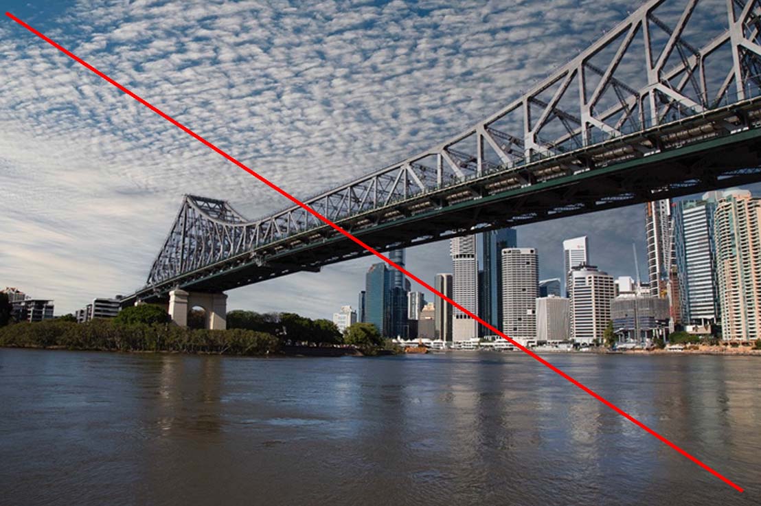
ORIGINAL IMAGE REGISTERED BY THE CAMERA: acceptable Posted: 03/28/2023 20:39:37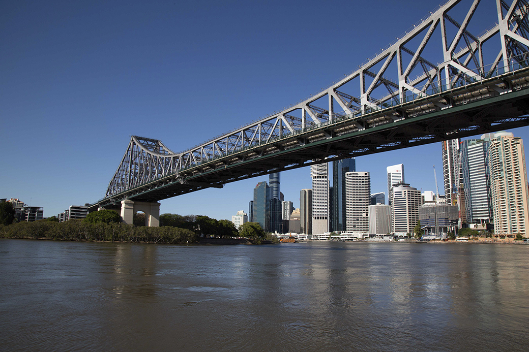
Thread Title: Blake Rudis on B&W Processing
https://youtu.be/aSS1LU3yTDY Posted: 01/09/2021 16:36:39
Thread Title: Monochrome Conversion Techniques
There are various process flows to convert our color images to monochrome using different software. Can all members here share their preferred technique.
I use Adobe Photoshop > Image > Adjustment > Black & White > then I use the 6 levels of R,Y,G,C,B & M and work to achieve a desired effect for a particular tone and contrast. I am aware of the other techniques like conversion in CameraRaw, PS>Image>Mode>Grayscale apart from third party Nik, Topaz, etc. Let's discuss on this topic if and only if our Admin Dave agrees. Posted: 05/26/2020 04:12:41
I use Adobe Photoshop > Image > Adjustment > Black & White > then I use the 6 levels of R,Y,G,C,B & M and work to achieve a desired effect for a particular tone and contrast. I am aware of the other techniques like conversion in CameraRaw, PS>Image>Mode>Grayscale apart from third party Nik, Topaz, etc. Let's discuss on this topic if and only if our Admin Dave agrees. Posted: 05/26/2020 04:12:41
I'm using this same method more and more. Once I get the image close I will then sometimes use a levels adjustment layer to dial in what I'm looking for along with masking and burning/dodging specific areas as needed for tuning the image. I seem to be relying on this method more and using Silver Efex less. Posted: 05/26/2020 19:30:50
I must admit I have more than one way of converting the image, it depends on the opening tonality of the image itself. But my favourite way is this.
All my images start in Lightroom so I will do basic tonal shit and convert to monochrome in there owing to the inclusion of the extra colour channels, especially orange. This comes in to play very handily with portraits, sunrises and sunsets.
I will then take it through to PS and using luminosity masks I will balance and tones the individual tonal areas, using this I can get very selective to the areas I want to effect.
With images that don't require so much orange and red, I would covert using Arfan way. Posted: 05/27/2020 10:06:06
I use Lightroom for most of my post processing and then check out the B&W version in LR, if it looks like it will work I then use Topaz Silver Efex Pro 2. I go through a number of the presets to find one I like the best for the image. Then I make adjustments starting from the prefix I like. After I may make additional adjustments back in LR. Posted: 05/27/2020 14:26:10
I use Lightroom (LR) to go in B&W, after the classical adjustments (objectives, crop, ...). After I adjust the level of different colors to treat the image as I like. After I can use Silver Effect Pro (SEP) to obtain a special effect. I usually try different presets, even if I usually use maybe 10 of them. I can make also adjustments at a preset. I come back in LR, and some adjustments can be done again. I don't use SEP for the portrait. I never reached a good result...
I don't use PS for the B&W. Posted: 05/29/2020 01:12:27
I don't use PS for the B&W. Posted: 05/29/2020 01:12:27
I usually open the file in Photoshop and crop and use "image>adjust>levels to eliminate flat areas in the histogram then I open the file in Silver Effex Pro2 and make all the adjustments in that program. Posted: 06/03/2020 11:42:30
Regarding Digital Color Conversion: My method has always been based on Making the Color Image the best I can, as I remember, and including the emotional factor experienced at the time of capture.
After Deleting Dust I open (PSCC-Camera-Raw) and overall Exposure Adjustments are made first. Then I approach each color separately: this includes correction to color-cast (if applicable) and also adjusting chromatic-luminance so colors fit/mate well with each other. (Note I rarely over saturate colors). Next, if applicable, in Color Efex Pro-4 I apply "gentle" polarizing filter. (Note, I will begin using more often these types of glass filter in the field to obtain far more better results). Then I move to Silver Efex Pro-2 for all my BW conversion work.
Briefly, I love the Isolated Adjustment Tool for more and precise exposure correction. I actually never touch the "Structure" slider and if I do its to DECREASE, not add "structure". This is prevent the hyper-reality aesthetic I am so opposed to.
Most important to create and illuminate the entire composition into a specific visual aesthetic, I look at the frame through all the Color Filters. (In many cases, each one shows a terrible result, as such No Color Filter is used in those circumstances).
Custom Toning: a signature to 98 percent of my BW work is through (one) custom tone. Actually, soon as the piece Opens in SEFP-2, I change to this Custom Tone before any work is performed.
(After A 5-10 Minute Break)*, back in PSCC I look over very carefully Exposure Details, dust and other digital artifacts (like a fried pixel, (red or yellow spot) for example) are deleted.
Lastly, I go back into Camera Raw and add Sharpening Adjustment, if necessary. I use these features very lightly, carefully, if at all. Remember, do your Sharpening only after all other adjustments are made, as most algorithms in this feature are based on individual pixels: so I make sure all my adjustments are complete before subjecting pixels to this process.
*It is so important to step back from the monitor (I use a 36" diagonal screen) to rest the eyes and re-set our vision as it were. Another practice is to stand and walk back a few inches (or feet) from the monitor to get a better sense of it projection of details or the lack there of. This is even more important to consider when shooting and editing film compositions. (50 percent of my work is now film based).
Once you get use to any process, the process is rather completed in a very timely manner. Posted: 12/11/2020 06:03:41