Paul Hoffman
July 2025 - Lights and Shadows
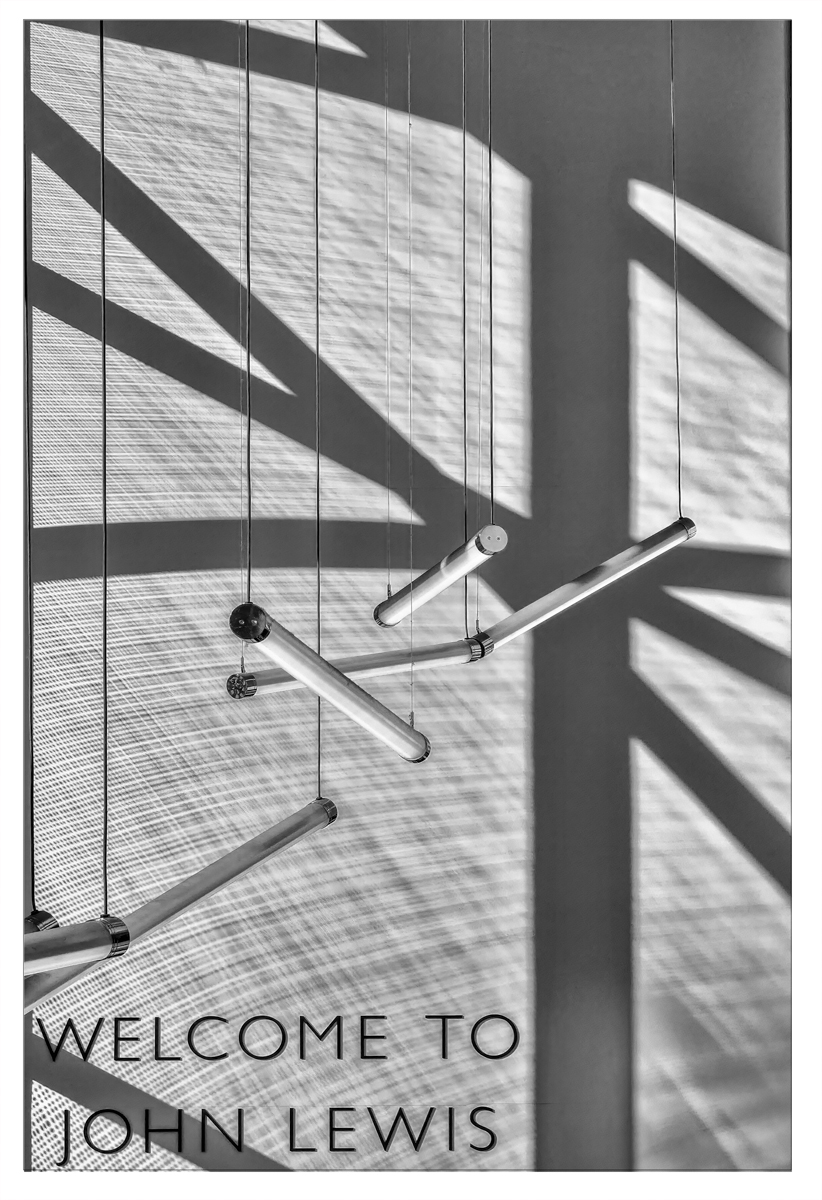
Original
About the Image(s)
I post on a site called Ephotozine and Saturdays is shadow day; I was having lunch at Huffins which is on the second floor of John Lewis in Cheltenham High Street. There is about a 10-meter gap between the second floor and the front of the building giving this great void and at curtain time of day the light pours in to give this amazing shadows. With a good lean over the edge, you can just get the angle to get the lights in the right line to make an image. With a bit of help from photoshop and Silver efex 7 I think it makes a good image. Must say the lunch was nice.
Samsung Galaxy S25 Ultra ??“ 200mm lens at 115mm, ISO32 1/800 f3.4.
5 comments posted
I'm not sure what these objects are, but the image makes for a great example of Light and Shadow. Very creative. Behind your objects, you show a texture...as a fabric!! It adds depth to your image, but what is it? What was for lunch? Posted: 07/07/2025 20:17:23
Paul, what a very creative shadow image! Are those hanging objects lights? And the texture behind them...is that from a screen or shade through which the sun is shining? Very intriguing image. My only thought is to bring up the contrast a bit. Posted: 07/07/2025 21:49:56
Light and shadow, always a pleasant subject.
Some shadow (left side) are sharper than other (right side)?
What about more contrast? Just a suggestion. Posted: 07/19/2025 15:48:00
Some shadow (left side) are sharper than other (right side)?
What about more contrast? Just a suggestion. Posted: 07/19/2025 15:48:00
I've been to Cheltenham a few times - I'll keep my eyes peeled better next time!
You have a good photographer's eye Paul. This works well and there are many options here. I don't dislike the words included - and you have positioned them cleverly - but excluding them may make the other detail stand-out more.
A square crop also may work, with the bottom just above "Welcome", so some of the top goes. This will focus the viewer on just the hanging shapes and texture. Many have commented on more contrast - perhaps a good idea, but if you were to have 2 masks (hanging poles and rest), you could adjust these individually to reflect the priority you prefer. - you may have already done that.
A well seen situation! I still like your presentation. Posted: 07/21/2025 06:34:56
This works well showing depth with the hanging objects. The texture look in the background also adds depth. I think the title, "Welcome to John Lewis" adds to the overall interest.
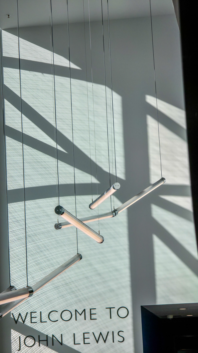
Because there is a bit to much shadow at the top I might crop about a quarter to a third off the top. Posted: 07/22/2025 17:43:03
Because there is a bit to much shadow at the top I might crop about a quarter to a third off the top. Posted: 07/22/2025 17:43:03