Paul Hoffman  


Two Chairs by Paul Hoffman

March 2025 - Two Chairs
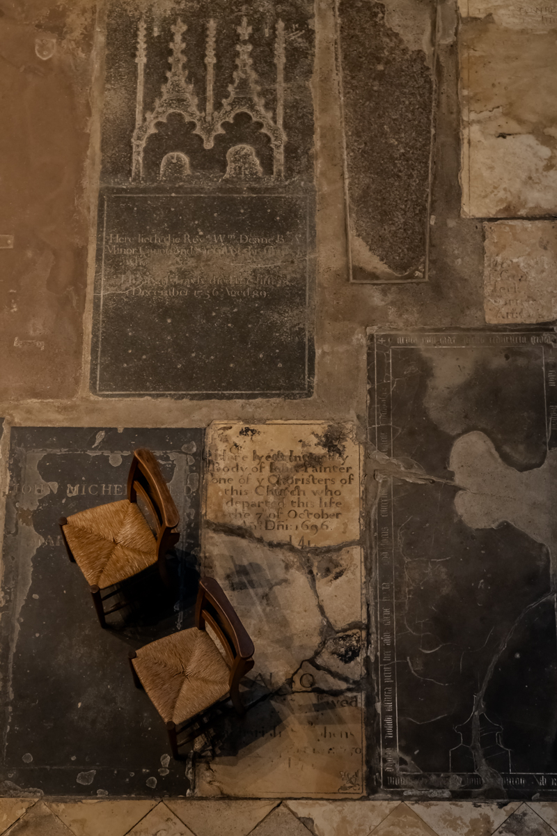
March 2025 - Paul Hoffman

Original

About the Image(s)

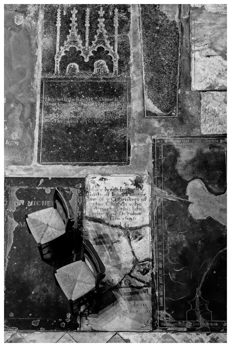
Sony a6600 ??“ Sony E PZ 18-105mm F4 G OSS @ 54mm ISO1600 1/15 f5.6 Hand Held

In Gloucester Cathedral there is an area where you can go to light a candle in memory to someone and there has always been three seats for you to sit and have a quite moment. (Now two) I have always loved how the chairs sit on the old gravestones and have known that there was an image here and have tried for many, many years. Now they have opened upstairs of the Cathedral you can now get right over the top and get the full impact of how they sit, it is a bit of an awkward image to take as you have to lean out and around pillars, but I managed to get what I was after. I am very pleased how well the camera did in such low light and not having to push the ISO.

Adjustments, first in lightroom with an Auto balance. Then to Photoshop and ran through Denoise. Then silver efex 6 using preset more silver I adjusted the light and tonal slides. Added border.


This round’s discussion is now closed!
5 comments posted


Paul Smith   Paul Smith
My tendency is to study the image before reading the narrative. At first glance, I could make out the chairs but not the background. I knew that I liked the top-down angle. Then, after reading your narrative and learning the location, the nature of the building, and age of the flooring ( I live in the high-desert of Colorado...very little here is over 100 years old) it made perfect sense!
I prefer the color image, but then a color image has no place in a monotone Group.
This is a creative shot, with an interesting story. Well done.   Posted: 03/12/2025 11:55:53
Vincent Cochain   Vincent Cochain
I agree with your tendency to analyse the picture before reading the narrative. I even would add before reading the comments.
It's a good theoretical approach that I unfortunately don't always apply ...
  Posted: 03/18/2025 03:58:09


Fran Yates   Fran Yates
You are always so creative in finding your shots. I 1st saw this image as a cubist painting. It wasn't until I read your description that I saw the chairs. I think they get lost, but if you cropped down from the top, they are more prevalent and balanced (In my opinion). I also think that the original tones show off the textures more.   Posted: 03/13/2025 13:52:50
Comment Image


Vincent Cochain   Vincent Cochain
Every suggestion is interesting, even the color version, where I think it is easier to read..., but the B&W is stronger (more texture and contrast).
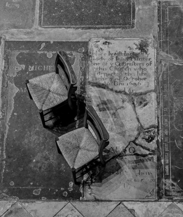
Even if the subject is the chairs, I like the triangular composition of the chairs and two stones.   Posted: 03/18/2025 04:01:51


David Halgrimson   David Halgrimson
I saw the chairs first thing, and I think the B&W is much stronger as it brings out more texture throughout the image. The composition is strong, and, sorry Fran, I don't think cropping it helps because, to me, the chairs are only a part of the image, not the subject. The shapes of the gravestones and the tiles at the bottom tend to lead to the chairs, giving them a little more attention.

All the elements work well together to create a strong image.

The border could be a little thinner to avoid pulling the eye.   Posted: 03/19/2025 22:09:52