Fran Yates
About the Image(s)
Neah Bay is a small fishing community on the Malaka Indian Reservation on the NE Olympic Peninsula.
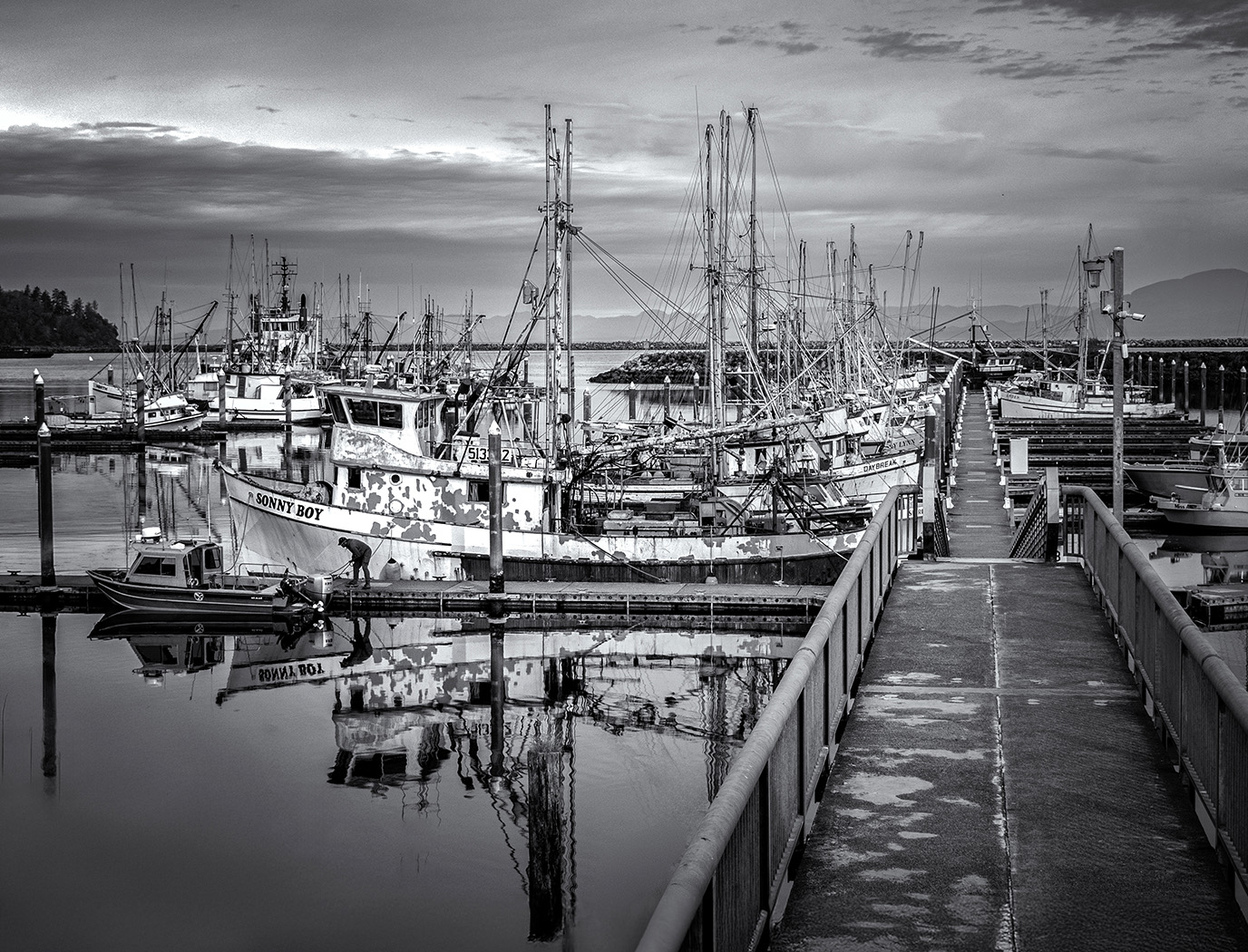
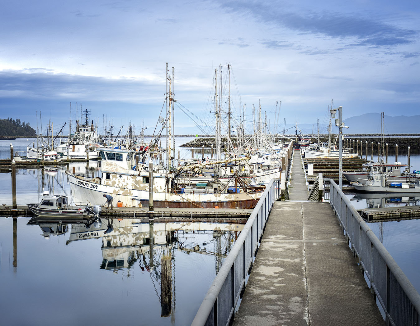
I was attracted to the reflections of the boats, particularly “Sonny Boy” I flipped the image horizontally and thought it looked better with the walkway on the left, but did not know how to flip the writing so it was readable. Thoughts? I also thought more emphasis was on the lines in B&W.
Converted to Black and White in Camera Raw using the sliders.
8 comments posted
There is good detail throughout. The leading line of the walkway works well to draw the viewer in. The sharp reflections of Sonny Boy in the water and the man next to Sonny Boy add to the story.
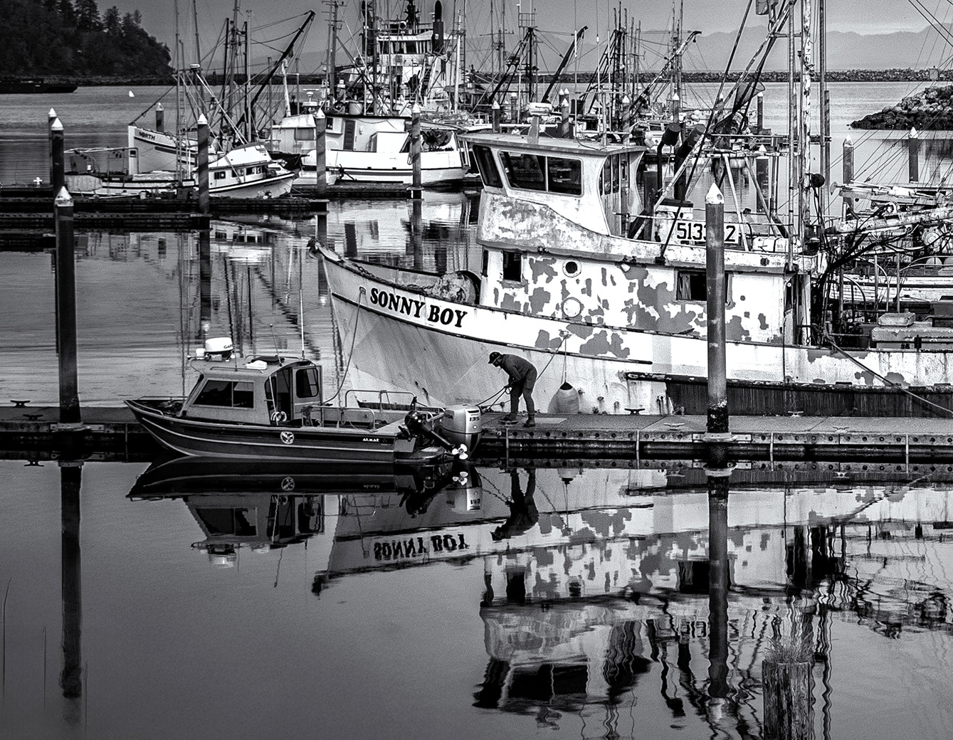
It is very busy, and I am not sure what to look at. My eye goes to the Sonny Boy, and the rest becomes distracting. I think cropping the right half off might work better. Posted: 11/08/2024 20:46:42
It is very busy, and I am not sure what to look at. My eye goes to the Sonny Boy, and the rest becomes distracting. I think cropping the right half off might work better. Posted: 11/08/2024 20:46:42
I think that works better, it puts the emphasis where you intended. Posted: 11/09/2024 17:26:51
This is a lovely shot of the harbour and your can spend your time wondering around the image looking at all the boats moored. But then you come to the joy of Sonny Boy and that reflection and then you see that lovely little boat and the man. Yes the second image is the shot, but the first has it place. Posted: 11/11/2024 11:17:02
My eye goes right to Sonny Boy and then goes all over the image, taking it all in. I do find it too busy as well and like your revised crop except that it cuts off some of the reflection and masts. Just a question...is it ok to be busy if the main subject is where the eye goes first? Posted: 11/17/2024 19:51:01
That's a good question, Mary Ann. Is it all in the eye of the beholder? Comments, anyone? Posted: 11/17/2024 21:09:26
Lovely detail and leading lines. My eyes just skimmed over the Sonny Boy in the uncropped version. With the cropped version I am attracted to all the interesting details in that part of the image. Posted: 11/17/2024 21:09:51
Good choice to convert is in B&W, as the color version (specially this blue) is quite "dull".
Even if the initial picture is quite busy, I like the construction of the perpendicular formed by the path and the boot. I saw that first, after the human presence and only after the inscription"Sonny Boy" and its reflection. I saw the picture from the right (I don't know why) and I like it.
The crop version is very different, "just" a beautiful reflection, without construction.
Everyone has his own opinion. Posted: 11/18/2024 17:04:04


