David Halgrimson, APSA
About the Image(s)
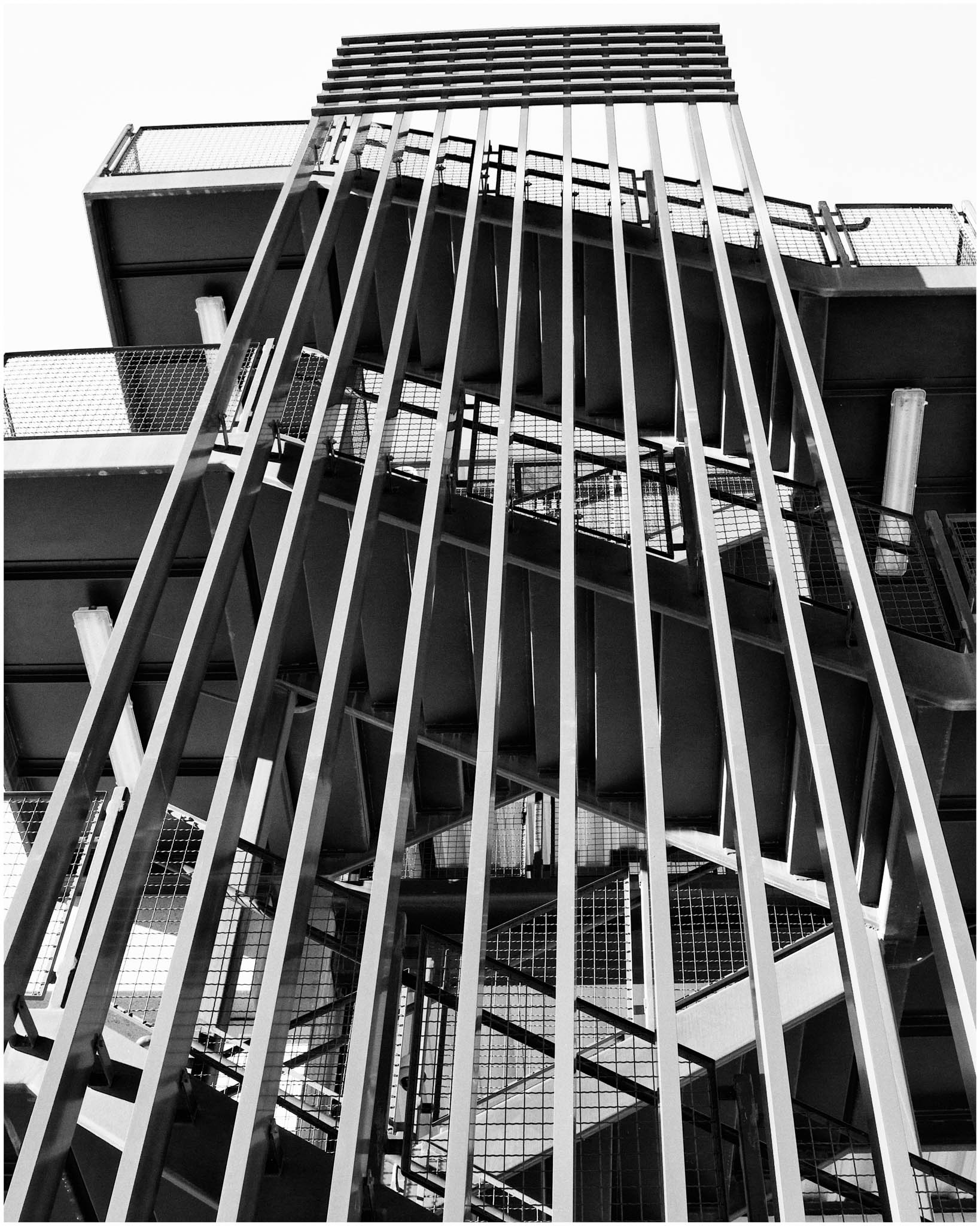
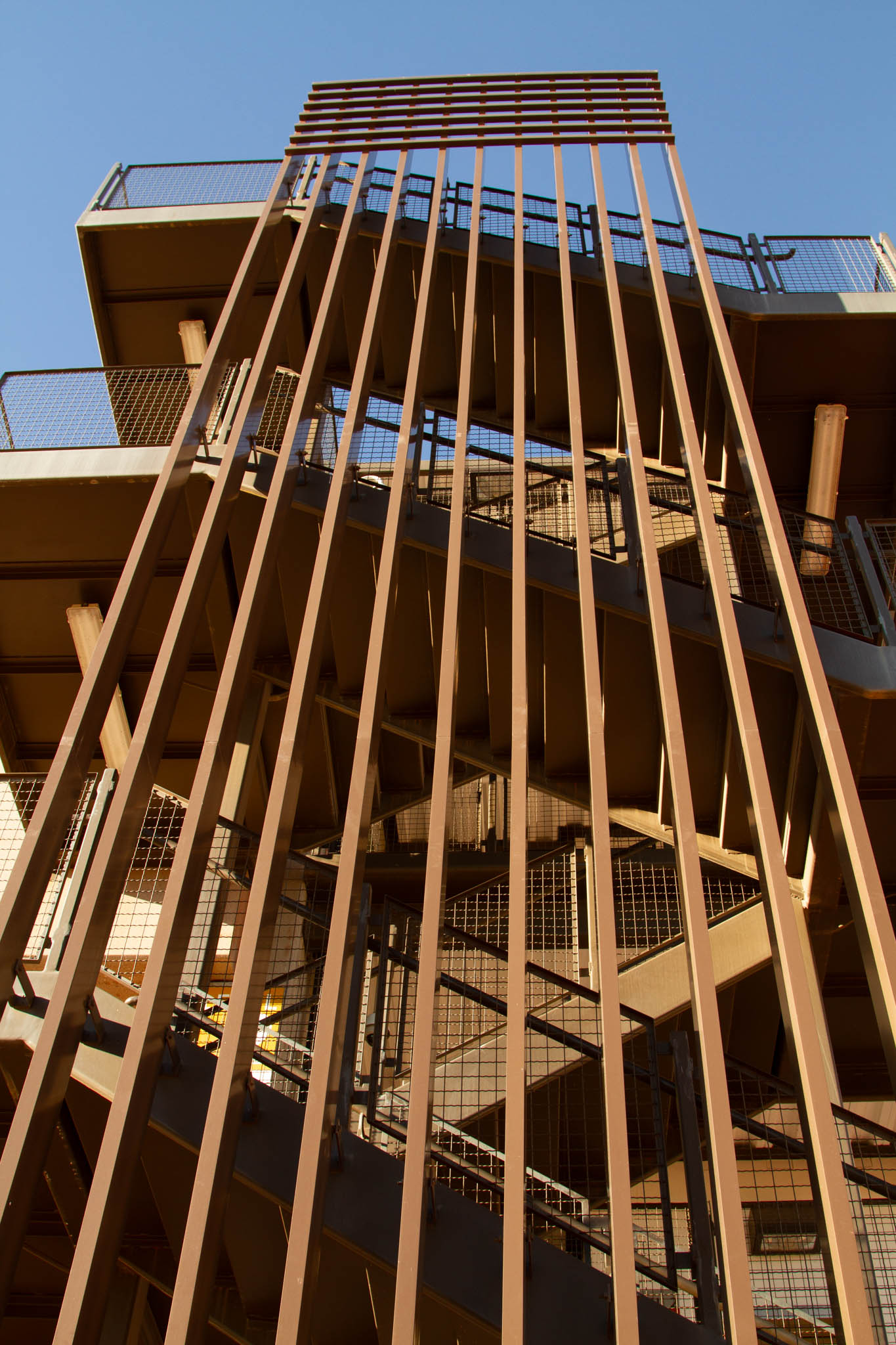
Have not shot anything lately that I would consider for B&W, so I found this one taken in 2013. I was shooting architecture for the city of Surprise, AZ. This was the stairway of a parking garage. The shapes, angles, repeating lines, etc., caught my eye. Because it is mostly monochrome anyway, I converted it to B&W.
Taken with a Canon EOS 7D, Canon EF24-150mm f/4 lens. With settings of 125th sec, f/8, and ISO 200.
No processing except to convert to B&W in Silver Efx Pro 2. I used preset # 8 and added a thin white stroke around the edge.
6 comments posted
The black and white conversion suit the image and the straight lines are very affective and draws the viewer in. I do find the image a tad tight in the frame and wonder if a wider view would have been better, a few steps back to your death would have suited to get the edges in. But a great subject for images and specially monochrome. Posted: 11/11/2024 11:12:53
I agree, a little further back would provide more room for the subject. Posted: 11/13/2024 19:11:24
I love how it works in monochrome. In the color version, the front structure is distracting and takes over. In the monochrome it all works together...a study in lines and shapes. Posted: 11/16/2024 19:01:57
I agree that this is a nice architectural image with various lines and diagonals. I find that in the monochrome version the sky is too bright so maybe bring down the highlights in that section a bit. Posted: 11/17/2024 19:47:40
The patterns and lines are enhanced with the monochrome conversion. I love how the lines take me through the image. Posted: 11/17/2024 21:12:55
Good reasons (choice) to convert in B&W.
Indeed some ft backwards would have provide more space, but the lines would have been different (more vertical and less to the sky. I hope you understand what I mean).
I think your camera was not perfectly parallel to upper line. We also see that with the different angle of view of the line. It can be disturbing. Posted: 11/18/2024 16:50:03

