Paul Hoffman
About the Image(s)
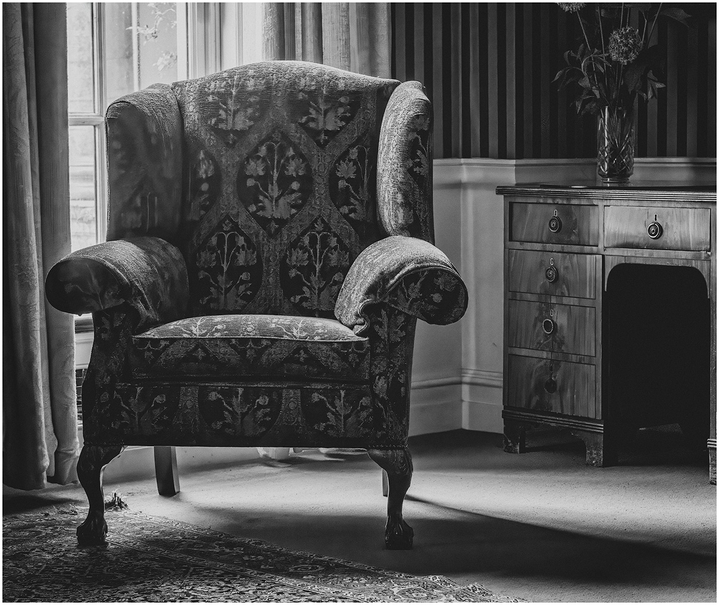
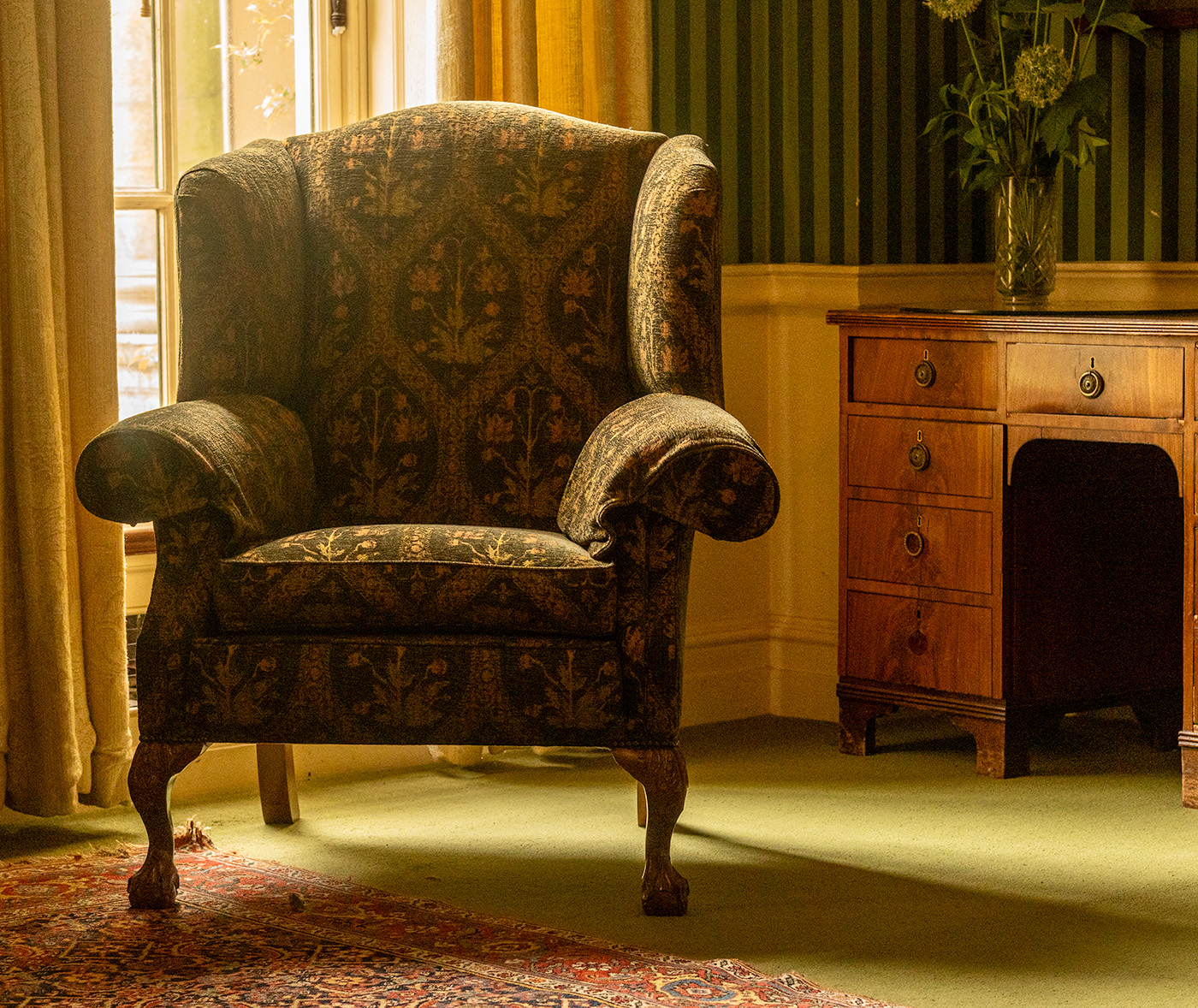
Taken at Polcey Lacey whilst on a visit, I do have a thing for a good chair, a nice chair to sit and read with the nice window light helping illuminate. I liked the way the shadows fell and the half desk and flowers were on purpose as I wanted to centre on the chair.
Nik Silver Efex and Photoshop.
7 comments posted
A strong composition with great lighting brings attention to the main elements of the chair and desk. The shadows and highlights provide dimension and depth. There is also a softness to the image which fits the subjects well.
The only thing I see is the cropping of the flowers, which I would prefer all in. Posted: 11/08/2024 21:24:24
The only thing I see is the cropping of the flowers, which I would prefer all in. Posted: 11/08/2024 21:24:24
I did not notice the flower till I got home, I was so fix on the chair. I call it chair blindness. lol Posted: 11/11/2024 11:18:06
The chair is the focal point, but I tend to see everything. It's not a big issue, just a small adjustment if possible. Posted: 11/13/2024 19:09:51
A wonderful chair and Reading Nook. I can visualize someone choosing a book and enjoying it for hours. The light is perfect for creating the tones and contrast. The chair does seem a bit cramped on the left. Using the new Generative Expand in PS, I would try to expand the frame a bit to the left for more balance. If you want to get rid of the stems and cut off flower, the remove tool would do a great job. Posted: 11/16/2024 18:18:21
Great composition and lighting. I am a reader and I want to pick up a book and sit down! I like the texture in the chair and the tones of the desk. I agree with others about expanding it a bit on the left of the chair and the flowers. Posted: 11/17/2024 19:45:29
Nice composition. The chair looms large and the light falling on it further enhances the image. I like both the color and black and white versions. Posted: 11/17/2024 21:03:56
A place to be, to read and to rest...
Two steps backwards and the crop "problem" (flowers) would have been solved, with a little more place around the chair.
Soft light and shadow. Very nice.
Posted: 11/18/2024 17:08:27
Two steps backwards and the crop "problem" (flowers) would have been solved, with a little more place around the chair.
Soft light and shadow. Very nice.
Posted: 11/18/2024 17:08:27

