Arief Rahardjo, QPSA
April 2026 - After The Rain
About the Image(s)
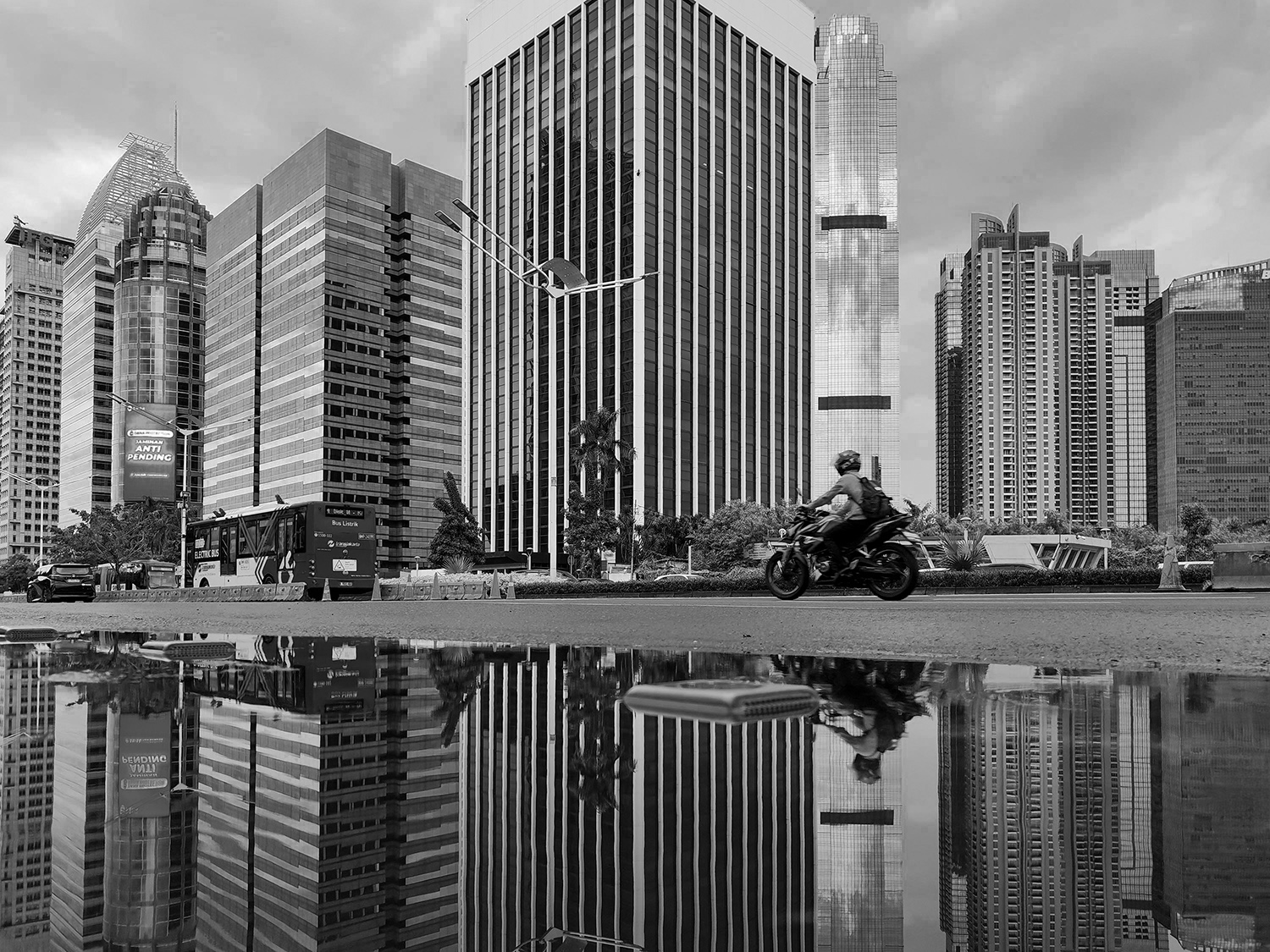
October was rain season in Jakarta. Though, 2025 season was anomaly. I took this photo in Sudirman street of Jakarta. It’s a main corridor of Central Business District of Jakarta. I purposely looked for puddle in the road to get reflection.
I took this using my smartphone since I can put very low to the asphalt (purposely to save my professional lens camera .. lol..)
Editing using Camera RAW in PS 2026. Preset : BW no 6 (-70).
Technical data :
Date image was taken : October 26. 2025
Camera make and model - Xiaomi 12
Lens type and focal length - Xiaomi, FL : 5.59 mm
Aperture : f/1.9, Shutter : 1/640 , ISO : 50, Exposure mode : Auto, Metering : Center Weighted Average.
8 comments posted
That's a fascinating photo. The lines and shapes are interesting, the reflection adds to that, and the person on the motorcycle adds to the story. And it all works well in black-and-white. Nicely done! Posted: 04/06/2026 22:20:57
Thank you Marilyn. Posted: 04/13/2026 02:44:51
Love the symmetry with the reflection. I"m with Marilyn; a great choice for monochrome. The human element give a sense of scale and action to the image; a nice blend of the stationary (buildings) and animated (the motorcyclist).
Marilyn (rightly) suggested that the image of a sailboat I submitted for this month's critique could use more "headroom" (the upper part frame seems truncated). Perhaps a similar thought for the tops of the buildings in this image - including more of their tops with the sky above might be good - ? Posted: 04/07/2026 00:17:15
Marilyn (rightly) suggested that the image of a sailboat I submitted for this month's critique could use more "headroom" (the upper part frame seems truncated). Perhaps a similar thought for the tops of the buildings in this image - including more of their tops with the sky above might be good - ? Posted: 04/07/2026 00:17:15
Hi Stan, thank you for your thought. Posted: 04/13/2026 02:45:50
This is so close to being right up there. The patterns and symmetry are spot on, the vehicles of the buildings are nicely broken by the road the vehicles. But that bike and rider is nicely placed. I would want a touch more contrast in this just to enhance the black and whites of the images as it is a touch on the grey side. But it is held off the top spot by not moving your camera up one or two CM so we have the top of that building. It would fulfil the image and make it pop. But great image to view. Posted: 04/07/2026 09:53:36
Thank you Paul. Posted: 04/13/2026 02:46:38
I ditto all of the great comments and it's perfect in B&W. The symmetry adds visual strength giving perspective views on both sides, the reflection and the cyclist are a great addition also. I kind of wished the building in center wasn't cut off on the top, but I really like this. Posted: 04/07/2026 10:08:08
Thank you Carl. Posted: 04/13/2026 02:46:53