Ian Ledgard, GMPSA/b, EFIAP/p, AWPF, GPU-Cr5
September 2023 - Durham brollies
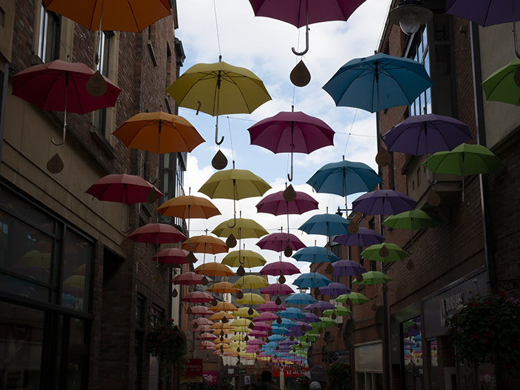
Original
About the Image(s)
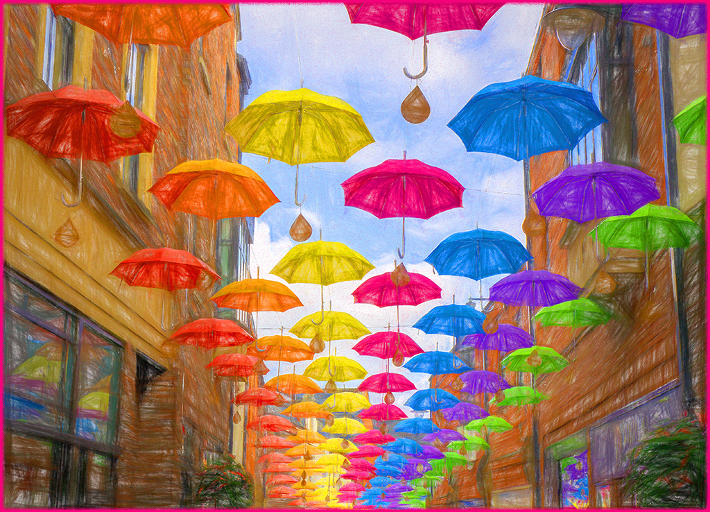
When visiting Durham City some time ago I spotted these colourful umbrellas in a shhopping mall.
After adjustments in Camrea Raw I moved to topaz studio 2 and cycled through the artistic presets settling on Coloured pencil 2 which I applied at reduced opacity of around 80%.
Back in Photoshop I boosted saturation and added the coloured border.
This round’s discussion is now closed!
11 comments posted
A wonderful and delightful image. The color of the brollies is just perfect. And, the use of an artistic preset does so much in having the buildings not being a distraction but instead a compliment to overall image. I have no suggestions. Posted: 09/10/2023 19:52:34
(Group 87)
Very nice colorful image. I like the effect from topaz, and the border. I am very happy that I joined this group and look forward to learning from each member. Posted: 09/11/2023 16:25:43
Certainly a very nice and playful image - lots to see with lots of colours and shapes. The use of filters such as this one is a very subjective choice, and not to every one's taste. I'm not a fan of this one. It works reasonably well with the umbrellas, but not so much with the buildings.
Really like the original, and hope you don't mind, but did some adjustments in Photoshop - to brighten the umbrellas and darken the buildings. Not very Creative, but it's just another version.
. Posted: 09/13/2023 12:05:01
Really like the original, and hope you don't mind, but did some adjustments in Photoshop - to brighten the umbrellas and darken the buildings. Not very Creative, but it's just another version.
. Posted: 09/13/2023 12:05:01
(Group 21)
A great image. Magritte would have been proud of it. The boost in saturation brings everything to life and the frame completes perfectly. Posted: 09/13/2023 13:56:46
(Group 21)
A great image. Magritte would have been proud of it. The boost in saturation brings everything to life and the frame completes perfectly. Posted: 09/13/2023 13:56:49
Hi Ian,
I was browsing this month's images (https://psadigital.org/groups/images.php) and yours captured my eye. It is sharp and the colors pop. I might consider bringing forward the brollies (bumbershoots in Seattle) and pushing the buildings back a little. I just selected and masked the umbrella's in PSCC and then darkened and blurred the buildings, I changed the blend mode to lighten on the selection layer. Posted: 09/16/2023 12:57:11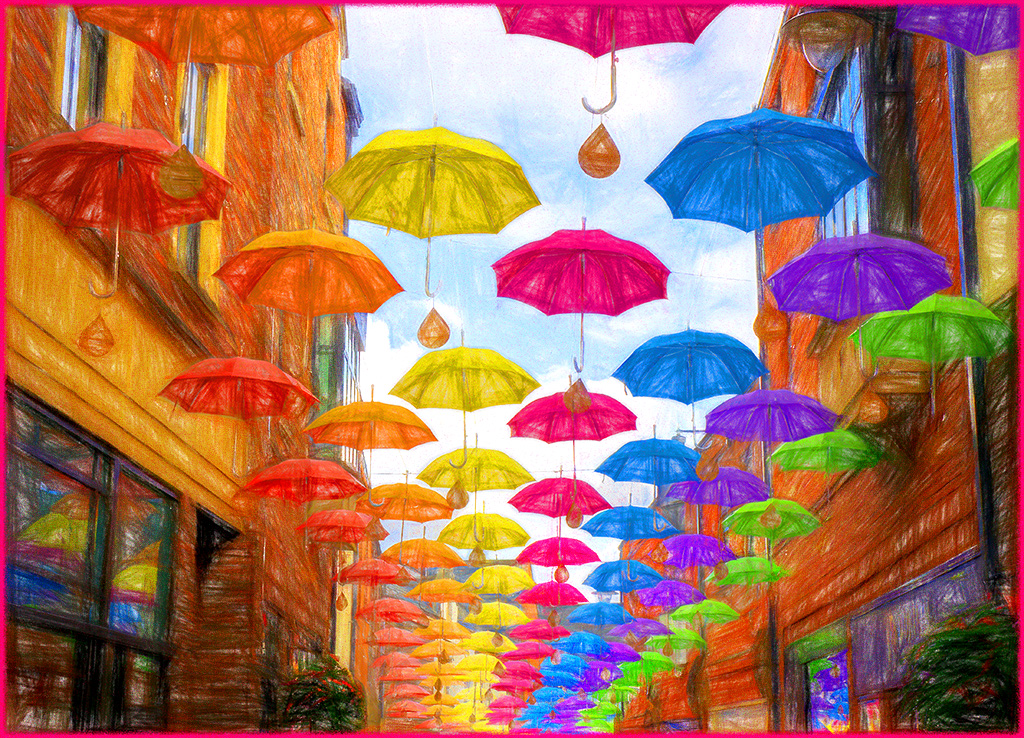
I was browsing this month's images (https://psadigital.org/groups/images.php) and yours captured my eye. It is sharp and the colors pop. I might consider bringing forward the brollies (bumbershoots in Seattle) and pushing the buildings back a little. I just selected and masked the umbrella's in PSCC and then darkened and blurred the buildings, I changed the blend mode to lighten on the selection layer. Posted: 09/16/2023 12:57:11
Thank you for your suggestion which helps a lot. Just goes to show how we all view images differently. Posted: 09/25/2023 23:02:21
(Group 40)
Great pic, nice treatment. Maybe just straighten the verticals though? Posted: 09/18/2023 02:11:32
That must have boon a delightful day. I thought a first it was a creation you had made yourself, but it is wonderful that someone had done it. The umbrellas with the hangers or whatever they are are particularly interesting because whoever put that together for the fair was able to get the trollies just perfectly aligned. I think it is very necessary to lighten the. colors as it makes it gay and exciting. The version sent in bt Gunther is my favorite. The umbrellas really stand out, while the buildings do not compete with them for color, Posted: 09/25/2023 15:57:01
(Groups 41 & 44 & 46)
Visiting and the colors and subject matter and composition caught my eye. Lovely!
Perhaps darken the buildings just a tad Posted: 09/25/2023 17:01:38
Perhaps darken the buildings just a tad Posted: 09/25/2023 17:01:38
(Groups 20 & 81)
Really colourful and painterly!! Posted: 09/29/2023 16:52:29